The Stack

Every letter,
one pile.

Scroll through the archive. Each letter slides in and stacks on the last — the way they arrived, the way they compound.

Issue 01 · Education · Jun 3, 2026

Dividend Investing Is More Misunderstood Than Either Side Will Admit

Dividend critics cite Miller-Modigliani. Dividend devotees cite income stability. Both miss the real picture. Here's what the evidence actually shows about dividends.

Dividend investing generates more tribal loyalty than almost any other strategy in personal finance. On one side, a large and vocal community of income investors insists that dividends represent the real, tangible return on ownership, that companies paying reliable and growing dividends are simply better businesses, and that living off income without selling shares is the only psychologically sustainable path to retirement. On the other side, a smaller but equally confident group of academics and index advocates point to Merton Miller and Franco Modigliani’s 1961 theorem of dividend irrelevance and declare the entire enterprise a tax-inefficient distraction from total return. Both camps have picked up the parts of the evidence that support them and quietly set aside the parts that complicate their story. That is the real problem with the dividend debate, not that one side is right, but that neither side is being fully honest about the tradeoffs.

The theoretical case against dividends mattering is elegant and worth understanding precisely. In their 1961 paper, Merton Miller and Franco Modigliani demonstrated that in a world with no taxes, no transaction costs, and rational investors with equal access to information, a firm’s dividend policy cannot affect its total value. The argument is straightforward: if a company pays you $1 in dividends, the stock price drops by exactly $1 on the ex-dividend date. You have the same total wealth, just in a different form, cash plus a slightly reduced stock price. Conversely, if the company retains that dollar and reinvests it, the stock price reflects the retained capital. Either way, the mathematics of value are the same.

Meir Statman, expanding on this logic, put it simply: a dollar labeled dividends is as green as a dollar labeled capital, so rational investors should be indifferent between the two. If you want income but your holdings pay no dividends, you can sell a small slice of appreciated stock. This is sometimes called a homemade dividend, and in a frictionless world it is financially identical to receiving a declared dividend.

The M&M theorem does not say dividends are bad. It says that in a world free of distortions, they do not change the total value equation. The distortions are where the real investing decisions live.

Issue 01 · Education · Jun 3, 2026
Dividend Investing Is More Misunderstood Than Either Side Will Admit
continued

The theorem’s assumptions, however, are the key. We do not live in a tax-free world. Transaction costs exist. Information is asymmetric. And human beings are not the coolly rational agents of classical theory. Strip away those assumptions and you do not destroy the insight, you qualify it in ways that cut differently depending on who you are, what account type you hold, and how you actually behave with money.

The most concrete objection to dividend investing in a taxable account is that dividends are often taxed less favorably than long-term capital gains, especially for higher-income investors. In the United States, qualified dividends receive preferential tax treatment roughly on par with long-term capital gains for many investors. But that near-parity erodes as income rises, and in most other major jurisdictions the gap is more pronounced. A capital gain can also be deferred indefinitely, you choose when to realize it. A dividend arrives on the company’s schedule and is taxable in the year it is paid, regardless of whether you needed the cash or wanted to trigger income that year.

This creates a genuine compounding disadvantage for investors in taxable accounts, particularly high earners. Every year a dividend forces a small tax event, which means less capital compounding forward. Over a decade or more, the annual tax drag from dividends paid into a taxable account can represent a meaningful reduction in after-tax wealth compared to an equivalent portfolio that defers gains until sale. The effect is most severe for investors already in high tax brackets who have no immediate need for the income.

The flip side is important: this argument largely disappears inside a tax-sheltered account, whether an IRA, a 401(k), an ISA, or equivalent. In those structures, dividends and capital gains are treated identically during the accumulation phase. The tax inefficiency case against dividends is entirely about account type, it is not a universal verdict. Investors who hold dividend-focused funds or stocks entirely within tax-sheltered accounts do not face this particular headwind at all.

Here is where the dividend critics tend to be too quick. The theoretical equivalence of dividends and homemade dividends is mathematically tidy, but it does not hold up against how most investors actually behave. Research by Hersh Shefrin and Meir Statman, published in 1984, found that investors exercise considerably better self-control over their spending when income arrives as a dividend than when they are required to take the deliberate action of selling shares to generate cash. The act of selling shares carries psychological weight that receiving a dividend does not. Selling feels like depleting a portfolio. A dividend feels like earning.

This is a form of mental accounting, the tendency to assign money to different psychological buckets based on how it arrived rather than treating all wealth as fungible. For a retirement investor trying to avoid the real danger of liquidating too much capital during a bear market, this asymmetry is not irrational noise, it is a functional constraint that actually helps. An investor who commits to spending only dividend income and never selling shares will tend to spend less in years when dividends fall, because the spending cap adjusts automatically. An investor following a total return approach who must decide how much to sell faces a harder behavioural problem, particularly when markets are falling and every sale feels like a loss.

This observation does not prove that dividend investing produces superior returns. It says something more modest and more useful: the psychological structure of living off dividends creates a spending discipline that some investors genuinely need and will not get from a pure total return framework. That is a legitimate reason to consider a dividend-oriented approach, especially in distribution rather than accumulation, and it deserves more intellectual respect than the total return purists typically give it.

One of the most persistent misunderstandings in dividend investing circles is the yield-on-cost argument. The logic runs like this: if you buy a stock yielding 3% and the dividend grows steadily over many years, your yield on your original cost will eventually look extraordinary. Some proponents suggest this means dividend growth stocks will eventually “beat the market on yield alone.”

This reasoning contains a fundamental accounting error. Total return equals dividend yield plus price appreciation, full stop. A company that raises its dividend consistently must also be growing its earnings and, over any sustainable period, its share price at a roughly similar rate. Yield on cost does not represent a growing slice of return, it represents the compounding of both the income and the capital together. An index investor who holds the same company inside a broad fund receives the exact same total economic outcome. The yield on cost calculation does not reveal excess value, it simply restates compounding in a form that feels gratifying but does not add information. Comparing your yield on cost to someone else’s current yield on the same stock is comparing apples to time machines.

Yield on cost is a way of making compounding feel personal. It is not a measure of outperformance, and mistaking it for one leads investors to overestimate what their strategy is actually delivering.

Issue 01 · Education · Jun 3, 2026
Dividend Investing Is More Misunderstood Than Either Side Will Admit
continued

There is a related problem with concentration. Dividend-focused strategies systematically exclude large segments of the equity market: most small-cap companies, most growth-oriented businesses, and most non-US markets pay little or no dividend in their early or mid-cycle phases. Evidence on long-run equity returns suggests the small-cap premium has historically been meaningful over very long periods. A strategy that screens for yield by definition skips the highest-growth portion of any market cycle, and this exclusion is rarely acknowledged in dividend investing conversations.

It is worth being precise about what a dividend-focused fund like VIG, the Vanguard Dividend Appreciation ETF, is actually delivering. At a trailing price-to-earnings ratio of around 26.4x, VIG trades at a modest discount to SPY’s roughly 28.5x, reflecting a tilt toward established, profitable businesses with strong free cash flow and consistent earnings records. That is a quality and mild value tilt, and there is reasonable evidence that such tilts have historically provided some protection in down markets and respectable long-run returns.

A quality tilt and a dividend tilt are not the same thing, though. A company can be extremely high quality, compounding capital at excellent rates of return on equity, and pay no dividend at all, because it has better uses for the capital than distributing it. Berkshire Hathaway is the most frequently cited example: for decades it paid no dividend while compounding shareholder wealth at rates most dividend stocks could not approach, though investors who bought at peak valuations in periods like the late 1990s experienced that compounding very differently from those who purchased at more reasonable prices. The quality of the underlying business, and the price paid for it, drove those outcomes, not the dividend policy.

This is the investor’s real task: identifying businesses that allocate capital well. Sometimes those businesses pay dividends because they have reached a mature stage with limited reinvestment opportunities, and distributing excess cash is genuinely the best use of it. Sometimes they reinvest aggressively. A thoughtful long-term investor should care deeply about capital allocation quality and very little about the specific form in which shareholder returns are delivered. For investors who want a framework for thinking about long-term market exposure and when broad indexes offer genuine value, the Buy the 200 strategy offers a discipline grounded in index-level positioning rather than dividend purity.

It would be a mistake to finish this with the impression that dividend investing is simply wrong. Several things that dividend investors emphasize are well-founded. First, companies with long records of consistent and growing dividends have often demonstrated superior management discipline, the requirement to maintain a cash payment imposes an accountability that retained-earnings-only businesses do not face in the same way. Dividend stability is frequently a signal, even if an imperfect one, of underlying business quality and financial conservatism.

Second, dividend investing is a coherent, low-turnover, low-complexity strategy for most investors. It tends to anchor people in fundamentally profitable businesses and away from speculative growth stories. For investors who lack the time or inclination to assess valuations deeply, a dividend-growth screen naturally filters toward companies with earnings, cash flow, and financial discipline, all qualities worth having in a portfolio. The strategy does not beat a broad index with any consistency, but it also tends not to blow up in the ways that pure growth or momentum strategies can.

Third, for investors approaching or in retirement, the income framing genuinely helps with distribution psychology. Constructing a portfolio where income roughly covers normal spending reduces the need to sell assets during market downturns, which is one of the most damaging behavioural patterns a retiree can fall into. For historical context on how broad market cycles have unfolded over the long run, the S&P 500’s 200-week SMA history provides a useful perspective on how deep and extended drawdowns have tested even disciplined investors.

Treating the dividend debate as a binary between “income is paramount” and “dividends are irrelevant” guarantees you will miss the actual decision. The question is not whether dividends are good or bad in the abstract. More useful questions are precise ones: what account type will you hold this in, and does the tax treatment favour dividends or deferred capital gains? What stage of investing are you in, and does a spending-discipline structure actually help you, or do you have the behavioural wiring to execute a total return drawdown plan reliably? What valuation are you paying for the dividend-paying portfolio versus a broader index, and does the quality tilt justify any tracking error you will experience in certain market cycles?

A broad low-cost index fund already delivers dividend income as part of its total return. The S&P 500 itself yields a modest amount across most periods, and that income grows over time as the earnings of its constituent companies grow. An investor in a total market or S&P 500 index fund is not avoiding dividends, they are simply not using dividends as the primary filter for what companies to own. Whether that is the right choice depends on factors specific to the individual investor, not on which community has the better rhetorical posture in the debate.

The best investors in either camp share one trait: they are clear about what problem they are actually solving. Income certainty, behavioural guardrails, and tax efficiency are different problems. A strategy optimised for one may be poorly suited to another.

Almanac 184
Chapter II

What we learned the week BBY hit its 200-week SMA in 2016.

Matt Denney
• • •

The week of June 6, 2016 put BBY right on its 200-week line — $29.44 versus a mean of $29.94.

Twelve months later: +97.5%. Three years later: +116.4%. Five years later: +294.0%.

10 years on, BBY trades at $77.95+164.8% from the touch.

— Patience is the trade. Conviction is the discipline.

184
The BuyThe200 Journal
Education · Since 2026

Ergodicity: The Math Concept That Explains Why You Can’t Average Bad Outcomes

Most return calculations lie to you by averaging across investors instead of through time. Understanding ergodicity reveals why volatility kills wealth, and how to size accordingly.

Most return statistics are computed the wrong way for the question you are actually asking. A fund reports its “average annual return.” A backtesting tool shows “expected value.” A financial planner projects a smooth 7% compounding line into your retirement. Every one of these figures is technically correct and practically misleading, because they measure outcomes across a population of investors rather than through time for a single investor. That distinction is not a rounding error. It is, depending on your leverage and withdrawal rate, the difference between building wealth and losing everything while the average looks fine.

The concept that formalises this gap is ergodicity, and once you understand it, a surprisingly large number of standard investment frameworks start to look inadequate.

A system is ergodic if the average outcome across many parallel instances equals the average outcome across one instance over a long stretch of time. Toss a fair coin one million times, and your long-run frequency of heads converges on the population average. The time-average and the ensemble-average are the same thing. That is ergodicity.

Financial returns are not ergodic. The reason is multiplicative compounding. When returns compound, the sequence in which they arrive permanently shapes the terminal outcome. A single catastrophic loss early in the series cannot be undone by averaging in better results later. The wealth path of one investor over forty years is not the same thing as the average wealth path of forty thousand investors over one year each.

Ergodicity: The Math Concept That Explains Why You Can’t Average Bad Outcomes
continued

When a financial model reports an “expected return,” it is computing what happens on average across all possible investors. But you are not a statistical average. You are one person, living through one sequence of returns, with a portfolio that can be permanently impaired.

This is the core of what the physicist Ole Peters and colleagues at the London Mathematical Laboratory have argued in recent years: most of neoclassical economics assumes ergodicity where none exists, and this assumption quietly distorts nearly every recommendation that follows from it.

The clearest entry point into ergodicity is the relationship between arithmetic and geometric returns. Suppose an investment gains 50% in year one and loses 33.3% in year two. The arithmetic average return is a respectable-looking 8.35% per year. The geometric mean is exactly zero. Your ending wealth is identical to your starting wealth.

Now suppose the swings are more violent: up 100% in year one, down 50% in year two. The arithmetic average is 25% annually. The geometric mean is again zero. You have not made a cent in two years despite the headline average showing strong performance.

The formula that connects these two measures is sometimes called the volatility drag: the geometric mean approximately equals the arithmetic mean minus half the variance of returns. A portfolio with a 10% arithmetic mean and 20% annual standard deviation has a geometric mean of roughly 8% (10% minus half of 4%). A portfolio with the same arithmetic mean but a 40% standard deviation has a geometric mean closer to 2%. The drag is quadratic in volatility, which means it accelerates fast as swings get larger.

This is not a theoretical nicety. It is the mechanism by which high-volatility strategies destroy compounding wealth even when their average return looks competitive. The arithmetic mean is the figure you see in a fund factsheet. The geometric mean is what lands in your account. Over decades, the gap between them compounds into a material difference in terminal wealth.

Ergodicity becomes most dangerous at the boundary where outcomes are irreversible. Loss of capital beyond a certain threshold is not a setback you average your way out of. It is a permanent exit from the compounding game.

Consider the canonical example used in probability theory. A gambler starts with $100 and bets a fixed fraction of their wealth on a coin flip with a 60% win rate. The expected value at each flip is positive. The arithmetic mean return is positive. Yet if the fraction bet is large enough, the gambler will almost certainly go broke over a long enough horizon, because the multiplicative nature of sequential losses creates a downward absorbing barrier. Once you hit zero, you cannot recover, regardless of what the expected value says about the average outcome across all parallel gamblers.

Real investing contains the same structure. A 50% drawdown requires a 100% subsequent gain just to return to even. A 75% drawdown requires a 300% gain. These are not symmetric. The deeper the loss, the more future growth is consumed simply by getting back to the starting line, rather than advancing beyond it. Meanwhile, another investor who avoided the drawdown has been compounding the entire time. The gap between them widens not because of differential skill, but because of differential path.

Survival is not just a nice outcome. In a non-ergodic system, survival is the prerequisite for all other outcomes. An investor who avoids ruin will eventually compound. An investor who does not has no future returns to average.

Ergodicity: The Math Concept That Explains Why You Can’t Average Bad Outcomes
continued

This is why the body of serious financial writing, from the Kelly Criterion to modern sequence-of-returns analysis, converges on one underlying principle: the goal is not to maximise the arithmetic expected return. The goal is to maximise the long-run geometric mean while keeping the probability of ruin near zero. These two objectives are not the same, and strategies optimised for one often perform badly on the other.

Leverage is the mechanism that most aggressively exploits the non-ergodic structure of returns. By amplifying both gains and losses, leverage widens the variance and therefore deepens the volatility drag. A 2x leveraged portfolio on an index with 20% annual standard deviation faces an effective standard deviation of 40%. The volatility drag on the leveraged position is four times larger in absolute terms. If the underlying index’s arithmetic mean is 10% and geometric mean is 8%, the 2x product’s arithmetic mean is approximately 20%, but the geometric mean might be only 12%, not 16% as naive doubling would imply.

That gap widens further when leverage introduces the possibility of a margin call or forced liquidation. At the moment the price falls far enough, the leveraged investor is compelled to sell, converting a paper loss into a permanent one. This is a hard, irreversible exit from the compounding series, exactly the ruin scenario that ergodicity analysis identifies as catastrophic. The subsequent recovery in the underlying asset is irrelevant because the investor no longer holds it.

This explains why the Kelly Criterion, a framework developed in information theory and later applied to gambling and investment sizing, recommends position sizes that are much smaller than naive expected-value maximisation would suggest. The full Kelly fraction maximises the long-run geometric mean. Fractions above it reduce the geometric mean even though they raise the arithmetic mean. Serious practitioners frequently use half-Kelly or quarter-Kelly allocations, accepting lower expected returns in exchange for a substantially reduced probability of catastrophic drawdown.

For the kind of long-term passive investor this site is written for, the practical implication is straightforward. Leveraged ETFs, margin accounts, and concentrated levered positions are products that look attractive through an arithmetic lens and are frequently destructive through a geometric one. The marketing materials for a 2x or 3x product typically show the arithmetic gain on up days. They do not show the geometric drag that accumulates quietly over years of two-sided volatility.

If volatility drag is the mechanism, then reducing variance is not merely a comfort measure. It is a direct lever on geometric returns. A diversified portfolio that holds many uncorrelated positions instead of a handful does not just smooth the ride. It demonstrably raises the geometric mean return by compressing the variance, even if the arithmetic mean of the constituent positions is unchanged.

This gives diversification a stronger justification than the conventional “don’t put all your eggs in one basket” framing. The conventional argument is about avoiding idiosyncratic catastrophe. The ergodicity argument is subtly different and more powerful: even if you expect all your concentrated positions to perform well, combining them reduces variance and therefore raises the geometric mean that actually compounds into your terminal wealth. You can expect to be better off in a mathematical sense, not just a risk-adjusted one.

The same logic applies to volatility more broadly. Two portfolios with identical arithmetic means but different volatilities will produce different terminal wealth. The lower-volatility portfolio will compound to a higher value over time, purely as a result of arithmetic. This is not hidden in any unusual assumption. It follows directly from the formula connecting geometric and arithmetic returns. Evidence in financial research consistently shows that lower-volatility equity strategies have historically delivered competitive or superior long-run geometric returns to higher-volatility alternatives, despite appearing less exciting in any individual year.

Position sizing that ignores this will over-allocate to high-variance ideas and under-allocate to steady compounders, producing worse outcomes than the raw expected return calculation suggests. A smaller position in a volatile asset can compound to a larger terminal value than a larger position in the same asset, if the smaller size keeps the overall portfolio variance low enough to protect the geometric mean. This is counterintuitive until you have seen the numbers, and it is one of the more practically important insights ergodicity brings to everyday portfolio construction.

Sequence-of-returns risk is ergodicity applied to the specific problem of withdrawals. An accumulator’s portfolio is largely indifferent to return sequence because no capital is removed. The geometric mean of the full series is determined only by the product of all the period returns, not their order. But a retiree withdrawing capital each period faces a non-ergodic trap: a bad sequence early in retirement forces asset sales at low prices, permanently reducing the base that future returns compound on. The same underlying arithmetic that makes volatility drag dangerous in accumulation makes early drawdowns catastrophic in decumulation.

Market Analysis

High Multiples Don’t Equal a Bubble (And What Actually Does)

A high P/E ratio makes markets expensive, not necessarily bubble territory. Learn the real markers — leverage, narrative dominance, and issuance frenzy — that separate overvaluation from speculative collapse.

Every time the S&P 500 trades at a trailing P/E above 25, a familiar chorus begins: this is a bubble. The argument is superficially intuitive. Prices are high relative to earnings, therefore something must be wrong, therefore a crash is coming. The problem is that this reasoning has led investors to sell out of perfectly rational bull markets, sit in cash through compounding years they can never recover, and develop a general paranoia about valuations that prevents them from thinking clearly about risk. High multiples are a meaningful signal, they genuinely predict lower future returns. But predicting lower returns is not the same thing as predicting a bubble. A bubble is a specific structural event with identifiable markers, and the P/E ratio is only a faint trace of one of them.

The price-to-earnings ratio answers a single, precise question: how much are investors paying today for each dollar of current earnings? At a trailing P/E of around 28, roughly where the S&P 500 sits today as measured by the SPY ETF’s trailing multiple, investors are paying approximately $28 for every $1 of trailing twelve-month earnings. The historical average for the S&P 500 since the late 1920s has fluctuated, but a conventional mid-cycle range sits somewhere in the high teens to low twenties.

So a trailing P/E near 28 is elevated. It means future returns, starting from this price level, are likely to be lower than the long-run average of roughly 10% nominal annually. The Shiller CAPE, which smooths earnings over ten years to strip out single-year distortions, sat at 42.3 as of late May 2026, comparable to the peak of the technology bubble in 2000, when it reached approximately 44. History is unambiguous on what this means for the next decade of returns: they will probably be modest, and could be flat in real terms. That is the honest read of the data.

What the P/E ratio does not tell you is whether a crash is coming next year, next quarter, or next decade. The relationship between starting valuation and short-term returns is statistically negligible. Markets spent years in the mid-to-high twenties during the 1990s without collapsing, and they spent years in the high thirties before the actual peak in March 2000. The signal gets useful only over a ten-year horizon. Investors who sold because of stretched valuations in 1996 sat out four of the most profitable years in equity history before being validated, and even then, what finally broke the market was not the multiple itself.

High Multiples Don’t Equal a Bubble (And What Actually Does)
continued

Valuation tells you the price you are paying for the next decade of earnings growth. It does not tell you when Mr. Market will notice he has overpaid.

Historical bubbles share a recognizable anatomy. Looking across the dot-com collapse of 2000, the US housing crisis of 2007 to 2009, and the Japanese asset price bubble that peaked in 1989, four conditions appear repeatedly and in combination. None of them is the P/E ratio.

The first is narrative dominance: the widespread belief that a new paradigm has made old valuation frameworks obsolete. In 1999, the story was that the internet had changed the economics of business permanently, making earnings irrelevant compared to eyeballs and growth rates. In 2006 and 2007, the story was that real estate could not fall nationally, because it never had before. In Japan in the late 1980s, the belief was that Japanese corporate cross-holdings and land scarcity made valuations in Tokyo permanently higher than anywhere else on earth. In each case, the narrative was not entirely wrong, the internet did transform commerce, real estate does tend to hold value over time, but the extrapolation was extreme enough to make skeptics sound ignorant rather than prudent. When challenging the prevailing story makes you the fool in the room, that is a genuine warning signal. When an investment thesis requires no exit analysis because everyone knows the asset only goes up, you are close to the edge.

The second is leverage at scale. A bubble almost always requires borrowed money to reach its final, unsustainable height. Margin debt surged through record after record during the late 1990s and again into the 2007 peak. Japan’s banks funded speculative real estate and equity purchases throughout the late 1980s at ratios that had no plausible path to servicing if asset prices fell even modestly. The mechanism is straightforward: leverage amplifies gains on the way up, drawing in more participants, which drives prices higher, which makes the existing leverage look safe, which encourages more borrowing. The reversal is equally automatic. When prices fall, margin calls force selling, which drives prices lower, which triggers more calls. What starts as a correction becomes a cascade. According to data reported by Advisor Perspectives, NYSE margin debt rose 6.8% in April 2026 to a fresh record high, a figure worth monitoring, though margin debt at a record is not sufficient on its own to call a bubble. It is one instrument in a diagnostic panel, not a verdict.

The third is an issuance frenzy. In genuine speculative peaks, the supply of assets expands rapidly to meet demand. During the dot-com era, hundreds of companies with no earnings, no revenue, and sometimes no products completed IPOs at nine-figure valuations. In 2021, the SPAC boom served a similar structural function, with blank-check vehicles raising capital at valuations that would have struggled to pass traditional underwriting scrutiny a decade earlier. Research examining the performance of sector and thematic ETFs consistently shows the same pattern: excess returns in the three years before launch, near-zero returns after. Issuance chases past performance, not future fundamentals. A surge in IPO volume, particularly concentrated in a narrow theme or sector, is one of the cleaner leading indicators that a speculative cycle is maturing.

The fourth is the suppression of dissent. In a genuine bubble, skeptics are not merely wrong in the market’s view, they are socially and professionally isolated. Fund managers who refused to own technology stocks in 1998 and 1999 faced client redemptions. Analysts who questioned mortgage-backed securities valuations in 2006 faced institutional pressure. Benjamin Graham’s conception of Mr. Market is useful here: when Mr. Market is not merely optimistic but genuinely manic, when he will only accept offers and never question what he is paying, dissent has been priced out of the conversation. That is a structural condition, not just a sentiment reading.

The dot-com era illustrates why the four-condition framework matters more than any single valuation metric. The Shiller CAPE peaked near 44 in early 2000. Many analysts pointed to that number throughout 1998 and 1999 as evidence of a bubble. They were correct about the outcome but often wrong about the mechanism. The crash that followed was not a simple reversion of multiples to historical averages. It was the simultaneous unwinding of all four conditions.

Narrative dominance collapsed almost overnight when high-profile dot-com companies began reporting that their revenue projections had been fabricated or that their business models required indefinite subsidization from capital markets to survive. Leverage unwound through margin calls that accelerated the decline. IPO issuance had been running at a pace that was structurally impossible to sustain, and the pipeline froze entirely. The professional skeptics who had been sidelined throughout the late nineties found themselves suddenly vindicated and vocal. The S&P 500 fell 49% from peak to trough and took 384 weeks, roughly seven and a half years, to fully recover. The NASDAQ was considerably worse.

The key point is that multiples alone did not cause that outcome. Japan’s Nikkei traded at price-to-earnings ratios well above 50 at its 1989 peak, among the most extreme valuation readings of any major market in the modern era. But it was the combination of that extreme multiple with real estate leverage of staggering proportions, a banking system that had lent freely against inflated collateral, and a cultural narrative of invincibility that produced an index which, more than 35 years later, has only recently recovered its 1989 nominal high.

An expensive market is one where you are paying a premium for future earnings growth, and the question is whether that premium will be validated by actual earnings, compressed over time as rates normalize, or punished abruptly if growth disappoints. This is a return-dampening condition, not a structural collapse condition. The S&P 500 can deliver below-average returns for several years from a high-CAPE starting point without experiencing anything that looks like a historic crash.

High Multiples Don’t Equal a Bubble (And What Actually Does)
continued

Markets can remain expensive for extended periods while delivering positive, if below-average, annual returns. The investor who exited on valuation grounds alone often found that the remaining years of an overvalued bull market cost more in forgone compounding than the eventual correction returned in avoided losses. This is not an argument that high valuations are harmless. It is a precise argument about timing: valuation compresses returns over a decade, but it rarely specifies the calendar year of the correction.

The 2022 bear market illustrates this distinction sharply. That correction, which saw the S&P 500 fall 25% before bottoming, was triggered by a rapid repricing of risk-free rates as the Federal Reserve tightened aggressively. It was painful, but it recovered to new highs within 68 weeks. The mechanism was valuation compression from rising discount rates, not the structural collapse of a leveraged speculative system. There was no issuance frenzy to unwind, no paradigm narrative to shatter. It was an expensive market meeting a higher-rate environment and adjusting accordingly, a very different animal from the crashes that followed genuine bubble conditions.

A bubble requires borrowed money, a story that silences skeptics, and an issuance machine feeding the frenzy. High multiples are the kindling. The other three conditions are the fire.

The S&P 500 is near all-time highs, with the 200-week simple moving average sitting approximately 40% below the current price. That gap, as explored in the S&P 500’s 200-week SMA history, reflects the distance between current prices and the long-cycle support level that has historically defined major buying opportunities. The current CAPE of 42.3 places the market in the same valuation territory as the pre-2000 peak. The Buffett indicator, measuring total market cap relative to GDP, sits near 139%, above what Buffett described as playing with fire. The 10-year Treasury yield at 4.47% is creating genuine competition for equity capital in a way that was absent during the zero-rate era.

Applying the four-condition framework to the current environment gives a more textured read than any single number. The AI investment narrative carries genuine characteristics of narrative dominance: a widely held belief that the technology is transformative, that the companies building it command permanent premium valuations, and that skeptics are missing the point. Margin debt has reached fresh records. IPO and issuance activity, while not at late-1990s levels in breadth, has been concentrated in technology and AI-adjacent sectors. These are conditions worth monitoring carefully.

The suppression of dissent, however, remains incomplete. Value investors, international diversification advocates, and fixed income allocators all maintain visible institutional platforms and client flows. The skeptics are not yet professionally endangered for their views. That is a meaningful structural difference from the late 1990s, even if the valuation picture looks superficially similar. A more nuanced reading suggests the current market has one or two of the four conditions in partial form, rather than all four at full intensity.

The honest conclusion is that today’s market is expensive and the long-run return outlook from these levels is below average, consistent with what the Buy the 200 strategy and its emphasis on buying at long-cycle support levels is designed to address. But expensive and bubble are different risk categories requiring different responses. One calls for reduced return expectations and thoughtful position sizing. The other calls for structural caution about leverage and concentration in the narratively dominant theme.

The practical implication of separating valuation from bubble diagnosis is that it clarifies what to do and what not to do at different points in the cycle. From an elevated but not obviously bubble-like starting point, selling out of equities entirely based on valuation alone has historically cost more in missed compounding than it saved in avoided drawdowns. The evidence on this is strong enough to be stated plainly: trying to time an exit based on CAPE level is a losing strategy for most investors over most time periods.

What the bubble diagnostic framework enables is something more useful: a way of monitoring whether an expensive market is developing the structural conditions for a genuine collapse. When leverage is growing faster than asset values and that margin is funded by assets that cannot survive a price decline, that is worth acting on. When the IPO pipeline fills with companies that require the continuation of current speculative conditions to justify their valuations, that is worth noting. When professional skepticism about the dominant narrative becomes commercially toxic, that is a serious warning.

None of these conditions triggers an automatic sell. They call for reducing concentration in the narratively dominant segment, ensuring that leverage in the portfolio is minimal or zero, and maintaining international diversification rather than betting the entire portfolio on the single theme that Mr. Market finds most compelling. Dollar-cost averaging through volatile, expensive markets continues to build cost basis at whatever price the market offers, without requiring a prediction about when the narrative breaks.

On Market News

Rate Cuts and Equity Returns: The Relationship Is Messier Than CNBC Suggests

Matt Denney
“Q: Do stocks always go up after the Fed cuts interest rates?” — BuyThe200, May 25, 2026

Every time the Federal Reserve cuts its benchmark rate, financial media packages the event as a green light for equity investors. The logic sounds intuitive enough: cheaper money lowers discount rates, lifts present values, and eases the borrowing burden on corporate America. Stocks should rally. And sometimes they do. But the historical record across the major easing cycles since the mid-1980s tells a considerably more complicated story, one in which the direction of markets after a cut depends almost entirely on why the Fed is cutting rather than on the fact that it is cutting at all.

Spend any time watching financial news around a Fed pivot and you will encounter a familiar pattern. Charts showing “average S&P 500 returns one year after the first rate cut” get passed around enthusiastically, and those charts often look encouraging. The implication is that investors who position for a rally after a first cut are working with historical probability on their side.

The problem is that these averages are doing something quietly dishonest. They are pooling together two completely different types of rate-cutting environments and presenting the average of the two as though it describes either one reliably. A rate cut made because the economy is running above potential and the Fed wants to extend the cycle looks almost nothing like a rate cut made because credit markets are seizing and unemployment is rising. Blending the outcomes of those two situations produces a number that does not accurately describe either scenario.

When the Fed cuts into strength, it is removing a constraint from an economy that still has momentum. When the Fed cuts into weakness, it is trying to arrest a deterioration that markets are simultaneously pricing in. The policy action is the same. The context, and the result for equity investors, is not.

166

Rate Cuts and Equity Returns: The Relationship Is Messier Than CNBC Suggests
continued

This distinction, between what researchers sometimes call “insurance cuts” or “precautionary easing” versus “emergency easing” during contractions, is the single most important variable for understanding what rate cuts actually mean for portfolio returns. Getting it right separates disciplined analysis from financial noise.

The 1994 to 1995 cycle is the case study that advocates of the “cuts are bullish” view return to most often, and with good reason. The Fed had aggressively raised rates in 1994, the bond market cratered, and growth slowed enough to generate concern without tipping into recession. In July 1995, the Fed began cutting from a 6% fed funds rate, delivering three cuts over the following several months. The economy did not enter recession. Corporate earnings held up. The S&P 500 delivered strong double-digit gains over the twelve months that followed the first cut in that cycle, well above its long-run historical average.

The 2019 cycle offers a more recent version of the same dynamic. Faced with trade-war uncertainty and some softening in manufacturing data, the Fed cut three times between July and October 2019, starting from a 2.5% ceiling. The U.S. did not enter recession. Equities performed well in the back half of 2019. Both of these episodes support the idea that rate cuts, when applied as a mid-cycle recalibration to a fundamentally healthy economy, can genuinely act as a tailwind for stocks.

What made these cycles work is not mysterious. Lower rates in an expanding economy lift equity valuations through multiple channels simultaneously. The discount rate on future cash flows falls, which mechanically raises present values. Corporate borrowing costs ease, supporting margins and capital investment. Consumer credit becomes cheaper, sustaining spending. Critically, none of these benefits are being offset by rising unemployment, falling earnings, or deteriorating credit quality, because the underlying economy is still growing. The tailwind from policy is not fighting a structural headwind.

The contrast with the recession-adjacent cutting cycles is stark enough to be uncomfortable for anyone who relies on the simple “cuts equal gains” framework.

The Fed began cutting rates in January 2001, roughly nine months into what would become the dot-com bear market. By the time the last cut in that cycle arrived, the Fed had brought the funds rate from 6.5% down to 1.75%. The S&P 500, over the roughly two years spanning that aggressive easing cycle, fell approximately 49% from its peak to trough. The Fed cut relentlessly, equities collapsed anyway. The cuts were responding to an economy that had run into serious structural problems, an overvaluation of technology assets, a collapse in business investment, and the additional shock of September 2001. Lower rates could not fix any of those things quickly enough to arrest the equity decline.

The 2007 to 2009 cycle is perhaps the most dramatic illustration. The Fed began its first cut in September 2007 with the S&P 500 near its cycle peak. By March 2009, the index had fallen 57% from that peak, representing the deepest S&P 500 drawdown in the verified historical record going back to the 1970s. Over that same span, the Fed cut the funds rate from 5.25% to essentially zero. The mechanism that normally transmits rate cuts into equity support, restored corporate borrowing capacity, improved consumer credit, rising present values on growing cash flows, could not function when the banking system itself was impaired and earnings were collapsing.

The Fed’s rate tool works through the economy to reach asset prices. In a recession, especially one involving credit stress, the transmission mechanism is broken. The cut happens. The relief does not follow on the timeline markets require.

Research into equity returns across economic regimes consistently shows that stocks experience negative average returns during recessions and significantly higher volatility compared to expansion periods. That empirical regularity holds regardless of what the central bank is doing with short-term rates, because policy is one input among many, and in recessions it is rarely the binding constraint on equity values.

Understanding why rate cuts do not automatically translate into equity gains requires thinking carefully about how monetary policy actually works its way into asset prices. The channel runs through credit conditions, corporate cash flows, and investor discount rates. In each case, the benefit of lower rates is conditional on the economic environment being functional enough to transmit the easing.

167

Rate Cuts and Equity Returns: The Relationship Is Messier Than CNBC Suggests
continued

Lower rates reduce the cost of capital for businesses, which raises the present value of their future earnings streams. But that arithmetic only produces higher equity prices if those future earnings streams are actually expected to grow. In a recession, earnings expectations are falling. The lower discount rate is fighting against a deteriorating numerator in the valuation equation, and the numerator typically wins. This is why markets frequently fall even as the Fed cuts aggressively: investors are not discounting a fixed set of cash flows at a lower rate, they are simultaneously revising those cash flows down in response to economic deterioration.

The equity risk premium adds another complication. Using the implied forward equity risk premium methodology developed by Aswath Damodaran at NYU Stern, the risk premium at the start of 2026 was estimated at approximately 4.23% over the U.S. Treasury bond rate. With the 10-year Treasury yield currently above 4.5%, equities are already competing with a meaningful risk-free alternative. A rate cut that brings short-term rates down but leaves long-term yields elevated, as has often been the case when the Fed cuts against a backdrop of persistent inflation, delivers far less valuation relief than the simple lower-rate story implies. The long end of the curve, which matters most for equity valuation, moves on inflation expectations and growth outlook rather than on Fed policy alone.

Even investors who correctly diagnose the expansion-versus-recession distinction face a brutal timing problem. Rate cut cycles that begin in expansion can transition into recession, as happened in 2007. The first cut in September 2007 looked, at the time, like a precautionary move to address housing market stress. Twelve months later, it was clear that a recession had already begun well before that first cut. Anyone who rotated aggressively into equities on the back of that September 2007 cut, reasoning that historical expansion-cycle patterns applied, incurred severe losses over the following eighteen months.

The 2022 tightening cycle demonstrated the mirror-image version of this problem. Investors who expected rate hikes to destroy equity valuations in the way they had historically found that the market, despite a 25% peak-to-trough drawdown, bottomed and recovered fully within roughly 68 weeks, faster than any of the recession-driven bear markets. Aggressive monetary policy was not enough to produce a recession, so the drawdown, while uncomfortable, was a compression rather than a prolonged earnings collapse.

Both examples illustrate the same underlying truth: the macroeconomic context matters more than the policy instrument. Getting the context right is genuinely difficult, particularly in real time when the data is lagged and the narrative is contested. Most investors who try to trade around the Fed’s rate decisions underperform those who do not, not because they lack analytical skill, but because the information they need to execute the trade correctly arrives after the relevant market moves have already happened.

The current valuation environment adds a dimension that matters specifically for the rate-cut-to-equity-return relationship. The Shiller CAPE ratio for the S&P 500 currently sits at approximately 42, comfortably in the range of readings that have historically been associated with muted or negative real returns over the subsequent decade. The Buffett indicator, measuring total U.S. equity market capitalization against GDP, is registering at roughly 139%, in territory that Buffett himself has described as playing with fire. These readings do not tell you what the market will do next quarter. They do tell you that a rate cut delivering meaningful valuation relief requires more compression in interest rates than has typically accompanied a mid-cycle adjustment.

At CAPE readings in the low-to-mid teens, which characterized the environment around the 1995 soft landing, a cut-driven compression of discount rates genuinely moved the needle on valuations because the starting point left room for meaningful multiple expansion. At a CAPE above 40, the mathematical headroom is much smaller. The same percentage-point reduction in the discount rate produces a smaller percentage gain in equity valuations when valuations are already stretched, and a larger potential loss if earnings disappoint. This asymmetry, which is absent from the simple “cuts are bullish” narrative, matters for how seriously investors should adjust their portfolios around Fed announcements.

The relationship between the 200-week simple moving average and long-term market cycles provides a useful structural perspective here. As explored in our S&P 500 200-week SMA history, the index currently trades roughly 40% above its 200-week SMA, a level that reflects the extended nature of the current cycle rather than a market sitting at long-cycle support. Rate cuts arriving into a market this far above its long-term average have different implications than cuts arriving near that average, where the structural case for mean reversion provides a floor beneath any cyclical concern about recession.

The practical conclusion from this analysis is not that rate cut announcements are meaningless, nor that investors should try to trade around them based on their reading of whether the economy is expanding or contracting. The conclusion is more useful and less actionable in the short-term sense: the economic regime matters far more than the policy action, and investing strategies built around responding to Fed headlines are structurally disadvantaged.

A baseline approach that deserves genuine respect is maintaining a diversified equity allocation, continuing systematic contributions through rate cycles, and not altering long-term strategy based on whether the Fed is raising or cutting. The historical evidence for this, across the S&P 500 and broader global indices including the MSCI World, is consistent: investors who remained invested through rate cycles, including both the cut-and-recover cycles and the cut-and-still-fall cycles, generally captured more of the available long-run return than those who moved to cash or defensives at the first sign of a Fed pivot.

168

Almanac Sunday, May 24, 2026 Page B6

What we learned the week NVDA hit its 200-week SMA in 2019.

On the week of May 27, 2019, NVDA touched its 200-week moving average at $3.39. The SMA itself was sitting at $3.35.

Twelve months later: +162.1%. Three years later: +455.5%. Five years later: +3,043.9%.

7 years on, NVDA trades at $215.33, +6,258.5% from the touch.

, The line does not predict, it confirms.

BuyThe200 Magazine
Market Analysis 01
Market Analysis

Which Equity Sectors Actually Pass Inflation Through to Earnings

Not every sector that rises in an inflation narrative actually protects your earnings. Here's the sector-by-sector evidence on pricing power, and why the story often misleads.

Inflation is one of those investing topics where the narrative and the data point in almost opposite directions. The standard advice runs something like this: buy energy stocks, buy commodities, buy real assets. They go up when inflation goes up. That much is sometimes true. But there is a deeper and more useful question that rarely gets asked: which companies actually convert rising prices into rising earnings, rather than simply experiencing higher revenue that evaporates into higher input costs? The difference between the two is what determines whether inflation protects your purchasing power or simply creates the illusion of it.

Pass-through is not the same as revenue growth. A company that sells oil at $100 a barrel instead of $70 earns more revenue, but if its extraction, transportation, and capital costs have also risen, the margin expansion is modest at best. True pricing power means something more specific: the ability to raise prices faster than your own cost structure rises, thereby expanding margins even when the macro environment is hostile. That is a property of individual businesses and their competitive positions, not of sectors as a whole.

The clearest way to measure it is gross margin stability across inflation cycles. A company whose gross margin holds or expands during an inflationary period has genuine pass-through capability. One whose gross margin compresses is simply a revenue vehicle for inflation, not a real earnings protector. This distinction matters enormously for long-term investors, because real earnings growth, not nominal revenue, is what ultimately drives equity returns above inflation.

The question is not whether a sector’s revenues rise with inflation. The question is whether that inflation reaches earnings without being consumed by costs along the way. Most sector-level narratives confuse the two.

Market Analysis 02
Which Equity Sectors Actually Pass Inflation Through to Earnings
continued

Consumer staples companies are often described as defensive, which investors tend to interpret primarily as low volatility. But the more important property is structural: these businesses sell products people continue buying regardless of economic conditions, at price points they adjust upward incrementally. Because the volume decline from a price increase is typically modest for habitual household products, the business absorbs cost increases without sacrificing unit economics.

Procter and Gamble is the clearest illustration. The company carries an operating margin of around 23% and a return on assets above 10%, sustained across conditions that have included the post-pandemic inflation surge, supply chain disruptions, and significant commodity input cost increases. The brand strength behind names like Tide, Gillette, and Pampers means customers absorb price increases without switching to generics in sufficient volume to damage earnings. The free cash flow, currently running above $12 billion annually, reflects a business that translates nearly every dollar of price increase into cash, not one whose gains disappear into raw material costs.

The pattern holds broadly across well-managed consumer staples companies. Brand loyalty, high purchase frequency, and the relatively small share of household budgets occupied by any single product all contribute to a cost structure that passes price increases through without triggering the demand destruction that would erode volumes. That is the mechanism. The sector label is secondary to whether an individual company within it actually possesses these characteristics.

The conventional inflation hedging narrative almost never includes software, yet high-margin software businesses may be among the most structurally protected in a sustained inflationary environment. The reason is straightforward: their primary cost is human capital, particularly engineers and developers. Labor costs do rise with inflation, but for companies whose gross margins run well above 60 percent, a meaningful increase in labor costs still leaves operating margins largely intact.

Microsoft is an instructive example, though outcomes for any individual holding depend on the valuation at which it is purchased. With an operating margin of approximately 46% and free cash flow above $37 billion annually, the company’s cost structure is fundamentally dominated by labor rather than physical inputs. Enterprise software customers do not switch platforms to avoid a 5 or 10 percent annual price increase because the switching costs, measured in disruption, retraining, and integration work, far exceed the incremental cost of renewal. That switching cost is effectively a moat against the demand destruction that undermines pricing power in other sectors.

This is the category Buffett has described most consistently when discussing businesses he admires: companies that require little incremental capital to maintain or grow their earnings, and that can raise prices without losing customers. Software with deep enterprise integration fits that description closely. The inflationary environment does not generate headline excitement around these companies the way it does for oil producers, but the earnings resilience is measurably superior over full cycles.

Energy stocks attract enormous attention during inflationary periods for obvious reasons: oil and gas prices rise, revenues surge, and share prices follow. The 2021 to 2022 inflation cycle was a vivid example, with energy the only major S&P 500 sector to post strong positive returns in 2022 while almost everything else declined. This performance creates a compelling narrative about energy as an inflation hedge.

The problem is what happens over a full cycle. Energy companies are price-takers on their primary product. They cannot set the price of oil, they receive whatever the market offers. When the commodity cycle reverses, as it does with reasonable regularity, the earnings that looked so durable disappear. Exxon Mobil, one of the better-managed majors, currently carries an operating margin of roughly 6.4% and a return on assets of approximately 4.2%, both figures reflecting the reality that upstream energy is an inherently thin-margin business when measured across time rather than at a cyclical peak. The company’s earnings in 2020 were deeply negative. Its 2022 earnings were enormous. Neither figure tells you much about durable pricing power.

What this means practically is that energy exposure provides commodity price exposure, not earnings quality. It is a bet on the oil price cycle, which may or may not coincide with the inflationary period you are trying to hedge against. Supply shocks and demand cycles have their own timing, and they do not reliably track headline inflation in the ways investors assume when they buy energy as protection.

A commodity producer’s revenues rise with inflation in the commodity, but that revenue comes from a price set by global markets, not by the company. Pricing power requires the ability to set your own price. Commodity producers, almost by definition, cannot do that.

Market Analysis 03
Which Equity Sectors Actually Pass Inflation Through to Earnings
continued

Healthcare is a sector where genuine pricing power exists alongside genuine risk of its removal. Branded pharmaceutical companies with protected products can and do raise prices independently of inflation, often by amounts that significantly exceed it. That is a form of pricing power so strong that it has attracted sustained political scrutiny in the United States and regulatory intervention in many other markets.

The more durable part of the healthcare inflation story sits in medical devices, diagnostics, and healthcare services with sticky patient populations. These businesses combine recurring revenue, modest commodity input intensity, and a customer base whose demand is not meaningfully price-elastic. A patient requiring a specific diagnostic test or a hospital system needing specialized equipment is not particularly sensitive to a 5 percent annual price increase. That inelasticity, combined with relatively stable cost structures, creates a category of healthcare businesses whose gross margins hold reasonably well across inflation cycles.

The risk specific to healthcare is regulatory, not competitive. Governments retain the ability to impose price controls or reimbursement reductions that can override pricing power quickly. This is a ceiling on the thesis that does not apply to most other sectors, and investors who treat healthcare as straightforwardly inflation-proof without accounting for political risk are taking on an exposure that gross margin analysis alone will not reveal.

Utilities are frequently cited as inflation beneficiaries because many operate under regulatory frameworks that allow them to apply for rate increases when input costs rise. This is a real mechanism, but it comes with two important limitations. First, the regulatory approval process introduces a lag between when inflation hits and when a utility can recover it through approved rate increases. Second, utilities are long-duration assets whose valuations are highly sensitive to interest rates. Inflation and rising rates tend to arrive together, as the current environment with the 10-year Treasury yield above 4.5% illustrates, and the rate-driven valuation compression often offsets or exceeds whatever earnings benefit the utility eventually captures through rate approvals.

Real estate sits in a similar position. Landlords can, in principle, raise rents with inflation, and lease structures in commercial and industrial property often include inflation escalators. In practice, occupancy risk, lease duration, and the interest rate sensitivity of property valuations create a more complicated picture. The real estate investment that genuinely protects against inflation is one where rents can be repriced frequently, in markets with strong demand relative to supply. That describes a narrower slice of the real estate universe than the category broadly suggests.

The most persistent error in thinking about inflation and sectors is treating sector membership as a sufficient condition for protection when it is at best a rough prior. Within any sector, the distribution of pricing power is wide. There are consumer staples companies with weak brands that cannot pass through costs. There are energy companies with such low-cost production that their margins are relatively stable across cycles. There are industrial companies with near-monopolistic positions in specialized components whose pricing power rivals anything in consumer brands.

A more useful framework starts with the business, not the sector. Four questions identify genuine pricing power: Does the customer have a realistic and reasonably cheap alternative? Does switching to that alternative impose meaningful cost or disruption? Does the company’s primary cost structure track the inflation it is trying to pass through, or does it tend to compress margins? And has the company demonstrated stable or improving gross margins across at least one prior inflationary period? Companies that answer favorably on all four dimensions possess real pass-through capability. Those that answer favorably on one or two are often sector beneficiaries rather than pricing-power businesses.

For long-term index investors, the good news is that the S&P 500 contains a substantial weighting toward businesses with structural pricing power, particularly in technology, healthcare, and consumer brands. Passive ownership of the index captures that distribution. The Buy the 200 strategy uses the 200-week moving average as a long-cycle signal for broad market entry, and the logic there complements the inflation-resilience argument: entering the market when it is trading near or below its long-run trend means you are buying the index’s earnings power, including its inflation-resilient components, at more attractive prices. How that signal has behaved across past market cycles is covered in detail at the S&P 500 200-week SMA history page.

At current valuations, with the Shiller CAPE at approximately 41.9x and the 10-year yield above 4.5%, the market is not priced to offer easy nominal returns from here regardless of sector. The argument for quality, pricing-power businesses is strongest in this environment not because they will necessarily outperform short-term, but because their real earnings are most likely to survive a period of sustained above-average inflation without the kind of mean-reversion that hits cyclical or commodity-dependent earnings hard. Valuation at time of purchase still matters, even for the best businesses, but the structural characteristic of genuine pass-through capability is where the analysis has to start.

Inflation protection in equities is not about owning a sector. It is about owning businesses that can raise their prices without losing their customers, and whose cost structures do not quietly absorb the gains before they reach earnings.

Deep Dive 04
Deep Dive

Berkshire Without Buffett: What the Operating Engine Actually Looks Like

Buffett is gone from the CEO seat. What remains is an insurance float machine, two capital-intensive giants, and dozens of durable subsidiaries. Here's what Greg Abel actually inherited.

Warren Buffett stepped down as CEO of Berkshire Hathaway at the end of 2025, ending a six-decade run that is unlikely to be repeated in any of our lifetimes. Greg Abel, who has run Berkshire Hathaway Energy since 2008 and has served as vice chairman of non-insurance operations since 2018, assumed the CEO role. The market reaction was predictable: questions about whether Berkshire without Buffett is still Berkshire, whether the cult of personality was the product, and whether the whole thing begins to erode. These are reasonable questions. They are also largely the wrong ones. The more useful question is what the operating machine actually looks like from the inside, because most of what made Berkshire exceptional over the last 30 years was structural long before this transition arrived.

The popular narrative treats Berkshire as a stock portfolio with a legendary curator attached. The reality is nearly the reverse. The equity portfolio, impressive as it is, sits on top of an operating conglomerate that generates tens of billions of dollars in annual earnings from businesses Berkshire owns outright. Understanding the transition requires understanding that operating layer first.

Berkshire today has three distinct economic engines. The first is insurance, anchored by GEICO, General Re, Berkshire Hathaway Reinsurance Group, and a collection of smaller specialty insurers. The second is a pair of regulated, capital-intensive giants: BNSF, the railroad, and Berkshire Hathaway Energy, the utility. The third is a sprawling collection of manufacturing, retail, and service businesses that includes names like Clayton Homes, Precision Castparts, Lubrizol, Marmon, Forest River, and dozens more. Each of these layers has its own economic logic, and none of it requires a particular person’s presence to function.

Berkshire’s approach, as Buffett explained in the 2014 annual letter, was deploying capital into “controlled businesses that achieve good-to-excellent returns on the net tangible assets each requires.” The float engine then funds further acquisition without diluting existing shareholders. That flywheel predates Buffett’s departure by decades and will outlast the transition.

Deep Dive 05
Berkshire Without Buffett: What the Operating Engine Actually Looks Like
continued

Insurance float is the most important structural advantage Berkshire possesses, and it is almost certainly the least understood by retail investors who track the stock. Float is the pool of money insurers hold between collecting premiums and paying claims. It is not Berkshire’s money in a strict accounting sense, but Berkshire can invest it for its own benefit for as long as the insurance operation remains a going concern.

In 1970, Berkshire’s float stood at $39 million. By 2000, it had reached $28 billion. By 2014, it was $84 billion. Current estimates from Berkshire’s filings suggest it now exceeds $160 billion. That growth happened not through financial engineering but through disciplined underwriting. Berkshire has maintained underwriting profitability in the vast majority of years across its insurance history, meaning the float has often been genuinely cost-free or better. Where the rest of the property-casualty industry pays for its float through underwriting losses, Berkshire has been paid to hold its.

What does this mean in practice? A pool of investable capital above $160 billion, funded at a cost that in many years rounds to zero, sitting alongside Berkshire’s own equity. The investment income that float generates does not show up in the operating earnings of the insurance segment itself, but it powers the entire enterprise. This is not a personal trait of Warren Buffett. It is a balance sheet characteristic. Greg Abel inherits it fully intact.

The two largest non-insurance subsidiaries tell a consistent story about the kind of businesses Berkshire prefers to own. BNSF, acquired in 2010 for roughly $44 billion, is America’s largest freight railroad measured by freight volume. Berkshire Hathaway Energy, of which Berkshire owns approximately 92%, is a diversified utility with operations across multiple U.S. states, the United Kingdom, and Canada. Together, the two have historically contributed around one-third of Berkshire’s after-tax operating earnings.

Their shared characteristics are worth spelling out. Both operate under regulatory frameworks, which cap returns on one end but also protect competitive position on the other. Both carry long-lived, hard-to-replicate physical assets: rail networks, transmission lines, pipelines, generating capacity. Both carry their own long-term debt, none of it guaranteed by the Berkshire parent, yet both have maintained interest coverage that Buffett himself described as “far exceeding” requirements even in weak economic conditions. BNSF’s interest coverage in a weak railroad year still ran above 8-to-1, as confirmed in multiple annual letters.

Greg Abel ran Berkshire Hathaway Energy for over 15 years before becoming vice chairman, and Buffett praised his and Dave Sokol’s results there as early as the 2008 annual letter, calling them “unmatched elsewhere in the utility industry.” Abel is not a CEO who is unfamiliar with large capital expenditure decisions, regulatory relationships, or long-duration asset management. His background is precisely the kind of operational depth that the BHE and BNSF businesses require in the decades ahead, as both face substantial capital spending on energy transition infrastructure and network modernization.

Below the two regulated giants sits a collection of businesses that Buffett described in the 2017 annual letter as delivering more than $20 billion in pre-tax income from non-insurance operations. The hierarchy runs from large to small: Clayton Homes in manufactured housing, Lubrizol in specialty chemicals, Precision Castparts in aerospace components, Marmon in industrial manufacturing, and then dozens of smaller businesses across industries ranging from furniture retail to private aviation to candy.

The aggregate economics of this layer have been genuinely impressive across multiple annual letter reporting periods. Buffett noted in the 2014 letter that these businesses earned 18.7% after-tax on net tangible assets despite holding large quantities of excess cash and using little leverage. Returns of that order on tangible capital, sustained across a diversified collection of industries, are not an accident of brilliant stock selection. They reflect the quality filter that Berkshire applied at the time of each acquisition and the discipline of not overpaying for businesses that do not earn well on capital.

Critically, these businesses are managed autonomously. Berkshire’s headquarters in Omaha has historically employed fewer than 30 people for a conglomerate with several hundred thousand employees globally. Subsidiary CEOs do not report to quarterly earnings calls at headquarters. They do not navigate corporate approval chains for routine capital decisions. They run their own operations, and Berkshire’s role is to allocate the surplus cash those operations generate. That decentralized structure is embedded in how Berkshire operates, not in the personality of a single leader. New CEOs inherit the culture, not just the org chart.

“Our trust is in people rather than process. A ‘hire well, manage little’ code suits both them and me.” That principle, from Buffett’s 2010 annual letter, describes an institutional design that was already decades old when it was written. It does not require Buffett to perpetuate it.

Deep Dive 06
Berkshire Without Buffett: What the Operating Engine Actually Looks Like
continued

The genuine uncertainty in the post-transition era is not whether GEICO will keep writing policies or whether BNSF trains will keep running. It is whether Berkshire can continue to deploy the capital those businesses generate at attractive rates of return. This is the capital allocation problem that all mature conglomerates face, and it is the place where Buffett’s personal judgment historically added the most compounding leverage.

The scale of the challenge is real. Berkshire’s free cash flow came in above $61 billion in the most recently reported period. The existing cash and short-duration Treasury reserve, built partly from Buffett’s long-standing caution about overpriced acquisitions, is substantial by any measure. Finding acquisition targets that are large enough to move the needle, priced fairly, and culturally compatible with Berkshire’s permanent ownership model is genuinely hard at this scale.

Abel has already signaled, through his first shareholder letter as CEO and through early public statements, that he intends to maintain the acquisition discipline Berkshire is known for rather than chasing scale for its own sake. He also purchased approximately $15 million of BRK-B shares in open-market transactions in early 2026, a gesture that communicates alignment with shareholders in the clearest possible way. Whether his acquisition judgment over the next decade matches Buffett’s over the last one is unknowable in advance. The structural advantages available to whoever sits in that chair, however, are unchanged.

BRK-B currently trades at a trailing price-to-earnings ratio of 14.32x, with free cash flow of $61.2 billion and a market capitalization just above $1 trillion. The forward P/E is higher, at 22.57x, reflecting the gap between reported earnings and the more volatile mark-to-market accounting treatment Berkshire is required to apply to its equity portfolio under current GAAP rules. Buffett himself spent years urging shareholders to focus on operating earnings rather than GAAP net income precisely because unrealized portfolio gains and losses distort the picture quarter to quarter.

The operating engine valuation, separated from portfolio noise, is reasonable for a business of this quality. A free cash flow figure above $61 billion, generated by businesses with genuine moats, supported by a cost-free float pool exceeding $160 billion, and held within a structure that requires no external financing, would command a premium multiple from most institutional buyers if it were disaggregated and sold separately. The broader market context matters here too. With the Shiller CAPE ratio at 41.35x, well above its long-run historical average of around 16-17x, and the Buffett indicator showing total U.S. market capitalization at roughly 139% of GDP, Berkshire’s more modest valuation relative to the broader market index reflects some transition discount but also the relative conservatism of its underlying earnings base.

For long-term investors thinking about whether to own Berkshire as part of a portfolio that includes broad S&P 500 index exposure, the question is not primarily about succession risk. It is about whether the business economics justify the price. At current levels, with the transition uncertainty already reflected in a stock that has underperformed the index modestly in recent quarters, the setup is not obviously unfavorable, though outcomes for any individual holding depend heavily on the valuation at the time of purchase. Those considering how individual equity positions like Berkshire complement a passive index core may find the Buy the 200 strategy guide a useful framework for thinking about when individual positions add genuine diversification versus overlap.

Berkshire’s intrinsic value does not live in Warren Buffett’s head. It lives in the float, the railroad, the utility, the insurance subsidiaries, and the culture of decentralized ownership. Those things transferred intact on January 1, 2026.

The most durable competitive advantages in Berkshire’s history were never personality-dependent. The insurance float mechanism has been building for nearly 60 years. The permanent-ownership acquisition model, which allows sellers to avoid the disruption of private equity processes and the loss of operational independence, is a structural offer that no competitor has successfully replicated at scale. The decentralized management philosophy, which keeps talented subsidiary operators in place by giving them autonomy rather than subjecting them to headquarters bureaucracy, creates retention that money alone cannot buy.

Buffett noted in the 2014 annual letter that the company was “ideally positioned for life after Charlie and I leave the scene” because the culture was “embedded throughout their ranks” and “regenerative.” Business owners and operators with compatible values would continue to be attracted to Berkshire as a permanent home. That remains true. The pipeline of acquisition candidates who prefer the Berkshire model to a sale to financial buyers has not evaporated because the name on the CEO door changed.

What long-term holders of BRK-B are really underwriting is not Greg Abel’s personal judgment over the next 20 years, though that judgment matters at the margin. They are underwriting the proposition that a company built on durable economics, a unique liability-funded investment pool, and a culture of operational autonomy will continue to compound capital at a rate that competes respectably with a broad index fund. The historical evidence for that proposition, across Berkshire’s own annual letters and across decades of documented subsidiary performance, is considerably stronger than the succession anxiety in the financial press suggests.

buythe200.com
Issue 08 · Deep Dive · May 18, 2026

Factor Investing: Where the Premia Are Real and Where They’re Overfit

Not all factors are created equal. Discover which premia have survived out-of-sample scrutiny, which are likely data mining artifacts, and what it truly costs to capture them.

Factor investing sounds like the best of all worlds: the systematic discipline of passive investing, combined with a deliberate tilt toward characteristics that academic research says produce superior long-run returns. Buy cheap stocks, or high-momentum ones, or companies with strong profitability, and collect a premium the market apparently offers to patient holders. The pitch is compelling enough that hundreds of smart beta ETFs now exist to package these ideas for retail investors. The problem is that the underlying evidence is far messier than the marketing suggests. Some factors are well-grounded in decades of data spanning multiple countries. Others are almost certainly artifacts of statistical mining through historical returns. Knowing which is which is not optional if you plan to allocate real money.

A factor, in the formal sense, is a measurable characteristic of a security that has been shown to explain differences in risk-adjusted returns over time. The original one-factor model, the Capital Asset Pricing Model, said that market beta, or sensitivity to broad market movements, was the only systematic driver of expected return. Fama and French’s seminal 1992 and 1993 papers challenged that directly by showing that size and book-to-market ratio explained return variation that beta alone could not. Their three-factor model was followed by Jegadeesh and Titman’s documentation of cross-sectional momentum in the early 1990s, and then by Fama and French’s own expansion to a five-factor model in 2015, adding profitability and investment as additional systematic return drivers.

That progression sounds orderly. What happened next was not. Researchers, armed with expanding datasets and computational power, began testing every imaginable characteristic for predictive power. Academic journals, which are more likely to publish positive findings than null results, created a structural incentive to report the factors that worked in a given sample. By some counts, more than four hundred distinct factors have appeared in peer-reviewed finance literature. In a 2019 paper, Rob Arnott, Campbell Harvey, and colleagues argued that the majority are likely the product of data mining rather than genuine economic effects. The term “factor zoo” stuck.

When researchers test hundreds of variables against the same historical dataset, some will appear significant by chance alone. The question is not whether a factor worked in-sample. The question is whether it continues to work after publication, in different geographies, and across time periods the original research never touched.

Issue 08 · Deep Dive · May 18, 2026
Factor Investing: Where the Premia Are Real and Where They’re Overfit
continued

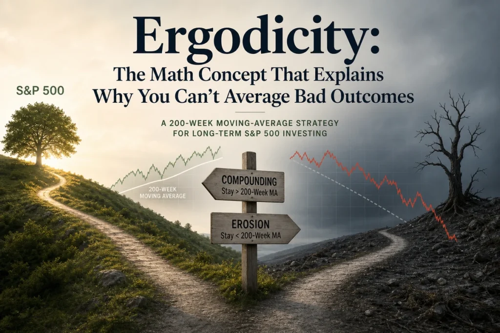
That distinction between in-sample fit and out-of-sample validity is the central issue in factor investing. McLean and Pontiff (2016) examined 97 published equity factor strategies and found that post-publication premiums fell by an average of roughly 32% compared to the figures reported in the original research. Part of that decay reflects arbitrage, capital flowing toward the known anomaly until it narrows. But part of it reflects the simpler truth that the in-sample result was never as strong as it appeared.

Value is the oldest and most studied premium. The idea, formalized by Fama and French’s HML factor (high book-to-market minus low book-to-market), is that cheap stocks, measured relative to their assets or earnings, tend to outperform expensive ones over long periods. The international evidence is reasonably consistent: a study of Canadian data from 1985 to 2005 found a persistent value premium that held across bull and bear markets, through recessions and recoveries, and survived when firm size was controlled for. Fama and French’s own international data showed an average value premium of approximately 7.68% annually from 1975 to 1995 across non-US developed markets. The mechanism has two competing explanations. One is rational risk compensation: value stocks tend to be distressed businesses carrying genuine operational risk, and investors require higher returns to hold them. The other is behavioral, rooted in investor overextrapolation of recent poor performance. Evidence suggests both forces are at work simultaneously, which is arguably why the premium has been durable despite widespread awareness.

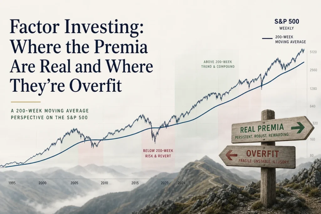
The important caveat is that the value premium has been concentrated in small-cap stocks and in periods of economic stress. Asness and colleagues noted that there is no strong standalone value premium among large-cap stocks, and the premium in small-cap value has itself weakened in more recent decades. A value tilt in a large-cap-only portfolio may therefore be capturing far less than the historical record implies. The Shiller CAPE on the S&P 500 currently sits at 41.66, well above its long-run average, which suggests growth expectations remain elevated relative to value, and the conditions for a sharp mean reversion in factor spreads are present, though not guaranteed to resolve on any particular schedule.

Momentum may be the most empirically robust of all the major factors, which is precisely what makes it theoretically awkward. Stocks that have performed well over the prior six to twelve months tend to continue outperforming over the next one to twelve months. The effect has been documented across equity markets in the US, Europe, and emerging markets, in bond markets, in currencies, and in commodities. It persists in more recent data and shows limited evidence of the post-publication decay that afflicts weaker factors. Nearly ninety years after Cowles and Jones first documented serial correlation in stock returns, cross-sectional momentum remains a live anomaly. The challenge for theorists is that no clean risk-based story explains it. The Fama-French five-factor model deliberately excludes momentum for this reason. Behavioral explanations, particularly initial underreaction to new information followed by overreaction, fit the data reasonably well. For investors, the practical constraint is that momentum strategies carry high turnover, which generates meaningful transaction costs and potentially unfavorable tax consequences in taxable accounts.

Quality and profitability have accumulated strong evidence since Fama and French’s five-factor extension. Profitable firms, measured by operating profitability relative to book equity, consistently outperform unprofitable ones after controlling for size and value. The quality factor more broadly encompasses high profitability, low leverage, stable earnings, and strong cash flow generation. Crucially, profitability has a documented ability to improve the performance of value strategies: a cheap stock that is also profitable is historically superior to a cheap stock with deteriorating fundamentals. The combination reduces the “value trap” problem that afflicts naive cheap-stock screens. Profitability’s evidence is also credible because there is a plausible rational explanation, namely that genuinely good businesses deserve a premium, alongside a behavioral one, that investors systematically underestimate the persistence of high returns on capital.

Low volatility presents the most intellectually interesting challenge to standard finance theory. Portfolios of low-beta or low-volatility stocks have historically produced returns comparable to or exceeding the broader market, with less risk. This flatly contradicts the core prediction of the CAPM that more risk should mean more return. Research from AQR Capital Management on defensive equity demonstrated that high-beta stocks, despite receiving the majority of a typical portfolio’s risk budget, have historically returned approximately the same as low-beta stocks. Explanations range from structural constraints, such as leverage-averse institutional investors bidding up risky stocks to chase returns within a mandate, to pure mispricing by retail investors attracted to lottery-like payoffs. Whether the source is rational or behavioral, the anomaly has survived extensive out-of-sample testing across international markets and across decades.

Beyond these core factors, the picture deteriorates quickly. The size premium, the original Fama-French SMB factor, provides a useful case study. From 1926 through approximately 2006, the average SMB return was roughly 0.23% per month, and the premium was consistent across sub-periods. Since then, the evidence has weakened materially. Large-cap earnings multiples expanded so dramatically that the benchmark itself rose in ways that compressed the relative advantage of small stocks. Critically, broad small-cap indices mix genuinely undervalued businesses with structurally declining ones, meaning an undifferentiated small-cap tilt often captures beta exposure rather than any genuine premium. The size effect appears most alive in international markets and when explicitly combined with quality screens, but realistic forward expectations for a size tilt alone should be modest.

Below these established factors, the catalog of proposed anomalies spans accruals, asset growth, net operating assets, earnings quality, share issuance patterns, and dozens more. Many of these show impressive backtested returns and fade considerably after publication. The mechanism is not purely arbitrage. Data mining is a significant part of the explanation: a researcher running enough variables through enough historical periods will inevitably find patterns that are statistical accidents. Arnott and Harvey’s 2019 work argued directly that the statistical threshold for claiming a genuine factor should be substantially higher than the conventional significance levels that academic journals typically require, precisely because so many specifications are being tested on the same underlying data.

The problem with the factor zoo is not just that many entries are spurious. It is that even genuine factors can be exploited in ways that destroy most of their value. A factor that earns a meaningful annual premium in a clean academic long-short portfolio may deliver near-zero net alpha when implemented through a long-only ETF, after fees, taxes, and timing risk are accounted for.

Academic factor premia are almost always reported gross of costs, in idealized long-short portfolios that no retail investor can implement, and based on historical periods that may include regimes that no longer apply. Converting that theoretical premium into actual investor returns requires clearing several hurdles simultaneously.

Issue 08 · Deep Dive · May 18, 2026
Factor Investing: Where the Premia Are Real and Where They’re Overfit
continued

Turnover is the most obvious cost. Momentum strategies, by their nature, require frequent rebalancing as leadership in the market rotates. High turnover generates transaction costs, bid-ask spreads on less liquid names, and in taxable accounts, short-term capital gains taxed at ordinary income rates. A momentum factor that earns an attractive gross premium may produce mediocre net returns for a taxable investor holding a physical ETF. Value strategies tend to have lower turnover but create their own challenge: the willingness to hold positions through extended periods of underperformance, sometimes lasting years or even a full market cycle. Research Affiliates’ Rob Arnott, Amie Ko, and Lillian Wu documented directly in their paper “Where’s the Beef?” that as assets managed by smart beta and factor strategies grow, implementation costs have contributed to a widening gap between backtested results and live outcomes. They also identified the problem of “revaluation alpha,” where a factor appears to outperform in backtests partly because the valuation multiples assigned to factor-tilted portfolios expanded during the sample period rather than reflecting a persistent structural premium.

Timing risk is equally important and less often discussed. Every major factor experiences multi-year periods of significant underperformance relative to the market. The value factor’s decade-long lag through the 2010s is the most visible recent example. Low-volatility portfolios underperform sharply during the strongest bull markets. Momentum can crash suddenly and severely when market regimes shift, as it did in 2009. Investors who implement factor strategies must have both the intellectual conviction to hold through drawdowns and the financial structure that lets them do so without being forced to sell at the wrong moment. Most individual investors overestimate their tolerance for tracking error against a familiar benchmark. The behavioral risk of abandoning a factor tilt at exactly the wrong point is not a minor footnote, it is one of the primary reasons realized factor returns for actual investors typically fall well short of the theoretical premiums.

The starting point for any serious investor should be a simple, low-cost, market-cap-weighted index fund. The S&P 500 or a broader global index like the MSCI World provides exposure to the market factor at minimal cost, with no turnover-driven tax drag and no multi-year tracking error to endure. The evidence on active management over 20-year horizons is clear enough that this baseline deserves genuine respect before any tilt is considered. The Buy the 200 strategy framework captures this logic well: systematic, long-term, cost-conscious participation in broad market compounding is the foundation, not a consolation prize.

A selective factor tilt makes sense only when several conditions are genuinely met. The factor must have out-of-sample evidence across geographies and time periods. The investor’s holding horizon must be long enough, arguably a minimum of ten years, to allow the premium to express itself through at least one full market cycle. Implementation costs, including the expense ratio of any ETF or fund, rebalancing friction, and tax drag in taxable accounts, must be explicitly estimated and accepted as a realistic reduction to the theoretical gross premium. And the investor must honestly assess whether they will maintain the position through a three- or four-year period of underperformance without abandoning it, because that period is not an exception in the historical record, it is a regular feature.

Among the better-evidenced choices, quality and profitability tilts are arguably the most practical for long-horizon investors. The evidence is credible, the turnover is moderate, the behavioral story is intuitive, and the combination with value screens reduces exposure to value traps. Momentum is real but expensive to capture efficiently in long-only, low-cost form. Low volatility deserves attention for investors whose primary concern is capital preservation through bear markets rather than maximizing terminal wealth. The 200-week SMA’s historical behavior across market cycles illustrates how a long-cycle technical filter can complement a factor framework by reducing exposure during the most severe drawdowns, without requiring the impossible task of forecasting precisely when those drawdowns will arrive.

A more grounded conclusion from decades of factor research is that a handful of premia appear real, several more are probably spurious, and all of them are harder and more expensive to harvest than academic papers suggest. The investor who captures two-thirds of a genuine factor premium through a simple, low-cost vehicle and holds it through a full cycle will almost certainly outperform the investor who chases the most recent backtest in a crowded strategy.

Q: How many factors have genuine out-of-sample evidence?

A: Of the hundreds proposed in academic literature, a small number have been validated across geographies, time periods, and different datasets. Value, momentum, quality and profitability, and low volatility each have meaningful out-of-sample support. The size premium is more contested and appears strongest when combined with quality filters. Everything beyond these core factors should be treated with substantial skepticism, as many appear to be statistical artifacts of mining large historical datasets.

Q: Why do factor premiums shrink after academic publication?

A: Two forces operate simultaneously. First, genuine arbitrage: once a premium is publicly documented, capital flows toward the strategy and narrows the spread. Second, many premiums were never as strong as the published research implied, because data mining through historical returns produces patterns that do not persist. McLean and Pontiff’s 2016 research documented that premiums across a broad sample of published strategies declined materially after publication on average, suggesting both mechanisms are at work.

Almanac

UAL touched its line in May 2016. Here’s what happened next.

UAL touched its 200-week line in 2016. Twelve months later: +74.3%.

The week of May 9, 2016 put UAL right on its 200-week line, $43.84 versus a mean of $43.83.

Twelve months later: +74.3%. Three years later: +93.4%. Five years later: +24.8%.

From that week to this, the move is +111.8%: $43.84 → $92.85.

, The chart was already broken by the time the line was reached.

Market Analysis 141
Chapter X

What 20 Years of SPIVA Data Tells Us About Active Management

Matt Denney
• • •

The S&P Indices Versus Active (SPIVA) scorecard was first published in 2002, and since then it has done something the fund management industry largely wishes it had not: it has produced a consistent, regularly updated, survivorship-bias-adjusted record of how active fund managers actually perform against their benchmarks. Not in marketing materials. Not in cherry-picked three-year windows. Across full market cycles, across asset classes, and across regions. The data has now accumulated for more than two decades, and the central finding has not changed direction once.

SPIVA tracks whether actively managed funds beat their stated benchmark index, net of fees, over periods ranging from one to twenty years. What separates it from a simple performance comparison is survivorship bias correction. When a fund closes, merges into another vehicle, or is quietly absorbed because it performed poorly, that fund’s record disappears from most standard databases. Investors comparing active to passive using only live funds are looking at a survivors-only sample, which systematically flatters active management because the failures have been removed from the comparison pool.

According to Tim Edwards, Managing Director and Global Head of Index Investment Strategy at S&P Dow Jones Indices, a substantial share of active funds do not survive a ten-year period. Research discussed in the SPIVA context suggests that only around half to three-fifths of active funds remain open after a decade. That means any analysis of active manager performance that ignores closed funds is working from a heavily filtered sample. SPIVA accounts for those failures, which is why its results tend to be more damning than what you would find by simply ranking currently available funds.

Survivorship bias is not a minor technical quibble. When a large share of active funds fail to survive a decade, a comparison built only on surviving funds is, by construction, a comparison built on the better portion of the original group.

141
What 20 Years of SPIVA Data Tells Us About Active Management 142

The methodology has faced academic scrutiny, and while researchers have proposed refinements, the directional conclusion has held up. Independent academic reviews of SPIVA’s approach have found that, while methodological adjustments can shift specific numbers, the study is directionally sound: passive funds generally outperform active funds in the long run, and any advantages active funds hold are wiped out by fees.

Across the SPIVA US scorecard, the percentage of large-cap active equity funds that underperform the S&P 500 rises consistently as the measurement horizon extends. Over a single year, some active funds beat the index, and the split can appear almost competitive. Over five years, the majority of active funds fall behind. Over ten and fifteen years, the underperformance rate climbs toward and often above 80 to 90 percent of active funds in most categories. This pattern is not a recent phenomenon driven by one long bull market. It has held across multiple full market cycles, including the dot-com collapse, the 2008 financial crisis, and the sharp swings of 2020 and 2022.

The numbers for mid-cap and small-cap active funds are slightly more competitive over shorter horizons, but the same compression toward majority underperformance appears as the time horizon extends. International equity active funds, covering developed markets outside the US, show the same pattern when measured against MSCI World and regional benchmarks. The SPIVA Europe scorecard and SPIVA reports covering Latin America, Canada, Australia, and emerging markets consistently show that most active funds across most categories trail their benchmarks over periods longer than five years.

What this means for a serious long-term investor is straightforward: the further out you intend to hold an investment, the more the odds compound against you when you choose active management over a low-cost index fund tracking the same market.

The economist William Sharpe articulated the core logic in what he called the arithmetic of active management. Before costs, the aggregate return of all active investors must equal the market return, because together they hold the market. There is no other mathematical possibility. For every active investor who outperforms, another must underperform by the same amount. The total is fixed. After costs, active investors as a group must underperform the market by an amount equal to their aggregate costs. Index funds, which carry substantially lower costs, capture close to the full market return. Active funds, which carry management fees, research costs, trading commissions, and often distribution charges, must deliver less in aggregate than the index. This is not a theory or a conjecture. It is arithmetic, and it applies regardless of market conditions, interest rate environments, or how much volatility the year happens to contain.

The practical gap between active and passive costs has narrowed over the past two decades, but it has not closed. Broad US equity index funds now routinely carry expense ratios below 0.10 percent. Actively managed equity funds typically charge between 0.50 and 1.00 percent or more, and in some markets, particularly outside the United States and in certain fund distribution channels, active fund fees remain considerably higher. That annual cost differential, compounded over fifteen or twenty years, creates a performance gap that the average active manager cannot bridge through stock selection alone.

A reasonable response to the aggregate data is to argue that most active funds underperform, but skilled investors can identify the minority that outperform and concentrate their holdings there. SPIVA publishes a separate persistence scorecard specifically to test this argument, and the results are consistent: past top-quartile performance offers almost no reliable prediction of future top-quartile performance.

Across multiple measurement periods, the share of previously top-quartile funds that remain in the top quartile in the following period is close to what you would expect by random chance. A meaningful proportion of former top performers fall into the bottom half or the bottom quartile in subsequent periods. This result is not saying that skill is impossible. It is saying that identifying skilled managers in advance, using the only information actually available to investors, which is past performance, has historically proven close to unreliable.

Picking last year’s top fund is not a strategy. It is a bet that the conditions that produced last year’s outperformance will repeat in exactly the way the manager happened to be positioned for, and that the manager’s edge, if it was real, has not already been competed away.

There is a subtler version of this problem involving closet indexers. Research using the Active Share metric, which measures how much a fund’s holdings actually differ from its benchmark, found that a significant portion of actively managed funds hold portfolios that substantially overlap with their benchmark index while charging active management fees. These funds are, almost by construction, destined to underperform net of fees: they provide most of the index return while subtracting active management costs from it.

142
What 20 Years of SPIVA Data Tells Us About Active Management 143

An honest reading of SPIVA data does not suggest that active management adds zero value in every context. There are market segments where the conditions for active outperformance are at least more plausible, and where the scorecard results, while still mixed, are less one-sided than they are for US large-cap equity.

Small-cap equities represent one such area. The argument is structural: large institutional investors cannot easily take meaningful positions in micro- and small-cap companies without moving the price against themselves. Analyst coverage is thinner. Information asymmetries between insiders and outside investors are larger. A disciplined active manager with genuine research capacity and the willingness to hold genuinely unconventional positions can, in theory, find mispriced securities more readily than in a market where hundreds of analysts are covering the same names. SPIVA data for small-cap categories tends to show active managers performing relatively better over short horizons, though the persistence problem remains, and over longer periods the underperformance ratio still rises.

Emerging markets present a related case. Price discovery in less liquid, less researched markets is noisier, governance standards are less uniform, and political and currency factors introduce risks that a skilled manager may be able to navigate more dynamically than an index that rebalances mechanically. Evidence on emerging market equity strategies does suggest that active selection within these markets is more likely to generate results than in developed large-cap markets, though the findings are far from uniformly positive and manager selection remains genuinely difficult.

Fixed income is a third area where the case for active management has more texture. Bond indices are constructed in ways that can systematically over-weight the most indebted issuers, and active managers can sometimes exploit duration, credit quality, and sector positioning to generate incremental return. SPIVA data for bond fund categories shows slightly better active outcomes than for equity, though still predominantly underperforming over multi-year horizons. The 2024 SPIVA US results identified certain fixed income categories as areas where active funds showed relatively stronger results, a finding worth monitoring but not yet a reversal of the long-run trend.

For active management to add value net of fees, several things need to be simultaneously true. The manager must hold a portfolio genuinely different from the benchmark, since a closet indexer cannot outperform after fees. The manager must have verifiable skill rather than recent luck, and the persistence data makes clear how hard this is to confirm in advance. And the fee must be low enough that outperformance, if generated, is not largely consumed before reaching the investor.

This combination is rare. It is not impossible, but it is rare enough that the base rate argument for passive investing is strong for most investors in most market segments. Committed active investors who understand this and continue to search for genuine edge are not being irrational, but they should hold themselves to a high standard of evidence before concluding they have found it. Identifying a manager who has outperformed for three years is not sufficient. Understanding whether that outperformance came from a verifiable and durable edge, or from a style tilt that happened to be in favor, is considerably harder and requires the kind of due diligence that most retail investors cannot realistically perform.

For investors building a long-term portfolio around the S&P 500 or a global index like the MSCI World, the evidence for owning the index at low cost and staying invested through market cycles is compelling. The primary risks to long-term returns are not manager selection. They are behavioral: selling into bear markets, over-trading, and allowing short-term fear to override a long-term allocation. A passive index fund does not insulate you from those risks, but it removes the additional active management headwind before the behavioral risks even begin.

The cost of active management is guaranteed. The outperformance is not. For most investors in most markets, that asymmetry goes a long way toward settling the question.

One legitimate criticism of SPIVA-based arguments is that they are measured during a period, particularly from 2010 onward, when large-cap US growth stocks dominated returns and passive US equity indices were unusually hard to beat. The counter-argument has two parts. First, the SPIVA data covers periods well before the recent growth-dominated era, including decades when value and active management were thought to have strong structural edges, and the pattern of majority underperformance appeared then too. Second, even if market regimes shift and active management performs better in a given decade, the persistence problem means that identifying in advance which active managers will benefit from the regime shift remains unsolved.

Long-cycle investors who use tools like the 200-week moving average as a broad market filter are already operating with a discipline that passive investing reinforces well: reduce exposure during sustained downtrends, hold through normal volatility, and avoid overreacting to short-term noise. The discipline of staying invested in a low-cost index fund closely mirrors the behavioral discipline that the data consistently identifies as a primary driver of long-run returns. Most active management, by contrast, introduces a layer of manager-selection uncertainty that compounds rather than reduces the challenge of maintaining a consistent long-term approach.

143
Education Wednesday, May 13, 2026 Page B11

The Real Cost of a 1% Fee Over 30 Years (It’s Worse Than You Think)

A 1% annual fee sounds almost politely small. It is, after all, just one cent on every dollar, assessed quietly each year without a line item on your brokerage statement. Most investors absorb it as the routine cost of professional management and move on. They should not. Over a 30-year investing career, that single percentage point can consume roughly a quarter of your ending wealth, not through any single bad decision, but through the relentless mathematics of compounding working against you rather than for you.

The psychological trap is straightforward. A 1% fee on a $100,000 portfolio is $1,000 in year one. On its own, that feels manageable. What investors rarely visualise is that the fee is not taken from a static pool. It is taken from the base that compounds every year going forward. Every dollar removed in fees today is a dollar that never compounds into two, then four, then eight dollars over the decades ahead.

Think of it this way: the S&P 500 has delivered a nominal annualised return of roughly 10% and a real (inflation-adjusted) return of approximately 7% over the long run. If you invest $100,000 at a net 7% annual return and leave it untouched for 30 years, you end up with approximately $761,000. Now subtract a 1% annual fee, reducing your net return to 6%, and the same investment grows to roughly $574,000. The fee has not cost you $1,000 a year. It has cost you approximately $187,000 in total ending wealth, an amount that dwarfs the original investment when viewed as foregone compounding.

A 1% fee does not reduce your return by 1%. It reduces your compounding base by 1% every single year, and the damage compounds just as your gains do. Over 30 years, the cost is not additive. It is multiplicative.

Education Wednesday, May 13, 2026 Page B11
The Real Cost of a 1% Fee Over 30 Years (It’s Worse Than You Think)
continued

The reason this is worse than intuition suggests is that the fee arrives in the early years, when the portfolio is smaller, but its absence in the final years, when the portfolio is large, would have generated the most growth. By removing capital from the compounding engine at every stage, a 1% fee costs you disproportionately in the decade where compounding works hardest: the last ten years.

Frame the problem differently and it becomes even starker. If your portfolio earns 7% annually and you pay a 1% fee, you are handing away roughly one-seventh of your gross return every single year, before inflation, before taxes. In that context, “just 1%” is not a description of the cost. It is a misdirection. You are surrendering about 14% of your annual earnings to a fee. A salaried employee offered that deal would refuse immediately. Long-term investors accept it by default, often without realising the terms.

The financial advice industry has long understood that annual percentage fees are easier to accept psychologically than equivalent lump-sum charges. A $10,000 invoice from a financial planner at the start of the year would prompt scrutiny. A 1% AUM fee drawn quietly from a $1 million portfolio achieves the same extraction with far less resistance. The structure of the fee conceals its true magnitude.

For context on what the market actually charges for passively managed exposure to the S&P 500: Vanguard’s VOO carries an expense ratio of approximately 0.03%, confirmed across multiple cost analyses of index ETF structures. iShares’ IVV runs at a similarly negligible level. Both provide essentially identical market exposure to the same 500 companies. Broad S&P 500 index ETFs generally sit well under 0.10% in annual costs. The difference between under 0.10% and 1.00% is more than 90 basis points, nearly the entire fee. Over 30 years, that spread compounds into a meaningful fraction of your retirement wealth.

For many investors, the 1% scenario is not hypothetical, it understates reality. A typical actively managed mutual fund carries an expense ratio that can range from around 0.44% to well above 1%, depending on the strategy and asset class. Layer an advisory fee on top of that, and total annual costs can approach 2% or higher. Some wealth management relationships, particularly those involving proprietary funds and bundled services, carry all-in costs of 2% to 2.5% annually, according to cost analyses of the UK advisory market.

At 2% annual fees against a 7% gross return, your effective net return falls to 5%. Over 30 years, $100,000 grows to approximately $432,000 at 5%, compared to $761,000 at 7%. The fee structure has cost you around $329,000 on a $100,000 starting investment, more than three times the original capital in lost wealth. At that level, the fee manager has not just taken a share of your returns. They have transferred the majority of your compounding power to themselves.

The evidence on whether those fees buy superior returns is not flattering to active management. The SPIVA Scorecard, which S&P Dow Jones Indices has updated continuously since 2002, consistently shows that the majority of actively managed equity funds underperform their benchmark index over 10- and 15-year periods, net of fees. As one analysis of the SPIVA data concluded: “any advantages of active funds are wiped out by the fees.” Even in cases where a manager demonstrates genuine skill at the gross return level, fees tend to absorb the outperformance, leaving ordinary investors with benchmark-minus-costs. For most investors, over most long time horizons, paying for active management has been a poor trade.

Fee drag does not operate in isolation. In a taxable account, it is compounded by a second silent cost: the tax drag generated by active trading inside a fund. When a portfolio manager sells a position at a gain, that gain is distributed to shareholders and taxed in the year of distribution. Index funds, by design, trade very little. They buy and hold the index constituents, selling only when the index changes. Active funds trade far more frequently, generating realised gains along the way. Even in years when you have not sold a single unit of the fund yourself, you may receive a taxable capital gain distribution because the manager turned over the portfolio.

For investors in higher income brackets holding funds in taxable accounts, this tax friction can add another 0.5% to 1% of annual drag on top of the stated expense ratio. The combination of a meaningful expense ratio, an advisory fee, and tax drag from active turnover can produce a total annual cost well above 2%, applied against a gross return that the market may deliver at roughly 7% to 10% before any costs. The investor absorbs all the volatility and all the market risk while the fee structure captures a large portion of the upside.

Low-cost index ETFs help on both dimensions. Their expense ratios sit near zero, and their in-kind creation and redemption mechanism means they rarely distribute taxable capital gains internally. As explored in our piece on index funds versus ETFs, the structural tax efficiency of the ETF wrapper can further widen the gap between a low-cost passive investor and a high-cost active one in a taxable account.

Education Wednesday, May 13, 2026 Page B11
The Real Cost of a 1% Fee Over 30 Years (It’s Worse Than You Think)
continued

Consider a 35-year-old investor making regular monthly contributions to a portfolio over a 30-year career. Assuming a 7% gross annual return with near-zero cost index exposure, the portfolio grows to a substantially larger sum than the same contributions compounding at 6% net, after a 1% fee. The further that net return falls, toward 5% under a 2% total fee burden, the larger the shortfall becomes. In each scenario, the investor contributed exactly the same amount of money over exactly the same period. The only variable is what the fee structure allowed to remain in the compounding engine.

What makes this concrete is the shape of the damage. In the early years of a 30-year accumulation, the difference in account balances between a high-fee and low-fee portfolio is relatively small in dollar terms. By year ten, it is noticeable. By year twenty, it is uncomfortable. By year thirty, it is the difference between a retirement that works and one that requires compromises. The fee structure that seemed inconsequential at age 35 has compounded into a significant constraint on financial independence at age 65.

The compounding trap of high fees is not that the early years are expensive. It is that the late years are impoverished. The money you never earned in your final decade of saving is the most expensive money in the portfolio, because it had the most years left to grow.

The practical implication is not that you should never pay a professional for financial advice. There are legitimate reasons to work with a fee-only financial planner: estate planning, tax optimisation, behavioural coaching during a panic, structuring withdrawals in retirement. These are services worth paying for. The problem arises when ongoing asset management fees are layered on top of those services indefinitely, because the compounding cost of perpetual AUM fees dwarfs the value of most ongoing management.

A fee-only planner who charges a flat annual retainer or an hourly rate can deliver planning services without an ongoing claim on your compounding. An investor who owns a low-cost S&P 500 index fund or a global equity ETF, rebalances once a year, and avoids panic-selling during bear markets will, in most cases, outperform the average advised client in a high-AUM-fee arrangement, simply because they keep more of their own returns. The Buy the 200 strategy is built on exactly this principle: systematic, rules-based investing that keeps costs near zero while maintaining discipline through market cycles.

There is also an argument for cost discipline during market downturns that goes beyond arithmetic. When the S&P 500 drops sharply in a bear market, a portfolio’s absolute value falls. A percentage-based AUM fee, still assessed on the depleted balance, now represents a larger share of remaining capital at exactly the moment when preservation matters most. The fee structure is asymmetric in practice: it does not fall in proportion to performance. The investor bears all the downside risk while the manager continues collecting fees regardless of results.

Not all fees are equal, and a few benchmarks are worth carrying in your head. Vanguard’s VOO charges approximately 0.03% annually. iShares’ IVV, another large S&P 500 ETF, runs at a similarly negligible level. A total-market ETF from Vanguard (VTI) or iShares (ITOT) is comparable. These instruments provide broad, diversified exposure to US equities at a cost that is functionally irrelevant over any reasonable holding period.

The typical actively managed equity fund charges somewhere in the range of 0.44% to above 1%, depending on strategy and distribution channel. Anything above 0.50% in total annual costs deserves scrutiny, and anything above 1% in total annual costs deserves a clear-eyed cost-benefit analysis against what you are actually receiving in exchange.

The goal is not to obsess over basis points at the expense of being invested. An investor who panics and sells during a bear market, even in a zero-cost index fund, will destroy far more wealth than a 1% fee ever could. Cost discipline and behavioural discipline are both necessary. Neither alone is sufficient. But cost discipline is the easier of the two to implement. It requires only one decision, sustained, rather than the ongoing psychological fortitude required to stay invested through volatility. Getting the fee structure right is the one investment decision that pays a guaranteed return from the moment you make it.

Q: Does a 1% fee really cost that much more than 0.1% over time?

On Deep Dive

Quantifying Economic Moats: ROIC, Reinvestment, and Why Margins Lie

Matt Denney
“Q: What is a reasonable threshold for ROIC to suggest a genuine economic moat exists?” — BuyThe200, May 12, 2026

There is a common shortcut in equity analysis that costs investors more than they realise: using profit margins as a proxy for competitive quality. A 25 percent net margin sounds impressive. It can even be impressive. But it tells you almost nothing about whether a business is actually creating value for its owners, or quietly destroying it while printing attractive income statement numbers. The framework that does that job reliably is return on invested capital, measured against the cost of that capital, and combined with an honest look at reinvestment rate. The three together form the closest thing investing has to a quantitative fingerprint of a real economic moat.

Margins measure what a company keeps from each dollar of revenue. That is useful context, but it is context about pricing power and cost structure, not about capital efficiency. Consider two businesses. The first earns a 30 percent net margin but requires two dollars of invested capital for every dollar of revenue to sustain operations, meaning the actual return on invested capital sits around 15 percent. The second earns a 12 percent net margin but operates an asset-light model where a single dollar of capital supports three dollars of revenue, producing an ROIC well above 30 percent. By a margin-first analysis, the first business looks superior. By any measure that actually connects to long-run wealth creation, it is not.

Warren Buffett made exactly this point in his 1982 shareholder letter, noting that accounting earnings can “seriously misrepresent economic reality.” The value to owners of retained earnings, he argued, is determined entirely by the effectiveness with which those earnings are subsequently deployed, not by their size on the income statement. A business that retains a large percentage of high-margin earnings but deploys them at low returns is not compounding wealth. It is recycling it.

The correct question is never “how wide is the margin?” It is “at what rate does each dollar reinvested return to the owner, and for how many years can that rate persist above the cost of capital?”

115

Quantifying Economic Moats: ROIC, Reinvestment, and Why Margins Lie
continued

Return on invested capital is calculated as net operating profit after tax divided by invested capital, where invested capital is broadly defined as total equity plus interest-bearing debt, minus excess cash. The result expresses how much after-tax operating profit the business generates per dollar of capital committed to it. The companion metric, weighted average cost of capital, represents what providers of that capital require in return, blending the cost of equity with the after-tax cost of debt, weighted by their proportions in the capital structure.

The spread between ROIC and WACC is what separates value creation from value destruction. When ROIC exceeds WACC, the business creates value with every unit of capital it deploys. When ROIC falls below WACC, growth actually destroys value, because the business is reinvesting at returns below what its capital providers require. This is not a theoretical observation. It is the mechanism behind why many fast-growing companies with expanding revenues and impressive margins have historically disappointed long-term shareholders: the growth was capital-intensive and the returns on that capital were unremarkable.

Morningstar’s moat framework formalises this logic directly. Their research identifies companies that consistently generate returns on capital above their cost of capital as the core candidates for moat ratings, and assesses whether that performance is likely to persist based on the structural sources underpinning it: network effects, intangible assets, cost advantages, switching costs, and efficient scale. The financial signal is ROIC persistence. The analytical question is what structural feature is producing it.

Here is the dimension of the framework that most investors skip. ROIC above WACC tells you that value is being created per dollar deployed. But how much total value gets created depends on how aggressively the business can reinvest at that superior rate. The reinvestment rate, expressed as the proportion of after-tax operating profit that gets ploughed back into the business rather than returned to shareholders, determines the speed of compounding.

Growth in intrinsic value can be approximated as ROIC multiplied by the reinvestment rate. A business generating a 20 percent ROIC with a 50 percent reinvestment rate grows intrinsic value at roughly 10 percent annually. A business with the same 20 percent ROIC but a 25 percent reinvestment rate grows at 5 percent, paying out or repurchasing with the rest. Neither outcome is inherently superior. What matters is whether the reinvestment opportunity is real: whether the business can actually deploy that capital at ROIC above WACC, rather than forcing growth through acquisitions at inflated prices or reinvesting into a deteriorating core.

Buffett captured this in his 2010 shareholder letter when discussing how retained earnings create different outcomes across businesses: “Some companies will turn these retained dollars into fifty-cent pieces, others into two-dollar bills.” The company that turns retained dollars into two-dollar bills is doing so precisely because its reinvestment opportunities carry ROIC well above its cost of capital. The capital allocation literature is equally explicit: measuring every reinvestment on an IRR basis against a preset hurdle rate is the discipline that keeps management from deploying capital in ways that look ambitious but quietly erode per-share value.

A high ROIC with nowhere to reinvest it is a cash-generation machine, not a compounder. A high ROIC with abundant reinvestment opportunity at the same rate is as close to a perpetual value-creation engine as public markets offer.

Academic research on corporate profitability consistently shows that high ROIC tends to mean-revert over time. Competition is the mechanism. When a business earns returns well above its cost of capital, it signals to rivals, new entrants, and substitutes that the industry or niche is attractive. Capital flows toward that attractiveness, eroding pricing power, driving up input costs, or introducing competing alternatives. The natural gravitational pull is toward returns approximating the cost of capital across most industries over most periods.

This is why persistence of high ROIC, not its level in a single year, is the real signal. A business that has sustained returns on invested capital above WACC for ten or fifteen consecutive years across different economic cycles has demonstrated that its structural advantage resists the normal erosion mechanisms. That kind of persistence is genuinely rare. Research into broad equity universes suggests that most companies with above-average ROIC in any given year see significant mean reversion within five years. The businesses that maintain elevated spreads over a decade or longer tend to share the structural characteristics that Morningstar’s framework identifies: true switching costs that customers face when leaving, network effects that strengthen the product with scale, or intangible assets such as brands and patents that are genuinely difficult to replicate rather than simply difficult to build quickly.

The practical implication for investors is that a one-year or even three-year ROIC figure is much less informative than a ten-year track record. It is also less informative than a trend: a business with ROIC rising from 12 to 18 percent over eight years tells a different story than one that peaked at 22 percent five years ago and has been declining toward WACC ever since.

116

Quantifying Economic Moats: ROIC, Reinvestment, and Why Margins Lie
continued

Not all industries offer the same structural conditions for moat persistence. The sectors where competitive advantages historically erode fastest share a few common features: rapid technological change that renders today’s process advantages obsolete, low switching costs that allow customers to shift providers without penalty, and input structures that are commodity-like and therefore cannot be proprietary.

Consumer electronics hardware is a consistent example. Gross margins in hardware can look impressive for a cycle or two while a product generation leads the market. But the absence of switching costs, combined with the speed of product iteration in the industry, means that ROIC advantages tend to be short-lived for all but the companies that have built a software or services layer around the hardware, creating the switching costs that the hardware alone does not provide. Specialty retail faces structurally similar pressures: the barrier to entry in physical retail has compressed significantly, and the barrier to competing online is lower still, making durable cost or differentiation advantages rare.

By contrast, industries with structurally high switching costs, significant regulatory barriers, or network dynamics that reinforce themselves with scale tend to sustain ROIC spreads over longer periods. Enterprise software businesses where customers have integrated the product deeply into their workflows, financial data platforms where the data itself becomes more valuable with each additional participant, and regulated utilities with legally protected service territories all demonstrate this dynamic, though the last category typically maintains ROIC only modestly above WACC due to the regulatory caps on returns that come with the protection.

The key discipline for the investor is to identify not just whether ROIC is currently above WACC, but whether the structural feature sustaining that spread is likely to persist or is already under erosion that has not yet appeared in the financial statements. Technology disruption frequently attacks moats several years before the ROIC figures reflect it.

The unreliability of margins as a moat signal is compounded by the prevalence of non-GAAP adjustments in modern earnings reporting. The SEC’s Regulation G has required reconciliation to GAAP measures since the early 2000s, but the body of academic and regulatory literature on this topic is clear: non-GAAP reporting remains a material risk for investors attempting to measure true economic profitability. The SEC has issued comment letters to issuers on this topic for over a decade precisely because the incentive to exclude costs that are genuinely recurring, while presenting them as one-time items, is structurally present in management compensation structures.

For ROIC analysis, the critical discipline is to use after-tax operating profit figures that include all recurring costs, and to define invested capital in a way that captures the full economic investment in the business. Stock-based compensation is a persistent source of distortion: companies that exclude it from adjusted earnings are presenting margins and returns that would look materially different if the full cost of talent were reflected. A business with genuinely strong returns on capital does not need to manufacture them through exclusions. The real numbers should speak.

Buffett observed that accounting earnings can misrepresent economic reality. The correction is not to trust reported figures more carefully but to rebuild the numbers from the cash flow statement and balance sheet, where creative exclusions are harder to hide.

The practical investor does not need a doctoral-level model to apply the ROIC framework usefully. A few concrete habits capture most of the value. First, calculate ROIC using at least five years of data, not a single year. Look for stability and trend direction alongside the level. Second, compare ROIC to an honest estimate of WACC. For most businesses, a pre-tax WACC in the range of 7 to 10 percent is a reasonable ballpark for a cost of capital benchmark, though capital structure and business risk should inform the specific figure. Third, examine the reinvestment rate alongside ROIC to understand whether growth is genuinely value-accretive or simply capital-consuming.

Fourth, and perhaps most importantly, ask the structural question. What specific feature of this business explains why its returns are above the cost of capital? Is it a patent that expires in four years, a brand that has sustained pricing for thirty years, a network that adds value with each new user, or simply a favorable supply-demand balance that competitors are already moving to correct? The answer to that question tells you more about moat durability than any single financial ratio, and it connects the quantitative measurement directly to the qualitative assessment that long-term investing ultimately requires.

None of this requires abandoning diversification or moving away from index-based core allocations. For most investors, the primary use of ROIC analysis is not to build a concentrated portfolio of moat businesses but to understand what separates a genuinely durable compounder from a cyclical earnings story or a margin mirage. That understanding sharpens every investment decision, whether it is evaluating an active fund’s portfolio, assessing the quality tilt of a factor strategy, or deciding how much weight to give a narrative-driven opportunity in a sector where moats historically dissolve quickly.

117

BuyThe200 Magazine
Education 01
Education

Free Cash Flow Tells the Truth Earnings Per Share Tries to Hide

EPS is the number every headline quotes and every analyst anchors to. Free cash flow is the number that tells you whether any of it is real.

Every earnings season, the number that leads every headline, every analyst call, and every investor presentation is earnings per share. EPS is clean, comparable, and easy to model. It also regularly lies to you, not by fraud necessarily, but by construction. Accounting rules allow companies to recognise revenue before cash arrives, defer costs until convenient, and treat real economic outlays as balance-sheet assets. None of this is illegal. Most of it is disclosed. And almost none of it shows up in the number the market is actually pricing.

Free cash flow does not have that problem. Cash either arrived in the bank account or it did not. Invoices that have been sent but not yet paid are not cash. Inventory that has been produced but not sold is not cash. Depreciation charged against machinery does not require anyone to write a cheque. Free cash flow cuts through all of it and asks a single, uncomfortable question: after running the business and maintaining its asset base, how much money is actually left over?

The answer, when it diverges sharply from reported earnings, is telling you something important. Learning to read that divergence is one of the most underrated skills in fundamental analysis.

Free cash flow is calculated by taking operating cash flow, which itself starts with net income and then adds back non-cash charges while adjusting for changes in working capital, and then subtracting capital expenditures. Stated simply: FCF equals cash from operations minus capex. What makes it superior to net income is precisely what it corrects for.

Education 02
Free Cash Flow Tells the Truth Earnings Per Share Tries to Hide
continued

Consider the three main channels through which EPS and FCF diverge. First, non-cash charges and credits distort the income statement regularly. Depreciation and amortisation reduce reported earnings without consuming a single dollar of cash in the period. Conversely, companies that capitalise costs rather than expensing them boost current earnings while hiding the real cash outlay in the investing section of the cash flow statement, where most investors never look. Second, working capital movements are invisible in EPS but fully visible in FCF. A company that books revenue aggressively before receiving payment will show rising earnings while its accounts receivable balloon, a pattern that eventually reverses. Third, the relationship between reported depreciation and actual capital expenditure is one of the most consequential mismatches in accounting. A business where capex consistently exceeds depreciation is consuming more cash than its earnings statement suggests. A business where depreciation exceeds capex may be harvesting its asset base and deferring necessary reinvestment.

The farther down the income statement one goes, the more polluted profitability measures become, and the less related they are to true economic profitability. Gross profits is the cleanest accounting measure of true economic profitability. Free cash flow goes further still, because it accounts for the capital a business must actually deploy to sustain itself.

This observation, echoed throughout financial economics research, explains why analysts who focus only on reported net income are frequently surprised when earnings eventually revert or collapse. The surprise is not in the fundamentals. It is in the metric they chose to watch.

Warren Buffett addressed this problem directly in his 1986 letter to Berkshire Hathaway shareholders, in an appendix titled “Purchase-Price Accounting Adjustments and the Cash Flow Fallacy.” He presented two hypothetical companies with identical revenues and identical underlying economics but different accounting treatments arising from an acquisition. The company with higher reported depreciation showed lower GAAP earnings, yet Buffett argued it was worth exactly the same as the company with lower depreciation and higher stated profits.

His solution was what he called owner earnings: net income, plus depreciation and amortisation, minus the capital expenditures required to maintain the business’s competitive position and unit volume. The critical word there is “required.” Buffett was not interested in total capex. He was interested in maintenance capex: the minimum reinvestment necessary to keep the business standing still. Growth capex, spending that creates new capacity rather than preserving existing capacity, is a different matter and should be evaluated on its expected return separately.

The owner earnings concept is not identical to free cash flow as conventionally calculated, but it is close enough in practice that the two move together for most businesses. The deeper point Buffett was making is that investors who use GAAP earnings mechanically, without adjusting for the capital intensity of the business, will systematically misprice capital-heavy companies against asset-light ones. A software company that earns $10 per share while spending almost nothing on capital assets is a fundamentally different proposition from a railroad that earns the same $10 per share while spending heavily each year just to keep the tracks operational. EPS treats them identically. FCF does not.

In 1996, accounting researcher Richard Sloan published a landmark paper documenting what became known as the accruals anomaly. His finding was straightforward and damaging to the EPS-first orthodoxy: companies with high accruals relative to their total assets, meaning companies whose earnings were composed disproportionately of non-cash items rather than actual cash generation, tended to significantly underperform in subsequent years. Companies with low accruals, where earnings were closely backed by real cash flows, tended to outperform.

The implication is direct. Investors who focus on reported earnings without decomposing them into their cash and non-cash components are effectively paying for earnings quality they are not receiving. The market, on average, is slow to spot the deterioration because most participants anchor on the EPS headline rather than the cash flow statement. Research published later by Hirshleifer, Hou, and Teoh found that firms with bloated net operating assets relative to their earnings, another proxy for accrual-heavy reporting, showed persistent return underperformance. The mechanism is the same: earnings supported by balance-sheet entries rather than cash generation eventually mean-revert, and when they do, prices follow.

This is not a theoretical edge that exists only in academic back-tests. It is a real pattern that any investor can check by pulling a company’s statement of cash flows alongside its income statement and asking whether the gap between them is widening or narrowing over time.

The most common way EPS gets ahead of FCF is through working capital manipulation, which is a clinical term for something that often happens without any bad intent. A company facing a difficult quarter may extend more generous payment terms to customers, booking the revenue while the cash remains outstanding in accounts receivable. It may reduce inventory purchases to preserve near-term cash, or stretch its own payment terms with suppliers, showing larger accounts payable on the balance sheet while its cash position temporarily improves.

Education 03
Free Cash Flow Tells the Truth Earnings Per Share Tries to Hide
continued

Each of these moves can be legitimate in isolation. Used consistently or aggressively over time, they flag a business whose reported earnings are running ahead of its actual collections. The way to detect it is mechanical. Watch accounts receivable as a percentage of revenue over several years. If receivables are growing faster than revenue, the business is effectively lending its customers money while booking the sale. Watch inventory turns. A declining inventory turn rate, meaning the business is holding more product for each dollar of sales, often signals weakening demand being papered over by continued production. Watch the relationship between net income and operating cash flow. A widening gap, where net income grows but operating cash flow stays flat or falls, is one of the clearest single signals of declining earnings quality available in public financial statements.

A decrease in accounts payable can mean vendors are requiring faster payment. An increase in accounts receivable can signal slower customer collections. Both affect free cash flow before they show up in earnings, which is exactly why cash flow analysis often leads income statement analysis by several quarters.

A subtler version of the same problem runs through the capital expenditure line. GAAP accounting allows companies to depreciate physical assets over their useful lives, spreading the cost across years rather than taking it in one period. This is rational and broadly correct. The problem arises when the depreciation schedule assumes asset lives that are longer than reality, or when a company’s actual required reinvestment substantially exceeds what accounting depreciation implies.

Airlines are a useful reference class here, though the same dynamic applies across industrial, retail, and infrastructure businesses. An airline may report solid earnings while its accounting depreciation runs significantly below the actual cash it must spend each year maintaining and replacing aircraft. Investors who evaluate the airline on an earnings multiple are paying for profits that are partially illusory. The business must spend that cash. It is not optional. FCF captures this reality; EPS obscures it.

The reverse pattern also exists and matters. A software company or a consumer brand with strong intangible assets may generate depreciation that exceeds its actual maintenance capex requirements, making its FCF look better than its GAAP earnings. This is not flattery. It is reality. These businesses genuinely convert a higher fraction of each revenue dollar into spendable cash than their earnings multiples would suggest. Apple, for example, reported trailing free cash flow of approximately $101 billion against an operating margin of 32.3 percent, reflecting an asset-light model where very little capital reinvestment is required to sustain the business. Microsoft generated approximately $37 billion in free cash flow with operating margins near 46 percent. In both cases, the cash flow numbers are the more accurate representation of the economic power of the business than any earnings-based figure.

Intellectual honesty requires acknowledging that there are situations where EPS is genuinely the better primary metric, or at least where FCF overstates the picture in ways that mislead.

The clearest case is a company in a heavy investment phase. A business spending aggressively on new factories, distribution centres, or infrastructure will show depressed or even negative FCF not because the underlying economics are poor, but because it is deliberately front-loading real economic value creation. In these cases, FCF punishes growth investment the same way it punishes capital maintenance, without distinguishing between the two. An investor who dismissed a major infrastructure or logistics company at its FCF trough during a capital expansion cycle may have missed the subsequent decade of returns. The right response is not to ignore FCF but to decompose capex into its maintenance and growth components and evaluate them separately, precisely as Buffett’s owner earnings framework suggests.

Financial companies also require a different framework. Banks, insurers, and asset managers do not have the conventional operating cash flow and capex structure that the standard FCF calculation assumes. For these businesses, earnings-based metrics adjusted for credit quality and reserve adequacy are more informative than a direct FCF calculation, which can be misleading or simply inapplicable.

A third exception applies to companies where a single large capex year distorts the FCF figure in a way that multi-year averaging would correct. FCF in any single year is a noisier number than trailing five-year average FCF, and investors who treat one year of FCF as definitive without understanding the context of the capital spending cycle will draw incorrect conclusions.

The practical application is simpler than the theory suggests. Start by pulling the statement of cash flows alongside the income statement for the last five to seven years for any company you are evaluating seriously. Calculate FCF each year as operating cash flow minus total capex. Then calculate the FCF conversion ratio: FCF divided by net income. A ratio consistently close to 1.0 or above indicates that earnings are well-supported by cash generation. A ratio that has been drifting down toward 0.5 or below over several years, with no obvious growth-investment explanation, is a serious warning sign worth investigating before it becomes a loss.

Education 04
Education

Buybacks vs. Dividends: The Argument Both Sides Get Wrong

The debate between share buybacks and dividends has produced more heat than light for decades. The real question isn't which tool is superior — it's whether management is using either one with the discipline the situation actually demands.

The internet has a well-worn groove when it comes to buybacks versus dividends. Dividend investors argue that buybacks are financial engineering designed to flatter earnings per share and enrich executives whose compensation is tied to the stock price. Buyback advocates counter that dividends are an inefficient, tax-forced distribution that removes the investor’s choice of when to realise a return. Both camps produce spreadsheets, academic citations, and passionate conclusions. Both camps are also, in important ways, arguing past the actual problem.

The real issue is not which mechanism is inherently superior. The real issue is whether management is deploying either tool with genuine capital allocation discipline, or whether they are reaching for whichever option produces the most flattering optics at the moment. Getting that distinction right matters far more for long-term investors than winning the theoretical debate.

Any serious discussion starts with the same foundation. In a world without taxes, transaction costs, or informational asymmetries, it genuinely does not matter whether a company returns a dollar to shareholders as a dividend or as a buyback. The shareholder ends up with the same economic claim. If a company pays a $1 dividend, the stock price drops by roughly $1 on the ex-dividend date, and the shareholder holds the same wealth in two forms: cash and a slightly smaller share position. If the company instead spends that dollar repurchasing shares, the remaining shares each represent a fractionally larger claim on the same enterprise. The investor who wants liquidity can sell a small slice of their position and achieve the identical outcome.

This theoretical equivalence is the correct baseline. Most of the popular debate ignores it and proceeds directly to real-world distortions. Those distortions are real and important. But starting from theoretical equivalence keeps the analysis honest: it forces us to ask why the choice matters rather than simply asserting it does.

Education 05
Buybacks vs. Dividends: The Argument Both Sides Get Wrong
continued

In practice, taxes create a meaningful asymmetry, and it runs in the direction buyback advocates claim. In most major jurisdictions, dividends are taxable in the year they are paid, regardless of whether the investor needs or wants the income. A long-term investor compounding wealth in a taxable account receives a dividend, pays tax immediately, and reinvests what remains. The compounding base is smaller from that point forward, and it stays smaller. Capital gains from a buyback-driven share price increase, by contrast, are only taxable when the investor chooses to sell. The investor retains full control over timing, and can defer the taxable event for years or decades. Over long compounding periods, this deferral advantage is meaningful.

The tax argument is real but context-dependent. Investors holding shares in tax-deferred retirement accounts face no current-year tax on dividends, which equalises the playing field considerably. Large institutional holders, pension funds, sovereign wealth funds, endowments, often have no direct tax liability at all. The tax efficiency of buybacks primarily benefits investors in taxable accounts with long holding periods. It is an important consideration, not a universal trump card.

The dividend tax drag is real for long-term investors in taxable accounts. But it only matters if the buyback alternative is executed with genuine price discipline. A tax-efficient way to overpay for your own shares still destroys value.

Dividends carry a commitment that buybacks do not. When a company initiates or raises a dividend, it is making an implicit pledge to sustain that payment. Management teams know that cutting a dividend sends a severe negative signal to the market, one that typically results in immediate share price punishment. This asymmetry creates a powerful discipline. Companies that raise dividends consistently over extended periods, a category that is far smaller than the popular conception suggests, with research indicating fewer than 300 companies have managed even a single decade of consecutive increases at any given time, have effectively screened themselves for financial stability, earnings quality, and conservative capital management.

Buyback authorisations carry no equivalent commitment. A company can announce a $10 billion repurchase programme and then execute very little of it, particularly if conditions change or management priorities shift. Research on buyback completion rates has repeatedly found that a substantial fraction of authorised programmes are never fully executed. The announcement itself generates positive market sentiment, which creates an incentive to announce frequently regardless of intent. This is not a minor quibble: if the signal is unreliable, the information content is limited.

Dividends also shape the investor base in ways that matter for long-term holders. Peter Lynch observed that regular dividends give shareholders a tangible reason to stay during difficult periods. Companies with long track records of dividend growth tend to attract what researchers have termed quality shareholders: patient, long-horizon investors who care about business fundamentals rather than quarterly price momentum. That shareholder composition has real effects on how management is evaluated and what time horizons they are implicitly held to.

This is the central flaw in the buyback-is-always-better argument, and it does not receive nearly enough emphasis. A dividend pays shareholders the same value regardless of whether the stock is cheap or expensive. It is mechanically indifferent to valuation. A buyback is not. When a company spends $1 billion repurchasing shares, the return to remaining shareholders depends entirely on the price paid relative to the business’s intrinsic value.

If shares are trading at a meaningful discount to intrinsic value, buybacks are extraordinary value creation for remaining shareholders. Warren Buffett has stated clearly that Berkshire Hathaway will repurchase its own shares when they trade at a meaningful discount to conservative estimates of per-share intrinsic value. This is capital allocation applied properly: treating the company’s own shares as an investment that must clear the same hurdle rate as any other use of capital. Berkshire currently generates over $61 billion in annual free cash flow, which gives management genuine optionality about when and how to deploy this lever. When shares have traded near or above intrinsic value, Buffett has historically preferred to accumulate cash rather than repurchase at unfavourable prices.

Most corporate managements do not exercise this discipline. The pattern that research has documented is a consistent and troubling one: buyback volumes across the broad market tend to be highest when markets are near peaks and lowest during corrections. Companies collectively buy the most of their own stock when it is most expensive, and pull back when prices fall. This is the opposite of sound capital allocation. It is also, not coincidentally, consistent with the incentive structure of executive compensation tied to short-term earnings per share. A buyback at any price reduces share count and mechanically inflates EPS. If executive bonuses are tied to EPS rather than per-share intrinsic value growth, the incentive to repurchase regardless of price is structural.

The textbook case for buybacks assumes management has both the information and the discipline to repurchase only when shares trade below intrinsic value. The real-world case for dividends rests partly on the observation that this assumption often does not hold.

Education 06
Buybacks vs. Dividends: The Argument Both Sides Get Wrong
continued

With that framework in place, the conditions under which each mechanism makes sense become clearer. Buybacks are the superior tool when three conditions are met simultaneously: the company’s shares trade at a genuine discount to conservatively estimated intrinsic value, the company has no better use for the capital that would return more than the implied yield on its own undervalued stock, and management has the conviction and credibility to resist the temptation to repurchase opportunistically at peaks. Apple’s buyback programme is often cited in this debate, and for good reason. Apple generates over $101 billion in annual free cash flow, carries extremely high returns on assets, and has used buybacks to reduce its share count substantially over many years. The aggregate effect has been meaningfully positive for long-term shareholders at various points in that programme. But Apple is not typical. Its free cash flow generation is extraordinary, and the management team has consistently demonstrated operational discipline that many companies cannot credibly claim.

Dividends are the superior tool, or at least the more honest tool, when management cannot be confident that shares are cheap, when the investor base includes a meaningful number of income-dependent shareholders who need current cash flows, or when the business is mature enough that retained earnings are unlikely to generate returns above the cost of capital. A mature utility, a well-established consumer staples business, or a financial company in a capital-intensive industry may find that regular dividends are both the clearest signal of financial health and the most appropriate use of surplus cash. Our research of quality-shareholder research is direct on this point: companies with significant executive stock option compensation coupled with significant share buybacks often represent situations where dividends would serve long-term holders better, because the incentive to repurchase is detached from the valuation discipline that makes buybacks rational.

The worst outcome, and a more common one than either camp acknowledges, is management using buybacks as a substitute for genuine strategic thinking, deploying capital at elevated valuations while framing it as prudent shareholder return. A Harvard Business Review analysis published in early 2026 noted that boards often misunderstand the true cost of buybacks, treating them as relatively costless when opportunity cost and valuation timing errors can be substantial over a full cycle.

For investors evaluating companies from the outside, the most useful lens is shareholder yield: the combination of dividend yield and net buyback yield (buybacks minus share issuances) expressed as a percentage of market capitalisation. This metric makes explicit what is otherwise obscured by looking at either mechanism in isolation.

A company with a 1.5% dividend yield and a 3% net buyback yield is returning roughly 4.5% of its market value to shareholders annually. A company with a 4% dividend yield that is simultaneously issuing shares to fund executive compensation plans at 1.5% per year is actually returning only 2.5% on a net basis. The gross dividend number looks superior, the economic reality is the opposite. Share issuance through stock-based compensation is a real cost to existing shareholders, and any honest accounting of capital return must net it out.

High shareholder yield, when accompanied by strong business fundamentals and reasonable valuation, has historically been associated with above-average long-term returns. The mechanism is straightforward: a business that generates more cash than it needs to maintain and grow operations, and returns that surplus to shareholders in a consistent and disciplined manner, is expressing both financial health and management alignment with long-term owners. The form of the return matters less than the quality and sustainability of the underlying cash generation that makes it possible.

Shareholder yield, dividends plus net buybacks as a share of market cap, is a more complete measure of capital discipline than either metric alone. Always net out share issuance before drawing conclusions.

The practical implication for serious investors is to shift the question entirely. Rather than asking whether a company pays dividends or does buybacks, ask whether the capital allocation decisions, whatever form they take, are being made with reference to a clear and conservative estimate of intrinsic value. Ask whether share count is actually declining on a net basis over time, or whether buybacks are merely offsetting stock-based compensation dilution. Ask whether dividend growth has been sustained through a full business cycle, including the periods when sustaining it required genuine financial resilience. Ask whether free cash flow is the source of the distributions, or whether the company is funding shareholder returns with debt.

Management teams who can articulate a clear capital allocation hierarchy, reinvest at returns above cost of capital first, maintain a conservative balance sheet second, return surplus capital in whichever form best serves the long-term investor base third, are the ones worth trusting with either tool. Those who fall back on the language of “returning value to shareholders” without demonstrating price discipline or genuine analytical rigour are often doing something else entirely.

The debate between buybacks and dividends, in its popular form, is a proxy for a more fundamental question about management quality and capital discipline. It is possible to be aggressively wrong on both sides: to pay dividends that are only sustained by taking on debt, or to execute buybacks at valuations that destroy rather than create per-share value. The investors who focus on the quality of the underlying cash generation, the discipline of the deployment, and the net economic effect on per-share intrinsic value over time will consistently make better decisions than those arguing about which mechanism has the better theoretical pedigree.

buythe200.com
The BuyThe200 Journal
Strategy · Since 2026

Risk Tolerance Questionnaires Lie About Who You’ll Be in a Bear Market

Most risk tolerance questionnaires measure how you feel about losses in theory, not how you behave when your portfolio is actually down 30%. There is a significant gap between the two, and building a portfolio around the hypothetical version of yourself is one of the most expensive mistakes a long-term investor can make.

Somewhere in the onboarding flow of almost every brokerage, robo-adviser, and financial planning platform sits a questionnaire. It asks you how you would feel if your portfolio dropped 20 percent. It asks whether you would buy more, hold steady, or sell. It presents hypothetical scenarios involving timelines and loss magnitudes and invites you to rate your comfort on a numbered scale. At the end, it assigns you a risk profile: conservative, moderate, aggressive, or some variation thereof.

The problem is not that these questionnaires are poorly designed. Many of them are thoughtfully constructed and grounded in genuine academic frameworks. The problem is more fundamental: they are measuring the wrong thing. They measure how you think you will respond to a loss. What actually determines your long-term wealth is how you respond when the loss is real, sustained, and accompanied by credible-sounding arguments that it is going to get worse.

Those are very different psychological events, and the gap between them is where a great deal of long-term wealth gets destroyed.

When you complete a risk tolerance questionnaire, you are almost certainly doing so during a period of relative market calm, or at least from the psychological distance of a screen and a quiet room. Your portfolio exists as a number, not a lived experience. The question “how would you feel if this number dropped by 25 percent?” is processed by the cognitive, deliberative part of your brain. You apply logic. You remind yourself that markets recover. You answer that you would hold, or even buy more.

Risk Tolerance Questionnaires Lie About Who You’ll Be in a Bear Market
continued

This is not dishonesty. It is a well-documented feature of human cognition. Behavioral economists refer to an empathy gap between the “cold” emotional state in which decisions are made and the “hot” emotional state in which they are actually experienced. When you imagine being down 25 percent, you are not actually experiencing a 25 percent loss. You are imagining one, which activates a much gentler version of the same neural response.

The real version arrives differently. It builds slowly, then accelerates. Your portfolio is down 8 percent, which feels manageable. Then it is down 15 percent over three weeks while every financial media outlet explains in authoritative detail why this time genuinely is different. Then it is down 27 percent, and a colleague tells you they moved everything to cash last month. The deliberative, logical part of your brain is still there. But it is now competing with a fear response that operates faster, louder, and with stronger evolutionary wiring.

One’s true risk tolerance can be hard to gauge until having experienced a real declining market with money invested. The questionnaire captures the deliberative self. The bear market introduces the emotional self. For most investors, these are not the same person.

Prospect theory, developed by Daniel Kahneman and Amos Tversky, provides the underlying framework here. Empirical research consistently finds that losses are experienced with roughly twice the psychological intensity of equivalent gains. A $10,000 loss does not feel like the mirror image of a $10,000 gain. It feels like considerably more. That asymmetry is not irrational in some simple sense. It may even have evolutionary roots. But it means that no questionnaire answered during a calm period can accurately calibrate how a real loss of that magnitude will actually feel when it is happening in real time, to real money, with an uncertain endpoint.

Standard risk tolerance questionnaires have a structural bias that makes underestimation of loss aversion even more likely. They are almost always completed at the beginning of an investor relationship, when the investor is motivated, optimistic, and often doing so in a rising market environment. The recency bias in human cognition means that recent market experience heavily weights forward-looking expectations and emotional forecasts. Someone onboarding in the fourteenth month of a strong bull market will systematically report higher risk tolerance than the same person onboarding in the third month of a bear market, even though their actual financial circumstances and investment horizon are identical.

There is also a social desirability dimension. Being classified as “conservative” can feel financially embarrassing, as if it implies a lack of sophistication or long-term discipline. Many investors unconsciously shade their answers toward the more aggressive end of the range, not because they have thought carefully about their actual behaviour under stress, but because the aggressive framing sounds like the wiser, more financially educated choice.

The result is that portfolios are frequently constructed around an inflated version of the investor’s actual risk capacity. The portfolio looks correctly calibrated on paper. The allocation matches the stated profile. But it does not match the person who will be watching that portfolio decline at an accelerating rate in a real bear market, listening to deteriorating economic data, and feeling the psychological weight of every percentage point.

The consequences of this mismatch are not theoretical. Tracking of actual returns earned by fund investors versus the published returns of the funds themselves consistently shows a substantial gap between the two. The average investor in an equity fund has historically earned meaningfully less than the fund’s own reported return, with estimates of the behaviour gap running at roughly 2 to 4 percentage points per year over long measurement periods. That gap is not caused by fees or fund selection. It is caused almost entirely by timing decisions: investors buying after strong performance and selling after poor performance, which is the behavioral signature of someone whose stated risk tolerance did not match their actual pain threshold.

Compound that gap over 20 years and the wealth destruction becomes concrete. A portfolio compounding at 8 percent annually grows to roughly 4.7 times its starting value over two decades. A portfolio where the investor earns closer to 5 percent annually due to behavioral drag grows to roughly 2.7 times. The difference is not a rounding error. It is the single largest source of underperformance for most retail investors, dwarfing fund fees, tax inefficiency, and asset allocation decisions by a wide margin.

The behaviour gap between what an index fund earns and what its average investor earns is driven almost entirely by self-inflicted timing decisions made under emotional duress. This is the real cost of a portfolio miscalibrated to a hypothetical risk tolerance rather than a lived one.

Risk Tolerance Questionnaires Lie About Who You’ll Be in a Bear Market
continued

If hypothetical questionnaires are poor predictors of bear-market behaviour, a more honest framework looks backward rather than forward. Lived experience during real drawdowns is a far stronger signal of actual risk tolerance than any scenario-based survey.

The first and most important question is: what is the maximum drawdown you have actually held through without selling? Not what you believe you could hold through. Not what you held through in a portfolio you were not watching closely. What real drawdown, in a portfolio you followed actively, did you stay invested through, without reducing equity exposure, from peak to trough?

For investors who were in equities during 2008 and 2009, when the S&P 500 lost roughly half its value over approximately 17 months, that experience is extraordinarily informative. Investors who held through that period and continued contributing have demonstrated a genuine high risk tolerance, not a hypothetical one. Investors who reduced equity exposure at any point during that decline have demonstrated something closer to moderate or conservative actual risk tolerance, regardless of how they scored on any questionnaire.

The COVID crash of early 2020 provides a shorter but sharper test. The S&P 500 fell sharply in a matter of weeks, faster than almost any prior decline in modern market history. Some investors who had held through 2008 without flinching found the speed of this decline more unsettling than its depth. Their reaction was informative. Others continued automated contributions throughout and gave the experience little conscious attention. Their behaviour revealed a genuine capacity for equity exposure that no questionnaire could have reliably confirmed in advance.

The second diagnostic question is closely related: did you continue making automatic contributions throughout past bear markets, without pausing or redirecting them? Maintaining contributions through a decline is a stronger behavioral signal than simply not selling, because it requires an active decision in the correct direction under exactly the conditions where most investors’ instincts point the other way. An investor who kept contributing through the 2001 to 2003 bear market, and again through 2007 to 2009, has demonstrated a behavioural pattern that no questionnaire administered in calmer times could reliably predict.

There is a particular timing problem that affects questionnaire reliability in ways that are rarely discussed. Risk tolerance scores tend to drift upward during extended bull markets, not because investors genuinely become more capable of handling losses, but because the memory of what a real bear market feels like fades. After several years of strong equity returns, the abstract knowledge that markets can fall 40 percent competes poorly with the visceral experience of watching a portfolio grow steadily. The danger feels academic.

This creates a systematic pattern: investors take on more equity risk during the late stages of bull markets, precisely when valuations are stretched and the probability of a significant correction is elevated, and then discover during the subsequent decline that their actual pain tolerance was considerably lower than their questionnaire suggested. The portfolio is positioned for the investor they were during the questionnaire. The market is testing the investor they actually are.

Overconfidence bias compounds this effect. Research consistently shows that investors overestimate their ability to manage emotional responses to adverse outcomes. This is not unique to unsophisticated investors. Experienced, financially literate investors exhibit the same bias, sometimes more acutely, because confidence in their own analytical frameworks gives them additional reason to believe they will behave rationally under stress. The evidence on actual behaviour during market drawdowns suggests that confidence in one’s rationality is not a reliable substitute for demonstrated behaviour under real conditions.

The practical implication of all this is straightforward, if uncomfortable: your portfolio should be calibrated to the investor you have demonstrated you are, not the investor you believe yourself to be.

If the maximum real drawdown you have held through without selling is 20 percent, then an all-equity portfolio is almost certainly miscalibrated for you, regardless of what your questionnaire says. The next bear market that takes equities down 40 percent will not be the one where your behaviour finally matches your stated tolerance. It will be the one where the mismatch between portfolio construction and actual temperament becomes expensive.

On Strategy

Bonds Still Belong in Your Portfolio (Just Not for the Reasons You Were Told)

Matt Denney
“income generation” — BuyThe200, May 9, 2026

In 2022, almost every serious investor heard some version of the same argument: bonds fell alongside stocks, so what exactly is the point of them? The 60/40 portfolio, a construction that had served institutional and retail investors for decades, posted one of its worst years on record. Aggregate bond indices lost roughly 13 percent. Long-duration Treasuries lost considerably more. Investors who had been told bonds were the “safe” part of their portfolio watched their fixed income allocation bleed out in real time, and understandably, many drew a permanent conclusion from a temporary event.

That conclusion was wrong. Not slightly wrong, substantially wrong. And the cost of acting on it will reveal itself clearly when the next serious equity bear market arrives.

To understand 2022, you need to understand what made it historically unusual. The Federal Reserve raised the federal funds rate by more than 400 basis points in roughly twelve months, one of the fastest tightening cycles in modern history. This happened because inflation, which had been functionally absent for a decade, arrived simultaneously with a supply shock from pandemic disruptions and an energy price spike following the conflict in Ukraine. The result was a regime where the Fed was forced to crush demand precisely when equity markets were already repricing growth expectations lower.

In that specific environment, stocks and bonds fell together. Stocks fell because earnings expectations were being revised down and discount rates were rising. Bonds fell because rising rates reduce the present value of fixed future cash flows. Both assets were hit by the same variable at the same time: the repricing of the risk-free rate.

112

Bonds Still Belong in Your Portfolio (Just Not for the Reasons You Were Told)
continued

Research spanning 70-plus years of market data shows this is deeply unusual. In the 2000 to 2002 dot-com collapse, the aggregate bond index posted positive returns in every calendar year while equities fell by nearly half. In 2008 and 2009, long-duration Treasuries produced double-digit gains while the S&P 500 lost more than 50 percent from peak to trough. In the COVID crash of March 2020, bonds again served as a meaningful buffer. The negative correlation between stocks and high-quality bonds held consistently across multiple crises spanning three decades. One extraordinary year broke that pattern. That is not a structural indictment, it is a data point in a long series.

If 2022 taught you never to own bonds, you learned the wrong lesson. You learned what happens during a rapid inflation shock. You did not learn what bonds do during recessions, credit crunches, or deflationary panics, which is where their value has historically been clearest.

One reason investors misread 2022 is that they conflated three separate functions bonds perform, treating them as if bonds had one job and had failed at it. The three jobs are distinct, and they rotate in importance depending on your life stage and the interest rate environment.

The first job is income generation. A bond pays a coupon. At current yields of 4 to 5 percent on investment-grade Treasuries and 4.5 percent or higher on guaranteed instruments like CDs and GICs, that income is genuinely competitive with dividend yields from broad equity indices for the first time since before the 2008 financial crisis. This shifts the calculus materially for income-focused investors who had been forced to reach into equities purely because bonds were yielding 1 to 2 percent.

The second job is portfolio ballast: providing a shock absorber when equities collapse. This is the function 2022 temporarily disrupted, and it is the one most investors focus on exclusively. But as the historical record shows, ballast works most of the time and failed in 2022 for a specific, unusual reason. For a retiree drawing down a portfolio, even one year of ballast failure is painful. Across a retirement spanning twenty to thirty years, the asset class performing its ballast role in multiple other crises more than compensates.

The third job, and the one that receives almost no attention in mainstream financial coverage, is rebalancing fuel. When equities crash 30 or 40 percent, the investor who holds bonds has something to sell at relatively stable prices in order to buy equities at dramatically reduced valuations. This is the mechanism by which diversified portfolios systematically buy low without requiring investor willpower or market timing. It is a structural, automatic advantage that an all-equity portfolio cannot replicate.

A substantial part of 2022’s damage was self-inflicted by investors who held the wrong bonds for the environment without understanding why. Long-duration bond funds carrying average maturities of 10 to 20 years are exquisitely sensitive to interest rate changes. When rates rise by 4 percentage points rapidly, a 15-year average duration fund loses roughly 50 to 60 percent of that rate rise in price terms. That is enormous volatility for an asset class sold as conservative.

Short-duration bonds, by contrast, mature quickly, return principal, and allow reinvestment at higher rates. An investor holding a two-year Treasury in 2022 experienced modest mark-to-market losses and within months was reinvesting at substantially higher yields. TIPS (Treasury Inflation-Protected Securities) offered a third option: a direct hedge against the inflation that was the root cause of 2022’s pain.

The lesson is not “abandon bonds.” The lesson is “hold bonds appropriate to your time horizon and rate environment.” Duration matching, the practice of aligning the maturity profile of your bond holdings with your actual investment horizon and liability structure, is what separates disciplined fixed income investing from passive ownership of a blunt instrument. Research and practitioner experience consistently point to this as a skill worth developing, or delegating to a low-cost index approach that at least makes duration explicit.

The 60/40 portfolio did not fail because bonds are structurally broken. It failed partly because many investors were not actually running 60/40. Bull markets in equities throughout the 2010s caused portfolio drift. A portfolio that started at 60 percent equities in 2012 and was never rebalanced likely sat at 70 to 75 percent equities by 2021. When markets fell in 2022, the actual equity exposure was far higher than the label suggested.

113

Bonds Still Belong in Your Portfolio (Just Not for the Reasons You Were Told)
continued

There is also the critical distinction between owning bond funds and owning bonds directly. As one thoughtful reader of a prominent investing blog articulated clearly: if you own a Treasury that matures in ten years and yields 4 percent, you will earn 4 percent annually and receive your principal back at maturity regardless of what rates do in the interim. The mark-to-market loss is irrelevant if you do not sell. Bond fund investors, by contrast, own a structure that must sell holdings when other investors redeem. If redemptions occur during a rate spike, the fund must realize losses that a direct bond holder could simply wait out.

This distinction matters enormously for the psychology of ownership. Investors who watched their bond fund drop 13 percent in 2022 felt the full pain in their brokerage statement. An investor holding a ladder of individual Treasuries saw coupon payments arrive on schedule while knowing their principal would return intact at maturity. The economic outcome across a full rate cycle is often similar, but the behavioral experience is entirely different.

One of the most intellectually honest positions in personal finance comes from a simple observation: if you are actively employed, contributing regularly to your investment portfolio, and have fifteen or more years before you need to draw on it, your paycheck is already doing part of what bonds do. Regular contributions into a falling market buy more units at lower prices. Your earned income smooths returns. In that specific life situation, holding little or no bonds is a defensible choice, because the human capital you are converting into financial capital serves as a stabilizing force.

That logic collapses the moment you stop earning. A retiree drawing down a portfolio has no paycheck buffer. If equities fall 40 percent in their first two years of retirement and they own only equities, they are forced to sell depressed assets to fund living expenses. This is sequence-of-returns risk in its most destructive form, and research on safe withdrawal rates consistently identifies the early retirement period as where permanent capital damage most often occurs. Bonds, in this context, are not about yield-chasing. They are about having something that holds its value so you are not forced to liquidate equities at the worst possible moment.

For a retiree, bonds are not about generating returns that compete with stocks. They are about preserving the option to let stocks recover before you have to sell them.

The mechanics here are straightforward. A retiree holding 30 to 40 percent in bonds and cash equivalents has two to four years of living expenses in assets that are unlikely to fall sharply during an equity crash. That buffer means they can draw from bonds while equities recover, avoiding the permanent impairment that forced selling at depressed prices creates. Research on safe withdrawal rates consistently supports the view that a moderate bond allocation in the early retirement years materially improves outcomes, even if bonds underperform equities over the full retirement period.

The practical question for most investors is not whether to hold bonds but which form makes sense. Three options dominate the conversation for individual investors: guaranteed instruments (GICs or CDs), direct Treasury ownership, and broad-market bond ETFs.

Guaranteed instruments like GICs and CDs offer simplicity and zero mark-to-market volatility. You lock in a rate, and it does not move on your statement. In the current environment, one-year GICs are yielding roughly 4.5 percent or higher, which exceeds the yield to maturity on broad-market bond ETFs. The catch is illiquidity. Investors who lock money in a five-year GIC and then need it for an unplanned expense face real costs to access it. History also shows that when rates fall sharply, broad bond ETFs surge. In 2019, broad-market bond ETFs returned roughly 6.8 percent. In 2020, they returned approximately 8.5 percent. Investors sitting in GIC ladders during those years earned well under 2 percent. The premium that GICs offer in a rising-rate environment disappears quickly when rates reverse.

Direct Treasury ownership sits between these options. It offers the certainty of GICs (you know your return if you hold to maturity) combined with the liquidity of a traded security. A three-year Treasury yielding 4.2 percent can be sold in a liquid market if circumstances change, whereas a GIC often cannot. For investors who want certainty without sacrificing flexibility entirely, laddering individual Treasuries across two, three, and five-year maturities is a practical and underrated approach.

Broad-market bond ETFs make the most sense for investors who want simplicity, automatic reinvestment, and exposure to potential capital gains if rates fall. They are appropriate for tax-advantaged accounts where the volatility of the fund’s net asset value is visible but not emotionally disruptive. The key is understanding that bond ETF volatility is real, even if it tends to reverse over time, and sizing the allocation accordingly.

114

BuyThe200 Magazine
Strategy 01
Strategy

Why Most US Investors Are Wildly Overexposed to Their Own Country

US investors typically hold 55–65% of their equity portfolios in domestic stocks despite the US representing roughly 35% of global market capitalization. This structural overweight is a behavioral bias masquerading as a strategy.

There is a number that should make every US equity investor pause. The United States represents approximately 35% of global equity market capitalization. Yet survey after survey, and portfolio audit after portfolio audit, finds that US retail investors and many advisor-managed accounts hold somewhere between 55% and 65% of their equity exposure in domestic stocks. The gap between those two numbers is not a strategy. It is a bias, and it compounds quietly across decades.

This article is not an argument that international stocks are about to outperform, or that the US market is overvalued today. Those are separate questions. This is an argument about structure: that holding nearly twice your market-cap-neutral weight in a single country, for psychological rather than analytical reasons, is a form of portfolio risk that most investors never consciously chose and rarely reassess.

Start with the neutral baseline. A portfolio weighted by global market capitalization, broadly following something like the MSCI ACWI, allocates roughly 35% to the United States and 65% to the rest of the world. That rest-of-world bucket includes developed markets in Europe, Japan, Australia, and Canada, as well as emerging markets across Asia, Latin America, and elsewhere. The specific percentage shifts over time as relative valuations move, but the rough proportions have been fairly stable: the US is large, but it is not the majority of investable equity wealth on earth.

A portfolio sitting at 60% US and 40% everywhere else is not a globally diversified portfolio. It is a US portfolio with an international sleeve. The distinction matters because the risk profile, currency exposure, sector composition, and cyclical behavior of those two constructions are genuinely different over long periods.

Strategy 02
Why Most US Investors Are Wildly Overexposed to Their Own Country
continued

Market-cap weighting is not a perfect framework, but it is the most defensible neutral starting point. Any meaningful deviation from it is an active bet, whether the investor recognizes it as one or not.

For investors who use all-in-one global ETFs, it is worth noting that even those products often embed some degree of home bias for their domicile. Vanguard’s VEQT, for example, currently carries roughly 45% US weight. That is already above pure global market-cap weight, and it still represents significantly more international diversification than most self-directed US investor portfolios. The point is not that VEQT is flawed. The point is that even a fund designed for broad global exposure lands above the neutral market-cap weight when it incorporates a deliberate home-country tilt for Canadian investors. US-domiciled investors constructing their own portfolios rarely apply even this level of discipline.

Behavioral finance has spent decades documenting how overconfidence distorts individual stock selection. The foundational work by researchers including Kahneman, Tversky, Odean, Malmendier, and Hirshleifer established that investors systematically overestimate their ability to identify winning securities, attribute successful outcomes to skill rather than luck or market conditions, and trade too frequently as a result. Research on self-attribution bias finds a strong positive relationship between market returns and subsequent trading turnover: when markets rise, investors conclude they were right, and they act on that conviction.

What receives less attention is how this same dynamic operates at the portfolio allocation level rather than the individual stock level. When an investor watches the S&P 500 outperform international indices for a decade, the psychological mechanism is identical to watching a stock they picked rise sharply. The instinct is to attribute the result to judgment: “I was right to favor the US.” The correct question, almost never asked, is whether the outcome reflected skill or a period of cyclical leadership that happens to have lasted longer than most.

Research on overconfidence among high-net-worth investors finds consistent evidence that success breeds conviction rather than humility, and that overconfident investors systematically underestimate risks they are not tracking closely. For a US investor whose international exposure has lagged for years, the risk of non-US equities feels vivid and recent, while the risk of US concentration feels abstract. That asymmetry in perceived risk is itself a bias, not a reasoned conclusion.

The period from roughly 2015 through 2024 was a genuine era of US equity dominance. Technology sector concentration in the S&P 500, combined with dollar strength and the scalability economics of platform businesses, produced returns that dwarfed most developed international and emerging market indices over that window. That is simply true. The question is what investors should conclude from it.

The behavioral error is what researchers call self-attribution at the portfolio level: interpreting a cycle of outperformance as evidence of a permanent structural edge. US investors who leaned domestic during this period did well, and they drew the natural but potentially wrong conclusion: that their preference for US equities was analytically justified rather than fortunate timing. As a result, many portfolios that started 2015 at 55% US had drifted well above 65% US by 2024, not through deliberate rebalancing upward, but through simple neglect as US holdings grew faster than international ones.

This is precisely the worst moment to be most overweight. Asset allocation drift driven by performance means that investors accumulate the most exposure to an asset class precisely when its relative valuation is highest relative to alternatives. The mechanical result of ignoring rebalancing during a period of US leadership is that investors bought more US exposure implicitly at the top of a relative performance cycle.

The phrase “US equities always win long-term” is recency bias treated as natural law. The historical record is considerably more complicated. During the 1970s, international developed markets materially outperformed the US as dollar weakness and commodity cycles favored other economies. Through much of the 1980s, Japan’s equity market produced extraordinary returns, and European equities were competitive with US indices. The decade from 2000 through 2009, the so-called “lost decade” for the S&P 500, saw emerging market equities deliver strong absolute returns even after accounting for volatility, with Brazil, China, and other developing economies compounding substantially while US investors in domestic index funds essentially broke even or lost ground in real terms.

Even the period from 2010 through 2015, which preceded the sharpest phase of US outperformance, saw meaningful parity between developed international and US returns in several years. The historical record does not support the conclusion that any single country’s equity market permanently leads over all long horizons. What it does support is that leadership cycles exist, they last long enough to feel permanent, and they reverse in ways that surprise investors who had drawn permanent conclusions from temporary conditions.

Strategy 03
Why Most US Investors Are Wildly Overexposed to Their Own Country
continued

The investor who says “international has underperformed for a decade, so I am reducing my allocation” is doing the opposite of what sound portfolio construction requires. They are selling low on relative value and buying high on recent momentum.

Given the neutral baseline of approximately 35% US in global market-cap weight, what is a rational range for a US investor who wants some tilt toward their home market? There are legitimate arguments for a modest overweight. US-based investors earn income, hold assets, and will spend in retirement in USD, which gives them a genuine currency hedge argument for owning more US equities than a purely global weight would suggest. US regulatory and legal infrastructure for corporate governance is well established. And the technology sector concentration in US indices does represent real economic value that a purely geographic framework might underweight.

These arguments support a modest home tilt, not a structural doubling of market-cap weight. A reasonable defensible floor for US equities in a globally diversified equity portfolio is around 40%. A ceiling of roughly 55% is supportable only with an explicit, written conviction thesis about why the investor expects continued relative US outperformance, combined with a rebalancing discipline that will reduce US weight if it drifts higher through performance. Allocations above 55% with no rebalancing plan are not a strategy. They are the accumulated residue of behavioral drift.

For investors currently sitting at 65% or more in US equities, the practical question is not whether to go cold turkey to 35% overnight. Currency adjustments, tax implications in taxable accounts, and transaction costs all matter. The actionable move is to set an explicit target range, stop adding to US equity overweights through new contributions, and redirect incremental investment toward international and emerging market exposure until the allocation converges toward the target band.

Academic finance literature has documented rebalancing as one of the few genuine sources of return improvement available to passive investors without requiring skill or prediction. The mechanism is simple: selling relative winners to buy relative laggards is a systematic way of harvesting mean-reversion tendencies across asset classes. Research consistently finds that annual or semi-annual rebalancing produces better risk-adjusted outcomes over long periods than portfolios left to drift, primarily by preventing the accumulation of extreme concentration in recent winners.

For the home bias problem specifically, a rebalancing rule anchored to an explicit target range does something even more valuable: it removes the psychological decision from the equation. An investor who has written down “I will maintain 40, 50% US equity weight and rebalance annually when any allocation drifts more than 5 percentage points from target” no longer has to make a judgment call about whether US or international equities will lead next year. They simply execute the rule. That mechanical discipline is the practical antidote to the overconfidence and self-attribution effects that create the problem in the first place.

A rebalancing policy converts what would otherwise be a series of emotionally influenced allocation decisions into a single, well-reasoned rule made at a moment of clarity. That is the structural advantage it provides.

The specific rebalancing frequency matters less than having a policy and following it. Annual rebalancing is simpler to implement and incurs lower transaction costs than quarterly reviews. For taxable accounts, rebalancing through new contributions rather than sales can reduce tax drag while still moving allocations toward targets over time. The point is the discipline, not the precise schedule.

Most investors who are aware of home bias intellectually still fail to act on it because the correction requires doing something uncomfortable: buying assets that have underperformed. International developed and emerging markets have lagged the S&P 500 badly over the recent cycle. That lag is precisely the reason the opportunity for relative value is worth considering. It is not a prediction that international markets will outperform tomorrow. It is an acknowledgment that sustained underperformance is a condition that eventually ends, and that holding diversified global exposure means not needing to predict when.

The concrete action is straightforward. Calculate your current equity allocation by geography. Compare it to a market-cap-neutral baseline of approximately 35% US. Assess whether your deviation from that baseline reflects deliberate analytical conviction with a clear rebalancing plan, or whether it reflects passive drift accumulated during a favorable decade. If it is the latter, the portfolio you are holding today was not designed. It happened to you. And the correction is simply to take back control of it systematically, without drama, and without waiting for a signal that never comes.

Education 04
Education

Sequence-of-Returns Risk: The Retiree Killer No One Talks About in Accumulation

Two retirees with identical average returns over 30 years can end up hundreds of thousands of dollars apart depending solely on when those returns arrive. Understanding sequence-of-returns risk is the most important thing a pre-retiree can do before drawing down a single dollar.

During the accumulation years, average return is a perfectly reasonable shorthand for how a portfolio is likely to grow. You invest, the market compounds, and the sequence in which individual years arrive barely matters. A 20% gain in year one followed by a 10% loss in year two produces almost exactly the same ending value as the reverse order, provided you never touch the principal. This mathematical symmetry is so intuitive that most pre-retirement planning tools are built around it.

The problem is that retirement is not accumulation. The moment you begin withdrawing capital, the symmetry breaks. Return order stops being irrelevant and starts being one of the most consequential variables in your entire financial life. Yet the standard retirement calculator, the default 60/40 glide path, and the ubiquitous “4% rule” presentation in most financial media treat average return as if order still does not matter. It does. Enormously.

The compound annual growth rate (CAGR) is a clean, useful number for investors who are adding to a portfolio. It collapses a volatile return history into a single figure that accurately predicts where a lump sum will end up if left untouched. The problem is that “left untouched” is precisely what retirement prevents.

Consider a simple illustrative framework drawn from the research literature on sequence risk. Suppose a portfolio earns returns that can be classified as High (+29.71%), Moderate (5%), or Low (-15%), with the numbers chosen deliberately so that one High year and one Low year combined return exactly 5% CAGR. Over a ten-year period containing two High years, two Low years, and six Moderate years in varying order, a buy-and-hold investor with no withdrawals ends up at the same place regardless of sequence. Every arrangement produces the same terminal value because the math is purely multiplicative.

Education 05
Sequence-of-Returns Risk: The Retiree Killer No One Talks About in Accumulation
continued

Now introduce a retiree withdrawing $40,000 per year from a $1,000,000 starting portfolio. The research is unambiguous: final balances range from $887,000 to $1,244,000 depending solely on the order those returns arrive. That is a $357,000 gap from identical underlying CAGR. No average return figure surfaces this risk, because it genuinely cannot. The standard retirement calculator is, by construction, blind to it.

A retiree’s internal rate of return can be anywhere from -0.71% to +10.98% while the underlying portfolio CAGR remains a constant 5%. The gap is not a rounding error. It is sequence-of-returns risk made visible.

Most people intuitively understand that a market crash is bad for retirees. What they underestimate is the precise mechanism that makes early crashes categorically worse than late ones, and why the damage is permanent rather than recoverable.

When a retiree withdraws a fixed dollar amount during a down market, they must sell more shares to raise the same cash. A $40,000 annual withdrawal requires selling 40 shares of a $1,000 stock, but 80 shares of that same stock at $500. Those 40 extra shares are gone permanently. When the market recovers and the stock returns to $1,000, the retiree no longer owns those 40 shares. The recovery does not bring them back.

This is the inverse of dollar-cost averaging, which works in accumulation precisely because buying more shares when prices are low creates a benefit on the recovery. Withdrawing during low prices creates the same number of transactions with the exact opposite outcome. Research framing this problem directly notes: “Low returns early on are poison to your retirement finances. It’s the opposite of dollar-cost averaging; you sell more shares when prices are down.”

A late bear market is far less dangerous. By the time a significant decline arrives in year 20 or 25, the portfolio has had decades of growth and the retiree has fewer withdrawal years remaining. The asymmetry is not subtle. A bear market in years one through five is structurally more damaging than a bear market of identical magnitude in years twenty through twenty-five, even if the percentage drawdown is identical.

The $357,000 gap described earlier deserves a closer look because the mechanism is worth internalizing before choosing any mitigation strategy.

In the best-case sequence (High returns early, Low returns late), the retiree’s portfolio grows substantially before withdrawals begin eroding principal in earnest. The low-return years arrive when the portfolio is large enough to absorb them without severe share liquidation. In the worst-case sequence (Low returns early, High returns late), the retiree is forced to liquidate shares at depressed prices immediately. By the time the high returns materialize, the portfolio is materially smaller and there are fewer shares left to benefit from the recovery.

The IRR divergence in the research documentation is stark: from a 5% CAGR, retiree outcomes span roughly -0.71% to +10.98% in effective internal rate of return. This is not a difference of a fraction of a percent. This is the difference between a retirement that works and one that quietly fails, all while the average return figure on the account statement looks reasonable throughout. This is why sequence risk is called a “silent” risk. It does not announce itself. It compounds invisibly until, often too late, the trajectory becomes clear.

The bond tent strategy is one of the most empirically defensible responses to sequence risk, and one of the most misunderstood. The name refers to a temporary overweight in bonds or other low-volatility assets during the early years of retirement, typically years one through seven, followed by a gradual return to a higher equity allocation as the sequence-risk window passes.

Education 06
Sequence-of-Returns Risk: The Retiree Killer No One Talks About in Accumulation
continued

The misunderstanding usually sounds like this: “Bonds underperform equities over the long run, so holding more bonds in early retirement sacrifices returns.” This framing treats the bond tent as a performance allocation when it is actually an insurance contract. Its purpose is not to maximize expected return. Its purpose is to reduce the probability of being forced to sell equities at a loss during the most dangerous sequence-risk window.

Research into TIPS ladders as a sequence-risk hedge illustrates this clearly. Most of the time, a TIPS or bond ladder underperforms a 75/25 equity-bond portfolio. But in the scenarios that historically destroyed retirements, the ladder preserved capital that the equity portfolio could not. As the research notes: “That’s the nature of this Sequence Risk hedge: you do better in the worst-case scenarios, but you lose a little bit and leave a slightly less spectacular inheritance to your heirs when the market rallies during your first eight years of retirement. Most retirees are willing to pay this insurance premium.”

A practical bond tent might look like this: enter retirement at 50% equities and 50% bonds or fixed income, then glide back toward 75% equities over seven years as the acute sequence-risk period passes. This is not market timing. It is a pre-committed structural allocation designed specifically around the asymmetry of early retirement withdrawals.

The bond tent is not a drag on performance. It is the premium on an insurance policy that pays out precisely when you need it most and costs almost nothing in the scenarios where markets cooperate.

A complementary approach to the bond tent is the cash buffer strategy: holding two to three years of planned withdrawals in cash or near-cash equivalents at all times during retirement. The logic is straightforward. If you never need to sell equities to fund withdrawals during a downturn, the forced-liquidation mechanism that drives sequence risk cannot operate.

When markets are down, you draw from the cash buffer. When markets recover, you replenish the buffer by trimming equities at higher prices. The portfolio is insulated from at least two to three years of adverse returns without any liquidation of depressed assets.

Critics of the cash buffer note, correctly, that cash earns low real returns and creates a drag on the overall portfolio in normal market conditions. This is true. But the relevant comparison is not “cash versus equities in a bull market.” The relevant comparison is “cash buffer in the worst historical sequences versus no buffer in the worst historical sequences.” In the latter framing, the drag during good years is small relative to the benefit during sequences that would otherwise be catastrophic.

The cash buffer and bond tent are not mutually exclusive. Many thoughtful retirement frameworks combine both: a two-year cash buffer for immediate liquidity, a bond tent for medium-term protection across years three through seven, and a high equity allocation for the remainder of the portfolio that captures long-run compounding once the acute sequence-risk window is past.

The 4% rule originated from research into safe withdrawal rates for 30-year retirements and has since become the dominant mental model for retirement income planning. It is not wrong exactly. But it is a blunt instrument applied to a problem that rewards precision.

The core limitation of a static withdrawal rate is that it ignores feedback. It does not adjust when the portfolio underperforms early, and it does not increase when the portfolio outperforms. Both failures have costs. In a bad sequence, continuing to withdraw 4% regardless of portfolio value accelerates the depletion that sequence risk has already started. In a good sequence, the static rule leaves money untouched that could have improved quality of life or been given away.

buythe200.com
Issue 17 · Market Analysis · May 7, 2026

The Small-Cap Premium: Does It Still Exist, and Where?

The small-cap premium delivered over 3% annualized for eight decades, then nearly vanished after 2006. Here is where the evidence says it still hides, and how to think about pursuing it.

For decades, the small-cap premium was treated as one of the most reliable facts in empirical finance. Fama and French documented it across nearly a century of data. Retirement planners built Monte Carlo models around it. Factor investors anchored entire allocation frameworks to it. The logic felt airtight: smaller companies carry more operating risk, command less analyst coverage, and face higher financing costs, so the market must compensate patient holders with higher long-run returns. That compensation, the data seemed to confirm, ran north of 3% per year over 80 years.

Then, starting around 2006, the evidence quietly changed. Not with a crash, not with a scandal, but with the slow, grinding logic of efficient markets doing exactly what they are supposed to do.

Understanding what happened, where the premium may still exist, and how to build a sensible allocation around the updated evidence is the task this article takes on. The answer is more nuanced than either the enthusiasts or the skeptics tend to admit.

The Fama-French three-factor model, first published in 1992 and 1993, gave quantitative form to something practitioners had sensed for years. Small stocks, as a group, tended to beat large stocks over long horizons. The SMB factor, which stands for “small minus big,” captured this spread. Across the full sample period from July 1926 to December 2004, the average SMB return was 0.23% per month, or roughly 2.76% annualized. Crucially, the two sub-periods within that window, 1926 to 1963 and 1963 to 2004, produced nearly identical results: 0.20% and 0.24% per month, respectively. The consistency across out-of-sample periods was what gave the finding its authority.

Issue 17 · Market Analysis · May 7, 2026
The Small-Cap Premium: Does It Still Exist, and Where?
continued

That robustness is what turned a finding into a dogma. Retirement planning frameworks began including a small-cap tilt as a near-free enhancement. The argument was simple: accept modestly higher volatility, collect a long-run return premium, rebalance patiently. For an investor with a 30-year horizon, even 1.5% of additional annualized return compounded into a meaningfully larger terminal portfolio. The small-cap premium became standard curriculum.

The small-cap premium was more than 3% during the past 80 years. Most small companies do not pay any yield, so investors selecting only dividend-paying stocks are ignoring the segment of the equity market that has historically enjoyed the highest long-term returns.

What that curriculum rarely addressed was the mechanism behind the premium. Was it compensation for genuine economic risk, or was it an exploitable anomaly that would erode once widely known? That distinction turns out to matter enormously.

The HML value factor, closely related to the size premium in practice, provides one of the clearest timelines of the shift. From 1926 through approximately 2006, HML showed a recognizable pattern: frequent drawdowns during recessions and bear markets, followed by recoveries that pushed the cumulative factor return to new highs. The trend was noisy but directionally consistent. Anyone charting it would have seen a rising series with setbacks, not a structurally broken series.

After 2006, the picture changed sharply. The factor stopped making new highs. Instead, it began printing successively lower lows and lower highs, a technical profile that would alarm any trend-aware investor. The same general deterioration applies to the size premium. Small-cap value stocks, the most targeted expression of both factors simultaneously, have significantly underperformed broad market benchmarks since that inflection point.

The timing is not coincidental. Several forces converged around 2005 to 2007. The Fama-French research had achieved Nobel-level recognition, ensuring the anomaly was known to every institutional allocator on earth. ETF providers began packaging size and value tilts into low-cost, liquid vehicles for the first time. Institutional money, which can move in scale that retail investors cannot match, began flowing systematically into exactly these exposures. When hundreds of billions of dollars target the same anomaly simultaneously, the arbitrage mechanism that efficient market theory predicts begins operating in real time. The excess return does not disappear overnight, but it gets competed away over years.

Here is the part that most commentary gets wrong. The disappearance of the small-cap premium over the last 20 years is not primarily a story about small-cap stocks performing badly. It is a story about large-cap growth stocks performing extraordinarily well, driven largely by multiple expansion rather than proportionate earnings growth.

The denominator changed. The benchmark to which small-cap returns are compared, the S&P 500 and its mega-cap components, experienced a sustained, historically anomalous valuation re-rating. Technology companies in particular saw their earnings multiples expand in ways that had no clear precedent in the long-run data. That expansion made anything benchmarked against large-cap growth look like underperformance, even when small-cap absolute returns were reasonable by historical standards.

This distinction matters for forward-looking analysis. If the premium’s disappearance were caused by small-cap earnings deteriorating structurally, that would be a reason to permanently downgrade expectations. If it was caused by a one-time multiple expansion in the comparison group, that multiple expansion either sustains at current elevated levels, which is a separate bet on large-cap valuation, or partially reverses, which would mechanically restore some of the relative return differential. The evidence points more to the latter explanation than the former, though the honest answer is that the magnitude and timing of any reversion are unknowable in advance.

What is knowable: a realistic forward estimate for a deliberate small-cap tilt, net of friction, is closer to 0.50% per year above the total market than the 2% to 3% that the historical record recorded. That is a narrow margin when weighed against the real costs of implementation.

Issue 17 · Market Analysis · May 7, 2026
The Small-Cap Premium: Does It Still Exist, and Where?
continued

The most important practical insight from recent factor research is that “small-cap” is not a monolithic category. Broad small-cap indices, including the widely tracked Russell 2000, blend two very different types of companies. The first type is genuinely small businesses with durable competitive positions, real earnings, and the capacity to grow into larger companies over time. The second type is structurally marginal businesses with deteriorating unit economics, negative free cash flow, and no credible path to profitability. Both types share a market capitalization below the large-cap threshold. Almost nothing else about their investment cases is similar.

When an investor buys a total small-cap index, they buy both categories in proportion to their representation. Research into the “quality over junk” dynamic in factor investing suggests that a significant portion of the historically observed size premium was concentrated in the quality segment, the businesses that actually compounded earnings over time. The junk segment contributed volatility without proportionate return, diluting the premium and adding drawdown risk that was not rewarded.

Broad small-cap indices conflate quality businesses with structurally deteriorating ones. Investors who tilt toward small-cap without filtering for earnings quality are buying beta, not alpha.

This means the actionable question is not “should I own small-cap?” but “which small-cap?” Screens that filter for positive earnings, reasonable debt levels, and stable or improving return on invested capital substantially narrow the universe but improve the quality of what remains. Several ETF providers now offer small-cap quality or small-cap profitability variants that implement this logic at low cost. The evidence that quality filtering improves outcomes within the small-cap universe is stronger now than it was a decade ago, though no filter eliminates the fundamental difficulty of picking outperformers in advance.

International equity markets offer a different perspective on whether the size and value premiums have been permanently arbitraged away globally. Research based on Fama-French methodology applied to international samples finds economically and statistically strong value premiums outside the United States. Notably, in international data, these premiums are as large among the biggest stocks as among smaller stocks, which is a different pattern than what the US data shows and suggests that international markets have experienced less crowding in the factor trade.

For the size premium specifically, the institutional arbitrage machine that compressed returns in the US has had less time and less capital to operate equivalently in developed-market ex-US small-caps and emerging-market small-caps. Coverage gaps are wider. Analyst attention is thinner. Liquidity is lower. In efficient market terms, these are the conditions under which a genuine anomaly is harder to arbitrage away quickly.

The practical complications are real, however. Currency risk adds a layer of volatility that is not compensated by a risk premium in the same way that equity risk is. Transaction costs and bid-ask spreads are higher for ex-US small-cap than for domestic large-cap. Tax treatment of foreign dividends and withholding taxes can meaningfully reduce net returns for investors in certain jurisdictions. And as global capital markets become more integrated over time, the gap between US and international crowding will likely narrow, reducing the differential opportunity going forward. The ex-US small-cap opportunity is real but it is not a free lunch. It requires accepting meaningful implementation friction in exchange for a premium that may be modestly larger than the domestic equivalent.

For an investor considering a deliberate small-cap quality tilt, the arithmetic of implementation deserves honest treatment. The expected gross premium above a total-market fund is roughly 0.50% to 0.60% per year based on current evidence, not the historical 2% to 3%. Against that gross premium, set the following costs.

Expense ratios for broad small-cap ETFs are low, often under 0.10% for the largest domestic products, but quality-screened or factor-tilted variants run 0.20% to 0.40% annually. Turnover within quality-filtered portfolios tends to be higher than for passive market-cap indices, generating modest transaction costs and, in taxable accounts, capital gains distributions. Small-cap as a category also exhibits higher volatility than large-cap, meaning that during sustained bear markets, the tilt will amplify drawdowns at exactly the moment when many investors are emotionally tempted to reduce risk. Behavioral drag from poorly timed rebalancing decisions is a real cost that does not appear in expense ratios.

The alternative, staying entirely in a total-market index fund, is not as small-cap-free as it sounds. By market-cap weighting, a total market fund like those tracking the CRSP US Total Market Index includes small-cap stocks at their proportionate weight. That weight is diluted, roughly 5% to 10% of total exposure in practice, but it is not zero. An investor in a total-market fund already captures a mild, inexpensive form of small-cap exposure without paying the incremental costs of a dedicated tilt.

The BuyThe200 Journal
Strategy · Since 2026

Compounders vs. Cyclicals: Building a Portfolio That Lets You Sleep

Quality compounders and cyclical stocks behave very differently through drawdowns. Understanding that difference, and building your allocation around your temperament, is what separates investors who hold through recoveries from those who sell at the bottom.

There is a question serious long-term investors rarely ask explicitly, but answer implicitly every time the market drops 25 percent: can I hold this? Not “should I hold this” in some abstract, theoretical sense, but genuinely hold it, without selling, while colleagues are panicking and headlines are catastrophizing. The answer depends far less on the quality of your stock research than on the construction of your portfolio. Specifically, it depends on how much of your equity exposure sits in quality compounders versus cyclical businesses, and whether that mix was chosen deliberately or simply accumulated over time.

This article is about making that choice deliberately. It covers how compounders and cyclicals behave differently through drawdowns, why the distinction matters more than it appears during bull markets, and how to build an allocation framework that is keyed to your temperament rather than a generic target-return number someone else calculated.

Most return comparisons between investment strategies are done over full market cycles, which tends to flatter volatile strategies. A cyclical stock that doubles in a strong economic expansion looks like a genius pick when measured peak to peak. The analysis rarely captures what happened to the investor’s actual behavior during the trough in between.

The academic literature on rebalancing offers a useful lens here. Research from TD e-Series data on 2020 portfolio returns shows that monthly rebalancing beat annual rebalancing by between 0.21 and 0.46 percentage points depending on equity allocation. That number sounds meaningful until you realize it applies to one of the most extreme years in modern market history, a period that included the fastest bear market on record followed by a dramatic recovery. In a typical year, the difference in rebalancing cadence is negligible. The real payoff from disciplined rebalancing is not extra alpha. It is the behavioral enforcement of selling what has risen and buying what has fallen, consistently, over decades.

Compounders vs. Cyclicals: Building a Portfolio That Lets You Sleep
continued

That enforcement only works if you can stay in the chair. A portfolio loaded with high-beta cyclicals will test your willingness to rebalance in the exact moment when rebalancing matters most. A portfolio built around quality compounders gives you the psychological runway to follow through.

Here is the arithmetic that most investors understand in principle but underweight in practice: a 50 percent loss requires a 100 percent gain just to break even. That asymmetry is not a curiosity. It is the central reason why drawdown depth, not peak return, determines long-term wealth accumulation for most investors.

Research into defensive equity strategies, including work reviewed by AQR Capital Management, confirms that portfolios overweighting low-beta stocks, meaning stocks with lower sensitivity to market fluctuations and stronger fundamental quality indicators, have historically delivered competitive risk-adjusted returns relative to high-beta portfolios. The mechanism is straightforward: fewer deep drawdowns means more years of uninterrupted compounding. A business that generates stable, predictable cash flows and reinvests dividends consistently hands you compounding mathematics that a cyclical stock, however explosive its recovery, frequently interrupts.

The goal is not to find the stock with the highest possible return. The goal is to find a portfolio you can hold long enough for compounding to do its work. These are very different objectives, and confusing them is expensive.

Dividend reinvestment is a concrete illustration of this principle. An investor in a stable compounder who reinvests dividends through a drawdown is buying more shares at lower prices, the same mechanical advantage that monthly rebalancing provides. An investor in a cyclical stock that has cut or suspended its dividend during that same drawdown has lost the reinvestment mechanism entirely, precisely when it would have been most valuable.

Cyclical investing is not inherently wrong. It is, however, a game with asymmetric information requirements. To generate alpha from a cyclical position, you need to buy before the cycle turns up and sell before it turns down. In practice, most retail investors do the opposite: they buy after the narrative is established and sell after the damage is done.

Consider what happened with Waste Connections in 2025. WCN is widely regarded as a high-quality, predictable business in the waste management sector. Yet the stock fell sharply in Q3 2025 after reporting a 2.7 percent revenue decline, driven by the cyclical nature of some contracts and the early closure of the Chiquita Canyon landfill. Many investors who had held through the quiet years abandoned the position precisely when the fundamentals were most likely to be temporarily depressed rather than structurally impaired. They sold a compounder at a cyclical trough, which is the most expensive possible exit.

This illustrates a crucial point: even companies that behave like compounders most of the time can face periods of cyclical pressure. When they do, investors who misread the signal, confusing temporary disruption with permanent impairment, lock in losses that years of dividends had been patiently accumulating. The investors who held would have preserved the compounding chain. The investors who sold interrupted it.

Pure cyclicals, businesses in sectors like basic materials, energy, or certain financials that are genuinely tethered to economic cycles, require even more precise timing. Research consistently shows that retail investors are disadvantaged in this timing game. The institutional money that moves in and out of cyclical sectors efficiently has access to economic data, analyst networks, and risk management infrastructure that most individual investors simply do not.

The standard advice is to choose an equity allocation based on your time horizon. A 30-year-old gets 90 percent equities; a 60-year-old gets 50 percent. This framework is directionally correct but misses the most important variable: whether you will actually hold the equity portion through a severe drawdown, regardless of your age.

Compounders vs. Cyclicals: Building a Portfolio That Lets You Sleep
continued

A more honest allocation framework starts with a single question: if your portfolio dropped 30 percent tomorrow and stayed down for 18 months, what would you do? Not what should you do. What would you actually do?

Data from Wealthsimple’s managed portfolios since inception in 2016 offers a useful reference structure. Their Conservative Portfolio, approximately 35 percent equities and 62.5 percent bonds with a small gold allocation, has returned an average annualized 1.20 percent since inception. Their Balanced Portfolio, 60 percent equities and 37 percent bonds with gold, has returned 3.60 percent annualized. Their Growth Portfolio, 80 percent equities with the remainder in bonds and gold, has returned 5.70 percent annualized over the same period.

These are not just return numbers. They are a calibration of what each temperament profile costs and earns. The Conservative investor pays roughly 4.5 percentage points of annualized return relative to the Growth investor in exchange for dramatically lower volatility. Whether that trade is worth making depends entirely on whether the Conservative investor would have panic-sold in a pure Growth portfolio, which would have cost them far more than 4.5 points. A portfolio you hold through every cycle will almost always outperform a portfolio you abandon at the first serious drawdown, regardless of which one has the higher theoretical return.

The TD e-Series 2020 data showing a 0.21 to 0.46 percentage point advantage for monthly rebalancing is frequently cited as an argument for aggressive, frequent rebalancing. That interpretation misses the point. The research itself is explicit on this: there is no optimal rebalancing strategy, and over the long term the specific cadence does not meaningfully change outcomes once transaction costs and taxes are accounted for.

What rebalancing does is enforce the discipline of selling into strength and buying into weakness without requiring you to form a market opinion. When equities drift above their target allocation, rebalancing sells them automatically. When bonds or other defensive assets drift above target after an equity crash, rebalancing buys equities automatically. This is the behavioral anchor that most investors say they have but struggle to maintain without a systematic process.

Rebalancing is not a return-enhancement tool. It is a commitment device. Its value is that it removes the decision from the moment when emotions are most likely to corrupt it.

For portfolios built around quality compounders, annual or threshold-based rebalancing is typically sufficient. The low volatility of the core positions means drift accumulates slowly, reducing the urgency of frequent intervention. For portfolios with a meaningful cyclical sleeve, more frequent rebalancing attention is warranted, specifically because cyclicals can move dramatically in short periods and quickly distort your intended allocation.

When practitioners talk about quality compounders, they generally mean businesses that share a cluster of characteristics: earnings that are relatively insensitive to the economic cycle, the ability to reinvest profits at high rates of return over long periods, durable competitive advantages that protect margins, and consistent dividend growth or free cash flow generation that enables a dividend reinvestment plan to function uninterrupted.

From a portfolio construction standpoint, an allocation of 60 to 75 percent in quality compounders achieves something important: it eliminates the need to time cyclical rotations. If you do not need to decide when to move from energy to consumer staples and back again, you avoid the most reliable source of investor underperformance, which is the attempt to rotate between sectors at the right moment. The core simply compounds, year after year, through whatever macroeconomic noise the market generates.

The defensive equity research from AQR reinforces this structurally. Portfolios that overweight stable, low-beta businesses and underweight risky, high-cyclicality businesses have historically maintained competitive returns with meaningfully lower drawdowns. The combination of lower drawdown depth and uninterrupted dividend reinvestment creates a compounding advantage that compounds over decades. It is not dramatic in any single year, but it is decisive over twenty.

Market Analysis 92
Chapter XIX

Value Investing After a Decade of Growth Dominance: Is the Setup Different Now?

Matt Denney
• • •

For most of the past decade, owning a diversified value portfolio felt like intellectual punishment. While the S&P 500 growth index compounded at rates that made textbooks look outdated, investors holding low price-to-book portfolios watched their thesis get tested year after year. By the late 2010s, some serious practitioners quietly wondered whether the value premium had been arbitraged away entirely. Others blamed index fund proliferation, zero interest rates, or the structural advantages of platform businesses. The truth is more nuanced, and it matters enormously for how you position a long-term portfolio today.

The question isn’t whether value eventually outperforms. The historical record on that point is robust across geographies and time periods. The real question is what has to structurally change before the cycle turns, and whether today’s environment meets those conditions. The answer, examined carefully, is more cautious than most rotation advocates would like.

The instinct among value investors was to dismiss a decade of underperformance as temporary, irrational exuberance, the same story that always precedes a mean reversion. That instinct was understandable but incomplete. The behavioral mechanics behind sustained growth outperformance ran deeper than crowd enthusiasm for technology stocks.

Research by van der Hart and colleagues, examining stock selection strategies in emerging markets, identified a precise mechanism: investors systematically underestimate the long-term earnings growth prospects of value stocks. Crucially, this isn’t a simple story of short-term pessimism correcting quickly. Their findings show that analyst earnings revisions for value stocks remain below average for approximately one year after portfolio formation. Only after that initial period do analysts begin revising upward, and expected earnings growth for value stocks exceeds the average within roughly two years after portfolio formation.

92
Value Investing After a Decade of Growth Dominance: Is the Setup Different Now? 93

This lag is significant. It means that the undervaluation of value stocks is self-reinforcing in the medium term. Analysts are anchored to recent poor performance, earnings models extrapolate weak near-term results, and institutional flows follow analyst sentiment. The correction, when it comes, tends to be abrupt rather than gradual, which is exactly why timing a value regime change by watching sentiment alone fails repeatedly.

The 2010s compounded this mechanism with historically low discount rates. When you value a growth business using a discounted cash flow model, lower interest rates disproportionately inflate the present value of earnings that arrive ten to twenty years in the future. Value stocks, which derive more of their worth from near-term cash flows and existing assets, benefit less from rate compression. The structural tailwind for growth was therefore partly macroeconomic, not purely behavioral, and it ran for longer than most expected because the interest rate environment was unprecedented in modern history.

Before treating the value premium as a reliable harvest strategy, it’s worth being precise about what academic research actually claims. The debate has two major camps, and the distinction between them shapes how you should think about regime persistence.

Fama and French, in their landmark 1998 paper examining international evidence from 1975 through 1995, found that the difference between average returns on global portfolios of high and low book-to-market stocks was 7.68 percent per year, with value stocks outperforming growth stocks in twelve of thirteen major markets studied. That’s an impressive and consistent result. But Fama and French’s own interpretation is critical: they argue the value premium is compensation for risk that the standard capital asset pricing model misses, not evidence of persistent mispricing. Specifically, a two-factor model incorporating a risk factor for relative distress captures the international value premium in ways the CAPM cannot.

The competing behavioral interpretation, associated with Lakonishok, Shleifer, and Vishny, holds that the premium reflects genuine mispricing because investors systematically overpay for glamour and undervalue distress. Both interpretations are consistent with value outperforming over long horizons. But they have different implications for regime persistence. If it’s a risk premium, you collect it by accepting distress risk, and that risk is most acute precisely when you most want to avoid it. If it’s behavioral mispricing, it should be more arbitrageable over time as sophisticated capital learns to exploit it.

The uncomfortable reality is that whether the value premium reflects genuine risk or behavioral error, it doesn’t arrive smoothly or predictably. It concentrates during specific macro regimes, disappears for years at a time, and punishes investors who treat it as a passive, always-on strategy.

This matters enormously for portfolio construction. Treating value as a factor you can simply tilt toward and wait is a misreading of the evidence. The premium is real across decades, but it is not evenly distributed across calendar years, and the conditions that unlock it are specific and identifiable.

Valuation spreads between value and growth indices widening is a necessary but not sufficient condition for a regime shift. Historically, the actual rotation has required a specific sequence of events that takes time to fully develop.

The first precondition is a sustained shift in analyst forecast revisions at the cohort level. Individual stock upgrades are noise. What matters is whether analysts across the value quintile are systematically revising earnings estimates upward relative to the growth quintile. Based on the evidence from the van der Hart research, this revision pattern typically lags portfolio formation by one to two years, meaning a genuine regime shift would have already been visible in earnings revision data before most investors recognize it in price returns.

The second precondition involves institutional reallocation. Professional portfolio managers operate on performance measurement cycles that distort their behavior in predictable ways. They don’t simply reallocate when factor spreads reach a threshold. They reallocate when the career risk of holding value stocks relative to a benchmark becomes lower than the career risk of missing a value rally. That tipping point is social and institutional, not mathematical.

93
Value Investing After a Decade of Growth Dominance: Is the Setup Different Now? 94

The third precondition is a meaningful and sustained shift in the discount rate environment. Value stocks are structurally more sensitive to absolute rate levels than growth stocks because their cash flows are front-loaded relative to long-duration growth businesses. When rates rise and stay elevated, the DCF arithmetic shifts in value’s favor across the entire investable universe, not just for a quarter or two.

Monitoring these three conditions simultaneously gives a far more reliable picture of regime positioning than watching the spread between a value and growth index on any given day.

One of the most persistent and least discussed distortions in the value-versus-growth debate is calendar seasonality. Research by Athanassakos, examining data across AMEX, NASDAQ, and NYSE stocks from 1985 to 2006, found that both value and growth stocks exhibit seasonal strength in January and the first half of the year, but the effect is stronger for value stocks. In the second half of the year, value stocks systematically weaken relative to growth.

The explanation is institutional, not fundamental. Professional portfolio managers, motivated by performance-based remuneration and benchmark tracking, tend to load up on higher-risk, less-visible securities at the beginning of the year when they are positioned to outperform. Value stocks, perceived as riskier than growth stocks in this framework, benefit disproportionately from this January rebalancing. Later in the year, managers rotate toward safer, more liquid, higher-visibility names to lock in returns before year-end evaluation.

This creates a predictable intra-year pattern in the value premium that has nothing to do with fundamental earnings catalysts. Investors who interpret first-half value strength as confirmation of a regime shift are often reading institutional calendar behavior as market signal.

The practical implication: a single half-year of value outperformance, particularly from January through June, proves very little about regime change. It may simply be the annual institutional rebalancing cycle running its normal course. Genuine regime shifts require the value premium to persist and strengthen across full calendar years and multiple annual cycles, accompanied by the analyst revision and earnings surprise evidence described above.

Investors who haven’t lived through a full value cycle tend to underestimate their duration and overestimate the precision with which entry and exit can be timed. The Fama and French international evidence spanning 1975 to 1995 is instructive here. The twenty-year period captured a sustained value premium across twelve of thirteen major markets, but the premium was not uniformly distributed. It was concentrated in periods of relative distress, meaning it arrived in clusters associated with specific economic conditions rather than spreading evenly across years.

U.S. market history adds context. The value-dominated cycles of the late 1970s and early 1980s, and again the period following the dot-com crash through roughly 2007, both lasted longer than most investors expected at the outset. The growth cycle that followed the 2009 trough was similarly durable, lasting well over a decade before showing sustained signs of reversal.

What triggered prior shifts isn’t simply valuation reaching an extreme, though that was always present at the start of a new cycle. The triggers typically included a change in the macro rate environment, a visible earnings disappointment in the dominant growth cohort, and a shift in analyst consensus that was broad and sustained rather than episodic. The dot-com unwind is the clearest example: it wasn’t valuation alone that ended growth dominance in 2000, it was the collision of extreme earnings misses with a rate environment that could no longer justify long-duration growth multiples.

The lesson for today is that waiting for the regime to “feel” like it’s changing is almost always too late. The setup has to be assessed before the consensus recognizes it, which requires monitoring leading indicators rather than coincident ones.

94
Strategy Tuesday, May 5, 2026 Page B20

Concentration vs. Diversification: Why Buffett’s Advice Differs From What You Should Do

Warren Buffett has said, in various forms over several decades, that diversification is protection against ignorance and makes little sense for those who know what they are doing. He has also said, with equal clarity and consistency, that most people should simply buy a low-cost S&P 500 index fund and hold it for life. These two positions are not contradictory. They are, in fact, the same idea expressed from two different vantage points. Understanding why requires being honest about something most active investors resist confronting: whether they actually have an edge, or whether they only believe they do.

Buffett’s case for concentration rests on a straightforward premise. If you have studied a business deeply, understand its competitive position, can estimate its intrinsic value with reasonable confidence, and are buying it at a meaningful discount to that value, then spreading your capital across dozens of other ideas you know less well actively dilutes your best thinking. Every additional holding beyond your highest-conviction ideas is, by definition, a lower-conviction idea. Why would you want a lower-conviction idea to have a meaningful weight in your portfolio?

This is not a fringe view. Charlie Munger ran a concentrated partnership in his early years, at times holding just a handful of positions. Philip Fisher, whose work heavily influenced Buffett, argued that owning shares in fifteen to twenty companies was the absolute upper limit for any investor who genuinely understood each business. The academic literature on active management broadly supports the idea that a manager’s best ideas, measured by the positions they most overweight relative to a benchmark, tend to outperform. The problem is that most managers hold many more positions than their genuine best ideas, diluting returns down toward mediocrity.

Concentration is not a strategy in itself. It is what rational portfolio construction looks like when genuine, verifiable analytical edge exists. Without that prerequisite, concentration is simply undiversified risk wearing conviction as a costume.

Strategy Tuesday, May 5, 2026 Page B20
Concentration vs. Diversification: Why Buffett’s Advice Differs From What You Should Do
continued

The word “edge” is used loosely in investing, often as a synonym for confidence. That is a dangerous conflation. A real edge means you possess information or analytical capability that is (a) accurate, (b) not already reflected in the current price, and (c) sufficiently durable to matter over the horizon you plan to hold. All three conditions must be met simultaneously.

Buffett’s edge over a long career has come from several compounding sources: an extraordinary capacity to read financial statements and identify durable competitive advantages; decades of accumulated pattern recognition across hundreds of industries; access to management teams and private deal flow unavailable to most participants; a permanent, low-cost capital base through Berkshire’s insurance float that gives him structural advantages during dislocations; and, critically, the psychological temperament to hold through prolonged periods of underperformance without abandoning a thesis. These are not things you accumulate by reading a few annual reports on a Sunday afternoon.

Most retail investors, if they are honest, have a genuinely deep understanding of perhaps one or two industries where they have spent their professional careers. Even that domain expertise only translates into investment edge if it leads to insights about future business performance that are not already priced in by professional analysts who are also specialists in that field. The bar is high. Research on active fund management consistently shows that the majority of professional fund managers, with full-time research teams, fail to outperform their benchmarks net of fees over long periods. The implication for an individual investor running a concentrated book based on part-time research is sobering, not discouraging in a dismissive sense, but sobering in the sense that demands honest self-appraisal.

Buffett’s recommendation to ordinary investors has been consistent for decades. In his 2013 letter to Berkshire Hathaway shareholders, he described instructions he had left for the trustee of his wife’s estate: put 10% in short-term government bonds and 90% in a very low-cost S&P 500 index fund. He specifically named Vanguard as the vehicle of choice. He added that he believed the trust’s long-term results from this policy would be superior to those achieved by most investors, including pension funds, institutions, and individuals, who employ high-fee managers.

He has repeated this recommendation in interviews, at annual meetings, and in written form many times since. The advice is not conditional on market conditions, not adjusted for interest rate cycles, not qualified by sector valuations. It is a clean, durable, structural recommendation: most people do not have edge, and for those people, the rational response is to buy the market cheaply and let compounding do the work over decades.

This is exactly what the empirical data on passive versus active investing supports. Research from S&P Dow Jones Indices, published annually in their SPIVA reports, shows that over rolling fifteen-year periods, the large majority of actively managed U.S. equity funds underperform the S&P 500 after fees. The numbers vary by year and category, but the direction of the finding is consistent and has been replicated across geographies and asset classes. Index investing is not a consolation prize. For most participants, it is the highest-probability path to long-term wealth accumulation.

There is another dimension to this conversation that receives less attention than it deserves: the difference between being wrong in a diversified portfolio and being wrong in a concentrated one.

In a well-diversified index fund holding hundreds or thousands of companies, the failure of any single business is a rounding error. The investor feels nothing. Enron is in the index; Enron collapses; the index continues compounding. In a ten-stock portfolio where one position is 20% of capital, a permanent impairment of that holding is a devastating event. It does not just hurt the return for a year. It destroys capital that will never compound again. The math of loss recovery is brutal: a 50% loss requires a 100% gain just to break even.

This asymmetry means that the cost of being wrong about your own edge is not symmetrical with the benefit of being right. If you are wrong about having edge and you diversify anyway, you earn approximately the market return. That is a good outcome. If you are wrong about having edge and you concentrate anyway, you risk permanent, large-scale capital destruction. The rational response to uncertainty about one’s own skill level is not to assume the best case.

The investor who diversifies without needing to loses very little. The investor who concentrates without the edge to justify it can lose everything. That asymmetry alone justifies caution for most people.

Strategy Tuesday, May 5, 2026 Page B20
Concentration vs. Diversification: Why Buffett’s Advice Differs From What You Should Do
continued

For investors who use long-cycle technical signals, including the 200-week simple moving average that this site takes seriously as a risk management tool, there is a useful parallel to draw here. The 200-week SMA is not a stock-picking tool. It does not tell you which companies to concentrate in. What it does is help identify broad market regimes: periods where the weight of evidence suggests the long-term trend is intact versus periods where it may be breaking down in ways that historically precede extended drawdowns.

Using that signal within a diversified, index-based portfolio is coherent and disciplined. Using it to time positions in a concentrated three-stock book is applying a broad macro indicator to idiosyncratic risk, which is a category error. The signal was designed for, and performs best against, broad market instruments. An investor who holds an S&P 500 or MSCI World index fund and uses the 200-week SMA as one input into their allocation decisions is working in the spirit of that tool. A trader who uses it to rotate between five individual stocks is asking the signal to do something it was never built for.

This is not an argument that retail investors should never hold individual stocks. There are circumstances where concentration in individual positions is rational even outside a professional investment management context.

First, if an investor has spent twenty or thirty years in a specific industry, understands the competitive dynamics intimately, can read supplier contracts, track channel inventory, and interpret technical changes that analysts at generalist funds routinely miss, that person may genuinely have edge in a narrow domain. Even then, the sensible approach is usually to express that edge in a small satellite portion of an otherwise diversified portfolio, not to bet the entire retirement account on it.

Second, some investors hold concentrated positions in a single company because they work there or founded it. That is a different situation from active stock selection, though it still carries substantial concentration risk that is worth managing deliberately over time through systematic diversification into broader holdings.

Third, there is the question of transaction costs and simplicity. A small portfolio with limited capital may, for purely practical reasons, hold fewer positions. That is fine as a starting point, but as capital grows, diversification becomes more achievable and more valuable.

The consistent thread through all of these cases is that concentration should follow from something real, a genuine and honest advantage, not from the desire to make investing feel more interesting or to avoid the perceived mediocrity of an index return. Index returns are not mediocre. Over long time horizons and relative to the results of most active participants, they are excellent.

The practical question for most investors reading this is not philosophical. It is: where should my money actually be? The honest framework for answering that question has three steps.

First, identify any domain where you have a verifiable information or analytical advantage, not just interest or enthusiasm, but a genuine structural edge that a full-time professional analyst covering the same sector would not easily replicate. Be rigorous. Most investors, if they are honest, will find this list is either empty or very short.

Second, if such an edge exists, consider a core-satellite structure. The core, representing the substantial majority of your investable assets, goes into low-cost, broadly diversified index funds tracking something like the S&P 500 or the MSCI World Index. The satellite, representing a smaller allocation you can afford to lose without threatening your long-term financial security, is where you express your highest-conviction, edge-backed ideas in individual positions.

Education

Using the 200-Week SMA as a Trend Filter, Not a Signal

The 200-week SMA is not a buy or sell trigger. Used correctly, it is a regime classifier that changes how strictly you apply fundamental due diligence to every position in your portfolio.

Most investors who discover the 200-week simple moving average make the same mistake. They treat it as a binary switch: price crosses above, you buy; price crosses below, you sell. This is understandable. It feels like a rule, and rules feel safe. But decades of market history suggest the 200-week SMA works very differently in practice. It is not a timing signal. It is a regime classifier, and that distinction changes everything about how you should use it.

The purpose of this article is to explain exactly what that distinction means, why it matters for how you apply fundamental analysis, and how to build a practical framework that treats the 200-week SMA as context rather than command.

A signal tells you when to act. Context tells you how to interpret the information you already have. These are related but fundamentally different functions, and conflating them is one of the most common errors in retail technical analysis.

When investors treat the 200-week SMA as a signal, they expect it to generate profits on its own. When they treat it as context, they use it to calibrate the weight they place on other information. The difference in outcomes is significant. An investor using the 200-week as a signal asks: “Did the price just cross the line?” An investor using it as a filter asks: “Given where price sits relative to its four-year average, how much fundamental evidence do I need before acting?”

Using the 200-Week SMA as a Trend Filter, Not a Signal
continued

The 200-week SMA does not tell you what to do. It tells you what kind of environment you are operating in, and that changes the burden of proof you should require from every other piece of analysis you perform.

This framing comes directly from how professional risk managers think about macro regimes. The question is never simply “is this cheap?” or “is this trending?” The question is always “cheap or trending relative to what backdrop?” The 200-week SMA provides a disciplined, historically grounded answer to that backdrop question.

The 50-day and 200-day moving averages are widely used tactical tools. They respond to momentum shifts over weeks and months and are most useful for position traders managing intermediate-cycle risk. The 200-week SMA is a different animal entirely.

At roughly four years of price memory, the 200-week SMA captures structural shifts in valuation regime and risk appetite. It smooths through earnings cycles, election cycles, Federal Reserve tightening and easing cycles, and most geopolitical shocks. What remains is the underlying direction of long-term capital allocation. When price is comfortably above this line, it reflects a sustained period in which investors have been willing to pay more for future earnings. When price is below it, the opposite is true: capital has been systematically repriced to the downside over multiple years.

This is why the 200-week SMA responds poorly to short-term manipulation. A single quarter of earnings beats will not move it. A central bank pivot announcement will not move it. A viral narrative around a sector will not move it. It moves when the fundamental reality of an asset class has changed over an extended period, which is precisely why it is useful as a regime indicator rather than a momentum signal.

Counterintuitively, the period when assets are trading well above their 200-week SMA is the period that demands the most rigorous fundamental discipline, not the least. This is where many investors make a quiet but expensive mistake.

When an asset has been above its four-year average for an extended period, sentiment is permissive. Analysts revise estimates upward. Multiple expansion has often already occurred. The forward P/E or EV/EBITDA that looked expensive twelve months ago now looks acceptable because everyone has grown accustomed to elevated valuations. This is precisely the environment in which Buffett and Munger’s margin-of-safety requirement becomes most operationally important, not because disaster is imminent, but because the cost of being wrong is highest when price has already moved significantly in your favor.

In practical terms, a position trading above its 200-week SMA should be subject to stricter ongoing scrutiny on three dimensions. First, earnings quality: are margins expanding on volume growth, or are they being supported by accounting choices and buyback-inflated EPS? Second, balance sheet trajectory: is leverage declining as earnings grow, or is the company taking on debt to fund a multiple that assumes indefinite growth? Third, free cash flow conversion: is reported earnings translating into actual cash generation, or is working capital consuming the headline numbers?

None of these questions are new. What the 200-week regime context adds is the reminder that the market will not forgive disappointments in this environment with the same patience it might show during a bear cycle. Sentiment reversals from above the 200-week tend to be fast and severe because they require investors to simultaneously reprice both the earnings outlook and the multiple.

The symmetrical error is buying on valuation alone when an asset is trading below its 200-week SMA. This is where deep-value investing, applied without regime awareness, produces some of its worst outcomes.

Using the 200-Week SMA as a Trend Filter, Not a Signal
continued

An asset trading below its four-year average has typically done so for a reason that extends beyond temporary market sentiment. Research suggests, and Morningstar’s work on deep-value traps has consistently reinforced, that a meaningful share of stocks trading 30% or more below their long-term average face structural challenges that simple mean reversion will not resolve. The business model may have been disrupted. The competitive moat may have narrowed. The balance sheet may have deteriorated to the point where equity holders bear real impairment risk before recovery occurs.

Below the 200-week SMA, statistical cheapness is not an edge. The edge comes from correctly identifying whether the business is stabilizing or continuing to deteriorate, and that requires qualitative judgment that a price-to-earnings ratio cannot provide.

This does not mean you never buy below the 200-week. Many of the best long-term entry points in market history have occurred precisely in this zone. The S&P 500 crossed back above its 200-week SMA in 2009 and again during the recovery period after 2020. Investors who bought during those regimes and held for years captured exceptional returns. But note the key word: investors who bought during those regimes were not buying on valuation alone. They were buying after identifying evidence of business stabilization, balance sheet durability, and the beginning of a fundamental rerating. The 200-week context told them the risk was elevated. The fundamental work told them the specific assets they were buying could survive and eventually recover.

There is a straightforward reason why the 200-week SMA used in isolation produces unreliable results: it cannot distinguish between a regime where earnings have legitimately collapsed and a regime where sentiment has overshot legitimate earnings concerns. Both scenarios produce assets below the moving average. Only one of them resolves favorably for equity holders over a reasonable holding period.

Consider two historical periods. During 2000 to 2002, a significant portion of the technology sector traded below its long-term averages. Many of those companies had never produced positive free cash flow and had business models that did not survive the collapse in venture capital and advertising spending. Buying the valuation compression, absent fundamental analysis, meant holding through a permanent impairment, not a temporary dislocation.

By contrast, during late 2008 and early 2009, many high-quality industrial and financial businesses traded below their 200-week SMAs not because their businesses were structurally broken but because systemic credit fear had applied an indiscriminate discount to every asset class. Investors who had done the fundamental work to identify which balance sheets were durable enough to survive the credit contraction were rewarded significantly over the following years. The 200-week context told them the regime was adverse. The fundamental analysis told them which assets deserved buying despite that adversity.

This combination, regime awareness from the moving average and business quality assessment from fundamental analysis, is more powerful than either tool used independently. Research from systematic asset managers including AQR has historically supported the idea that trend-following signals combined with quality and value factors produce more consistent risk-adjusted outcomes than any single factor applied alone.

Translating this framework into a practical portfolio process requires defining different fundamental hurdle rates for assets in different regime buckets. This is less complicated than it sounds, and it does not require constant monitoring or active trading.

For holdings in the risk-on bucket, meaning assets trading above their 200-week SMA, apply tighter standards across three metrics. Require positive free cash flow yield relative to the risk-free rate. Require stable or declining net debt to EBITDA ratios. Require that earnings growth is being confirmed by actual revenue growth, not purely margin or buyback mechanics. If a position fails these tests, the 200-week regime context makes the case for trimming to target weight at the next rebalancing date.

For holdings in the risk-off bucket, meaning assets trading below their 200-week SMA, apply a different set of standards before adding exposure. Require evidence of stabilizing revenues over at least two consecutive quarters. Require that the balance sheet can survive two to three more years of operating stress without requiring dilutive equity issuance. Require a clear and credible path to free cash flow generation, not a theoretical one based on best-case assumptions. If those criteria are met, the below-average price creates the margin of safety that makes the risk worth taking.

Strategy

Dollar Cost Averaging vs. Lump Sum: What 96 Years of Data Actually Show

Vanguard's research across nearly a century of market data shows lump sum investing beats dollar cost averaging about two-thirds of the time. But the one-third where it doesn't matters more than most investors admit.

There is a question every investor with a meaningful sum of cash eventually faces: do you put it all in at once, or spread it out over time? The answer feels like it should be obvious in one direction or the other. It is not. And the reason it is not obvious tells you something important about the difference between what the data says and what human beings can actually execute in practice.

Vanguard examined this question directly in a study covering nearly a century of U.S. equity market data, along with comparable data from the U.K. and Australian markets. The finding was clear enough to summarize in a single sentence: investing a lump sum immediately outperformed a 12-month dollar cost averaging plan approximately two-thirds of the time across all three markets. That is a strong result. It is also not the whole story.

The core methodology compared two investors. The first received a windfall and invested it entirely into a 60/40 portfolio of equities and bonds on day one. The second received the same amount and deployed it in equal monthly installments over 12 months, holding the uninvested portion in cash or short-term bonds while waiting. Vanguard then rolled this comparison across every 12-month period available in the historical record, stretching back to 1926 in the U.S. case.

Across U.S. markets, lump sum investing beat DCA in roughly 68% of rolling periods. In the U.K. it was around 71%, and in Australia approximately 63%. The average outperformance, when lump sum did win, was in the range of 2 to 3 percentage points over the deployment horizon. That is not a trivial difference when compounded over decades.

Dollar Cost Averaging vs. Lump Sum: What 96 Years of Data Actually Show
continued

The arithmetic is not complicated. Equities have a positive expected return over time. Every day you hold cash instead of equities, you are, in expectation, losing the equity risk premium. DCA delays full market exposure by design, which is precisely why it tends to underperform when markets trend upward, which they do most of the time.

The mechanism is straightforward. Because equity markets have historically risen more often than they have fallen, delaying deployment means missing some portion of expected gains during the averaging period. The longer the averaging window, the larger the drag. Vanguard’s research also tested 6-month and 36-month DCA windows and found that shorter windows performed better than longer ones, which confirms that the cost of delay is real and compounds over time.

The remaining third of periods is not noise. When a lump sum investor deploys capital at or near a market peak, the subsequent drawdown can be severe and psychologically devastating. An investor who put their entire retirement nest egg into equities in late 1999, or in the autumn of 2007, did not experience a minor statistical blip. They experienced losses that took years to recover from, and many of them did not stay invested long enough to see those recoveries.

This is the asymmetry that the raw win rate obscures. A 2% average outperformance over the two-thirds of periods where lump sum wins is meaningful. But the downside in the worst of the one-third of periods can be large enough to alter an investor’s financial trajectory permanently, especially if it triggers panic selling near the bottom.

The Vanguard study acknowledged this directly. The researchers noted that if an investor’s primary goal is to minimize the possibility of short-term underperformance relative to a cost-averaged baseline, DCA accomplishes that even when it leaves money on the table in the long run. The study called this the cost of regret minimization, and it treated that cost as a legitimate reason to choose DCA rather than a behavioral failure to be corrected.

There is a third option that neither the lump sum nor the DCA camp discusses with sufficient honesty: holding cash indefinitely. Historically, this has been by far the worst outcome of the three, yet it is what a large number of investors actually do when they cannot bring themselves to commit.

The investor who receives an inheritance, feels anxious about deploying it in what looks like an expensive market, plans to wait for a pullback, and then watches the market rise another 20% before eventually throwing in the towel at a higher price, has experienced a far worse outcome than either a DCA investor or a lump sum investor. This is the real base case against which DCA should be measured. A scheduled monthly plan, even a slow one, forces deployment in a way that waiting for the right moment does not.

The question is rarely lump sum versus DCA in isolation. More often it is: compared to a disciplined DCA plan, how likely is this investor to actually deploy their capital in a single transaction without second-guessing themselves afterward? If the honest answer is not very, then DCA is not a consolation prize. It is the correct tool.

Research in behavioral finance, including work associated with Daniel Kahneman’s framework on loss aversion, consistently finds that the pain of a loss is felt roughly twice as intensely as the pleasure from an equivalent gain. This is not a mindset problem to be solved with better information. It is a feature of human psychology that has persisted across cultures and time periods. Any investment strategy that ignores it is incomplete.

The evidence suggests a useful framework for deciding which approach fits your circumstances. Start with two honest questions. First, if you invested this money today and the market fell 30% over the next 18 months, what would you actually do? Second, does this capital represent a large fraction of your total investable assets, or is it incremental relative to a portfolio you already hold and have already stress-tested emotionally?

Dollar Cost Averaging vs. Lump Sum: What 96 Years of Data Actually Show
continued

If you have already lived through a significant drawdown with money you had at risk and did not sell, you have evidence about your own behavior under pressure. That is worth a great deal. An investor with that kind of track record has earned the right to rely more heavily on the statistical case for lump sum investing. The data is on your side, and you know you will not abandon the plan when it gets uncomfortable.

If, on the other hand, this sum represents a genuinely new scale of risk for you, if losing 30% of it would represent a qualitatively different financial and emotional experience than anything you have navigated before, then the two-thirds win rate for lump sum investing is a population average that may not apply to your individual situation. A strategy that works on paper but causes you to sell at the bottom is worse than a strategy that leaves a few percentage points on the table but keeps you invested.

A practical middle path that many thoughtful investors use is a compressed DCA window. Rather than 12 months, deploy over 3 to 6 months. This reduces the statistical cost of averaging while still providing some psychological buffer against an immediate and severe drawdown. Vanguard’s own data suggests the performance difference between lump sum and a 6-month DCA is smaller than the difference with a 12-month window, so the tradeoff is more favorable at shorter horizons.

Readers familiar with the 200-week simple moving average know that it functions as a long-cycle signal for identifying periods when major indices have moved into or out of structurally cheap territory. It is worth considering how this interacts with the DCA versus lump sum debate.

When broad equity indices are trading meaningfully above their 200-week SMA, the historical record of forward returns is somewhat less favorable than when markets are trading near or below it. This does not mean the market will fall in the short term. Markets can remain extended relative to long-cycle averages for years. But an investor who receives a large sum of capital during a period of broad market extension has some additional reason to consider a structured deployment window, not because market timing is reliable, but because the margin of safety is thinner than average.

Conversely, when markets are trading near or below the 200-week SMA, which historically has been associated with periods of significant dislocation, the case for rapid deployment becomes considerably stronger. In those environments, both the statistical case for lump sum investing and the fundamental case for buying cheap assets point in the same direction. The regret calculus also shifts. An investor who deploys capital during a recognized bear market phase has less to regret about the timing even if the market falls further in the near term.

This is not a recommendation to wait for a signal before investing. The evidence against market timing as a sustainable strategy is overwhelming, and most investors who wait for a better entry never find one they trust enough to act on. It is simply an observation that the 200-week framework can inform how aggressively you should consider compressing your deployment window when circumstances favor faster entry.

Much of the lump sum versus DCA debate applies most directly to investors who have received a one-time windfall: an inheritance, a business sale, a property sale, or a large bonus. For investors who are building wealth through regular contributions from income, the debate is largely resolved by default. You invest when you have money to invest. This is dollar cost averaging in its most natural and defensible form.

For these investors, the relevant insight from the lump sum literature is simpler: do not let cash accumulate in a savings account because you are waiting for a better moment to deploy it. The evidence that holding cash is costly is as clear as the evidence that lump sum beats DCA. If you receive your paycheck and delay investing your surplus for months because you are watching the market nervously, you are making the same mistake as a windfall investor who parks capital in a money market account indefinitely while hunting for the perfect entry point.

Automating contributions so that money flows into your portfolio on a fixed schedule removes this decision from the realm of active choice. You stop looking for the right moment because there is no moment to find. This is one of the most underrated advantages of systematic investing, and it applies equally whether you are using a robo advisor, a direct brokerage with recurring purchase orders, or a payroll deduction plan.

The BuyThe200 Journal
Education · Since 2026

Rebalancing Is the Only Free Lunch You’re Guaranteed to Eat

Portfolio rebalancing rarely gets the credit it deserves. Done consistently and intelligently, it is one of the few disciplines in investing that genuinely works without requiring superior forecasting ability.

There is a phrase in finance that gets repeated so often it has nearly lost its meaning: “there is no free lunch.” The idea is that every extra unit of expected return comes attached to extra risk, extra cost, or extra effort. That is mostly true. But there is one practice that comes closer to a genuine exception than almost anything else in the discipline of portfolio management, and it is one of the least glamorous things you can do with your money. It is rebalancing.

Rebalancing does not require you to forecast the economy, identify undervalued securities, or time market cycles. It requires only that you decide in advance what your portfolio should look like, notice when it has drifted from that target, and take the steps to restore it. That sounds almost trivially simple. The reason most investors do not do it well, or do not do it at all, has almost nothing to do with the mechanics and almost everything to do with psychology.

To understand why rebalancing matters, you first have to understand what happens to a portfolio when you leave it alone. The short answer is that it drifts toward whatever has performed best recently, and that drift is not neutral.

Consider a straightforward starting allocation of 60 percent global equities and 40 percent bonds. In a prolonged equity bull market, a portfolio like this does not stay 60/40 for long. Research suggests that a portfolio constructed at 60/40 in the mid-2010s would have drifted well past 75/25 or even 80/20 by the early 2020s without any intervention, simply because equities significantly outperformed fixed income over that period. This is not a problem when equities keep rising. It becomes a very significant problem when they fall, because the investor is now carrying substantially more equity risk than they originally chose to accept.

Rebalancing Is the Only Free Lunch You’re Guaranteed to Eat
continued

This is the core issue with cap-weighted drift. As prices rise, you automatically accumulate more of what has become expensive and proportionally less of what has become cheap. The passive investor who takes genuine passivity to mean “do nothing ever” is not actually maintaining a passive strategy. They are running a momentum strategy by default, one that systematically adds exposure at higher prices and reduces it at lower ones, which is precisely the opposite of what disciplined long-term investing is supposed to accomplish.

An unmonitored portfolio does not stay balanced by accident. Over time, it drifts toward concentration in whatever has won most recently, which is rarely what you would have chosen deliberately.

Academic finance has spent considerable effort trying to quantify what rebalancing actually adds to returns. The honest summary is that the benefit is real, it is consistent across long historical periods, and it is not large enough to be the primary reason you rebalance.

Historically, a systematically rebalanced portfolio has tended to outperform a buy-and-hold portfolio by somewhere in the range of 0.1 to 0.5 percent per year on a risk-adjusted basis, depending on the asset classes involved, the rebalancing threshold used, and the time period studied. That is not a dramatic number. Over thirty years of compounding, however, it is meaningful. More importantly, the rebalanced portfolio consistently achieves this result with lower volatility and smaller maximum drawdowns, which is itself a form of return for investors who care about the actual experience of holding an investment.

The mechanism behind the premium is straightforward. Rebalancing forces you to sell assets that have risen in relative price and buy assets that have fallen. When asset classes mean-revert, as they historically have over long cycles, this systematic contrarianism captures some of that reversion as return. It is not guaranteed to work in every period, particularly in sustained trending markets where the winning asset class keeps winning for years. But over full market cycles, the evidence is reasonably consistent.

What rebalancing definitely delivers, regardless of whether the premium materialises in any given period, is risk control. You are continuously returning to the risk profile you originally chose. That is not a small thing.

Not all rebalancing approaches are equal. The two most commonly discussed methods are calendar-based rebalancing, where you rebalance at fixed intervals such as annually or quarterly, and threshold-based rebalancing, where you rebalance whenever any asset class drifts beyond a defined tolerance band, typically 5 percentage points from its target weight.

The research generally favours threshold-based approaches, and the reasoning is intuitive. Calendar rebalancing may force you to trade when nothing much has changed, incurring transaction costs and potential tax events for no meaningful benefit. It may also fail to act when markets move sharply between your scheduled intervals, meaning a 20 percent equity correction in month two of your annual cycle goes unaddressed until month twelve. Threshold rebalancing, by contrast, triggers action in proportion to actual portfolio drift.

A practical hybrid that many serious investors use is a combination of both: check the portfolio at regular intervals, but only rebalance if allocations have drifted beyond a defined band. This avoids unnecessary trading while ensuring you do not miss significant dislocations. For most long-term investors holding broad index funds, a 5 percent threshold is a reasonable starting point. A 10 percent threshold may be appropriate in taxable accounts where the cost of realising gains is high.

The transaction cost question is worth taking seriously. For investors using low-cost ETFs through a commission-free brokerage, the direct cost of rebalancing has fallen to nearly zero in recent years. What remains is the potential tax cost of selling appreciated assets in a taxable account, which brings us to the most important practical refinement in the entire discipline.

Rebalancing Is the Only Free Lunch You’re Guaranteed to Eat
continued

Rebalancing in a tax-deferred or tax-exempt account is uncomplicated. You sell what has grown too large, buy what has shrunk too small, and owe nothing to the tax authority until you eventually withdraw. The calculation is clean.

In a taxable account, the situation is more nuanced. Every sale of an appreciated asset creates a realised gain, which triggers a tax event. If you rebalance aggressively in a taxable account without any tax sensitivity, you may consume a significant portion of the rebalancing benefit in taxes paid today, in exchange for a benefit that is modest and spread over many years. This is not a reason to abandon rebalancing; it is a reason to be strategic about how you do it.

In a taxable account, new contributions are often the most powerful rebalancing tool available. Directing fresh capital toward underweight asset classes can restore balance without triggering a single taxable event.

The most tax-efficient rebalancing tools, roughly in order of preference, are: directing new contributions to underweight asset classes, reinvesting dividends and distributions into underweight positions, selling assets at a loss to harvest tax losses while simultaneously rebalancing, and finally, selling appreciated assets in taxable accounts only when the drift is significant enough to justify the tax cost. The first two tools should be used continuously and automatically, well before you ever need to reach for the fourth.

Asset location plays a related role here. Holding higher-turnover or higher-income assets such as bonds and real estate investment trusts in tax-sheltered accounts, while holding lower-turnover equity index funds in taxable accounts, reduces the rebalancing tax burden structurally. You end up doing most of your rebalancing activity where the tax cost is zero.

Everything discussed so far has been quantitative. The rebalancing premium, threshold bands, tax drag calculations. But the most important reason to rebalance systematically may have nothing to do with any of those numbers.

Rebalancing forces you to do the hardest thing in investing, which is to act against your recent emotional experience. When equities have risen for several years and feel safe, you sell some of them. When equities have fallen and feel terrifying, you buy more of them. When bonds have been delivering poor returns and feel pointless, you add to them. Every one of these actions runs directly against the narrative that the market and financial media are telling you at that moment.

A written investment policy statement that includes specific rebalancing rules converts this behavioural discipline from a virtue you have to summon under pressure into a procedure you simply execute. The decision to rebalance is made once, in advance, calmly. The execution happens mechanically when the conditions are met. This removes the most dangerous variable in long-term investing, which is your own emotional state during a market crisis or an extended bull run.

Vanguard’s research on advisor value has consistently found that behavioural coaching, which includes maintaining discipline during volatility, accounts for the largest single component of what a good advisor actually provides. Rebalancing is the most concrete, rule-based expression of that discipline that a self-directed investor can implement without any outside help.

Several errors are common enough to be worth naming explicitly. The first is treating rebalancing as optional during bull markets. Many investors maintain their rebalancing discipline through small corrections but abandon it after years of rising equity prices, reasoning that equities always go up and the 40 percent bond allocation is just drag. This is precisely the portfolio drift problem described earlier, and it tends to be corrected involuntarily by the next bear market.

Market Analysis Saturday, May 2, 2026 Page B24

What Long-Cycle Bear Markets Have Taught Patient Investors

Most investors mentally prepare for a bear market that lasts a year or two. They rehearse the script: prices fall, sentiment collapses, headlines scream, and then the recovery begins. That is the cyclical bear market, and it is uncomfortable but survivable with a straightforward buy-and-hold approach. The secular bear market is something different. It can run for a decade or more, repeatedly producing rallies that feel like recoveries but are not, and it tests a patience that most people simply do not possess. Three episodes in modern financial history define what secular bear markets actually look like: the United States from 1966 to 1982, the global equity collapse from 2000 to 2009, and Japan from 1989 onward. Each case offers specific and sobering lessons about what works, what does not, and why the architecture of a long-term portfolio matters more than any short-term call.

The S&P 500’s nominal price level in August 1982 was roughly where it had been in early 1966. In between, there were dramatic rallies, false dawns, and moments when investors genuinely believed the worst was over. In real, inflation-adjusted terms, the losses were far worse. Consumer price inflation averaged over 6% annually through much of the 1970s, meaning that a portfolio that merely kept pace with the index lost purchasing power steadily year after year. The investor who held a simple S&P 500 index fund through the entire period and did nothing else ended 16 years with, at best, flat nominal wealth and substantially diminished real wealth.

What worked during this period was not cleverness in stock selection. It was the combination of assets that behaved differently from equities under inflationary conditions. Commodities, real assets, Treasury Inflation-Protected structures, and international equities with different inflation dynamics all provided genuine diversification when domestic large-cap equities could not. Investors who held some allocation to hard assets, particularly energy and resource-related equities, preserved real wealth. Those who remained concentrated in US large-cap growth stocks did not.

Dollar-cost averaging during this era produced a counterintuitive outcome worth examining carefully. An investor who contributed a fixed amount monthly from 1966 through 1982 accumulated shares at progressively lower and then higher prices. When the great bull market began in August 1982, that investor held a large number of shares purchased at depressed prices. The subsequent recovery from 1982 through 1999 was one of the most powerful in recorded market history, and those who had kept buying through the dark years received an outsized benefit. This is not a guarantee. It is a structural advantage that systematic investing creates under conditions that feel punishing at the time.

Market Analysis Saturday, May 2, 2026 Page B24
What Long-Cycle Bear Markets Have Taught Patient Investors
continued

The lost decade for US equities began with the collapse of the technology bubble in 2000 and ended with the S&P 500 trading below its March 2000 peak following the 2008-2009 financial crisis. Over the full ten-year period, the S&P 500 produced a negative total return in nominal terms, a genuinely rare outcome for a decade-long holding period in US equity history. The psychological damage was severe because investors experienced two distinct crashes separated by a partial recovery. The dot-com collapse from 2000 to 2002 wiped out roughly half of the index’s value. The financial crisis from late 2007 to early 2009 nearly matched that destruction.

The lost decade did not punish investors equally. It punished concentration. Those who held globally diversified portfolios across asset classes experienced a meaningfully different outcome than those who held US large-cap equities alone.

Emerging market equities, as measured by the MSCI Emerging Markets Index, delivered strongly positive returns over the 2000-2009 period. International developed market equities, represented by the MSCI EAFE Index, also outperformed US equities over the full decade, though with significant volatility. Real estate investment trusts in the US performed well through most of the decade before collapsing in 2008. Commodities, particularly energy, had a strong run through 2008. A truly diversified portfolio that maintained exposure across geographies and asset classes did not experience the lost decade in the way that a US-only equity portfolio did.

The lesson here is not that investors should time these allocations. It is that structural diversification, maintained through rebalancing, naturally shifted weight toward what was working and away from what was not. The investor who rebalanced annually during the lost decade was selling overperforming assets and buying depressed US equities throughout, which set them up for the powerful 2009-2019 recovery that followed. Rebalancing is not a way to avoid secular bear markets. It is a mechanism for surviving them and eventually benefiting from the recovery.

Japan’s Nikkei 225 reached an all-time high of approximately 38,915 in December 1989. It would not approach that level again for over three decades. The decline was not a brief crash followed by recovery. It was a grinding, decades-long deterioration punctuated by powerful bear market rallies that repeatedly attracted optimistic investors before failing again. By early 2009, the Nikkei had fallen roughly 80% from its peak. Even after the partial recovery driven by Bank of Japan policy and the “Abenomics” era, Japanese equities remained below their 1989 peak in nominal terms for more than 30 years.

Japan is the clearest historical case against the assumption that any major developed-market equity index must eventually recover and reward patient holders within an investor’s time horizon. This is not a minor caveat. It is a structural warning about the risk of home-country bias and single-market concentration. An investor who placed their entire retirement savings in Japanese equities in 1989 and planned to retire in 2009 faced a catastrophic outcome regardless of their patience or investment discipline.

What would have helped a Japanese investor? International diversification, first and above everything else. A portfolio that allocated meaningfully to US equities, European equities, and emerging markets through index funds would have captured the strong global bull markets of the 1990s and the 2010s, substantially offsetting the domestic stagnation. Additionally, fixed income allocation would have provided return and stability during the equity collapse, since Japanese government bonds produced positive returns through much of the period. The Japan case is one reason why serious long-term investors treat global diversification not as a tactical overlay but as a structural requirement.

Pulling the common threads across three very different secular bear markets produces a clear picture. Geographic diversification was the single most consistent protective factor. In every case, global equity exposure cushioned the blow of the home-market decline, whether that market was the inflation-ravaged US of the 1970s, the overvalued US tech sector of 2000, or the bubble-era Japanese market of 1989. Investors who were structurally committed to owning the world, not just one market, fared better.

Asset class diversification was the second consistent factor. Pure equity portfolios, particularly those concentrated in a single sector or market, suffered the most. Portfolios that included fixed income, real assets, and international equities in balanced proportions were more resilient. This is not simply a function of lower volatility. In inflationary secular bears like 1966-1982, bonds in isolation also struggled. The point is that no single asset class dominates across all economic regimes, which is the foundational argument for multi-asset diversification that does not change based on current conditions.

Dollar-cost averaging demonstrated its value as a behavioral and mechanical tool. Investors who kept contributing through secular declines built larger share counts at lower prices, a structural advantage that paid off in the eventual recovery. The critical requirement was that they did not stop contributing when the environment felt hopeless, which is precisely when the averaging benefit was largest. This requires either strong discipline or automated contribution structures that remove the decision from human emotion.

Market Analysis Saturday, May 2, 2026 Page B24
What Long-Cycle Bear Markets Have Taught Patient Investors
continued

The investors who recovered fastest from secular bear markets were not those who timed the bottom. They were those who kept contributing, stayed diversified, and rebalanced systematically when everyone around them had given up.

Several strategies that seem intuitively reasonable in secular bear markets consistently failed. Rotating into the previous cycle’s winners rarely worked because secular bears typically begin after extended periods of concentration in a particular sector or market, and those leaders often led the decline. Technology stocks were the leaders of the 1990s bull and the leaders of the 2000-2002 collapse. Japanese financial and real estate stocks led the 1980s bull and were destroyed in the subsequent crash.

Market timing based on valuation alone also consistently underperformed as a strategy during secular bears. Valuations can remain stretched for years before collapsing, and they can remain compressed for years after collapsing. An investor who sold in 1997 because US equity valuations looked extreme missed two additional years of strong returns, and an investor who bought Japanese equities in 1992 because they looked cheap relative to 1989 watched them continue to fall for years. Valuation is useful for setting long-term return expectations. It is unreliable as a timing mechanism.

Abandoning equities entirely at the first sign of a secular bear, or after the first major leg down, was also consistently damaging. The 1970s produced multiple powerful bear market rallies, including gains of 50% or more from trough to subsequent peak, before the secular bear resumed. Investors who sold during the initial decline and waited for clarity often missed these rallies, then re-entered at higher prices just before the next leg down. The pattern repeated in Japan and in the 2000s. Secular bears are designed, in a structural sense, to force investors out at the worst possible times.

Technical signals rarely add value in the context of individual stocks or short-term market moves, but the 200-week simple moving average has a coherent role in identifying long-cycle regime shifts. During each of the secular bear periods examined here, prolonged trading below the 200-week SMA coincided with the deep structural phases of the decline. The signal is not a sell trigger or a market-timing tool in the traditional sense. It is a regime indicator, a way of distinguishing whether an investor is navigating a cyclical correction within a secular bull or a structural shift into a secular bear.

Used properly, the 200-week SMA functions as a prompt for allocation review rather than a trading signal. An investor who noticed that the S&P 500 had sustained a break below its 200-week SMA in 2001 or 2008 had useful evidence that the environment warranted a defensive tilt in new contributions, a rebalancing toward fixed income, or at minimum a reconsideration of leverage and concentration. None of that requires market timing in the damaging sense. It simply means that a long-cycle indicator was consistent with what fundamentals, valuations, and economic conditions were already suggesting.

The 200-week SMA is most valuable when it confirms other evidence rather than when it contradicts it. In early 2009, as the S&P 500 was deeply below its 200-week average, valuations by most measures were reasonable to cheap, credit markets were beginning to stabilize, and the Federal Reserve was aggressively easing. The confluence of signals argued for maintaining equity exposure and continuing to invest, even though the technical picture alone looked bleak. That kind of multi-factor assessment, combining long-cycle technical context with fundamental and macroeconomic evidence, is how serious long-term investors actually use these tools.

The practical implication of these three case studies is that portfolio construction needs to account for the possibility of a decade-long period of negative or flat real returns in any single market. This is not pessimism. It is risk management. A portfolio that can only succeed if the home market delivers steady positive returns every decade is not a robust portfolio.

Global diversification through low-cost index funds tracking the MSCI World or MSCI All Country World Index provides genuine exposure to multiple markets and economic regimes simultaneously. When one region enters a secular bear, others are often in different phases of the long cycle. Systematic rebalancing maintains target allocations and forces the buy-low discipline that most investors fail to maintain emotionally. Fixed income allocation provides ballast, income, and dry powder for rebalancing into equity declines. And regular contributions, whether monthly or quarterly, maintain the dollar-cost averaging benefit through whatever conditions prevail.

No portfolio strategy eliminates the possibility of a secular bear market. The goal is to build a structure that survives one, keeps accumulating through it, and positions the investor to capture the eventual recovery fully.

On Strategy

The Passive Investing Paradox: Why It Works Until Everyone Does It

Matt Denney
“Q: Does the rise of passive investing mean markets are becoming less efficient?” — BuyThe200, May 2, 2026

There is a thought experiment that every serious index investor should sit with honestly. If passive investing works because markets are efficient, and markets are efficient because active investors do the analytical work of pricing securities, then what happens when almost everyone goes passive? Who does the work? And if nobody does the work, do markets stay efficient enough for passive investing to keep working?

This is not a fringe concern invented by active fund managers defending their fees. It is a real and important question rooted in one of the most respected ideas in financial economics. Understanding it clearly, including where it is persuasive and where it falls short, is something every thoughtful long-term investor owes themselves.

In 1980, economists Sanford Grossman and Joseph Stiglitz published a paper that created what became known as the Grossman-Stiglitz paradox. The argument was elegant and uncomfortable: if markets were perfectly efficient, then prices would already reflect all available information, which means no investor could profit by doing research. But if no investor can profit from research, no rational investor would pay to do it. And if nobody does the research, prices stop reflecting information accurately. Markets cannot be perfectly efficient in equilibrium, because perfect efficiency destroys the incentive to produce the information that creates efficiency.

Markets need to be just inefficient enough to reward the analysts and traders who make them efficient. The passive investor free-rides on that work. The question is whether the free riders are becoming too numerous to sustain the system.

57

The Passive Investing Paradox: Why It Works Until Everyone Does It
continued

This paradox was largely theoretical for its first few decades. Active management dominated fund flows, and the concern stayed inside academic journals. Then came the sustained, data-driven shift toward index funds. Assets in passive U.S. equity funds crossed roughly 50% of total U.S. equity fund assets by the early 2020s, a threshold that felt symbolically significant even if the number itself was debated in terms of precise methodology. Commentators began asking whether the tipping point was approaching.

The most important distinction to understand is the difference between ownership share and trading volume. Price discovery does not happen through who holds a stock. It happens through who is actively buying and selling at the margin. A passive index fund that holds Apple shares and never trades them contributes nothing to price discovery on a day-to-day basis, but it also causes no harm to the pricing mechanism during that same period. The active traders, including hedge funds, quantitative strategies, institutional desks, and individual stock pickers, are the ones whose transactions set the marginal price.

Research by economists including Antti Petajisto has examined what fraction of trading volume is attributable to truly active strategies versus passive or quasi-passive strategies. The conclusion, broadly, is that active trading remains the dominant source of volume even as passive ownership of assets has grown substantially. This is partly because active funds trade far more frequently than their ownership share would suggest, and partly because hedge funds, proprietary trading desks, and market makers operate at very high velocity relative to buy-and-hold index funds.

In other words, price discovery is more about the intensity of active participation than about the raw ownership percentage of passive funds. A market where 50% of assets are held passively but active participants trade those assets aggressively can still function with reasonable efficiency. The analogy is a city where half the residents commute by rail and half by car. The rail passengers are not causing traffic jams simply by existing.

If the paradox were operating at a meaningful scale, we would expect to see a detectable improvement in active manager performance as passive ownership rose, because less competition for mispricings should mean more mispricings available to skilled active managers. This is a testable prediction. The evidence, so far, does not strongly support it.

Research on active fund performance relative to benchmarks has not shown a clear trend of improving alpha as passive share has risen. The majority of active managers have continued to underperform their benchmarks net of fees across most time horizons and most market categories, roughly consistent with what the data showed before the passive revolution accelerated. If anything, the persistence of active underperformance in a world of growing passive ownership is itself evidence that price discovery remains reasonably competitive, because skilled managers are still not finding a growing pool of obvious mispricings to harvest.

This does not mean the paradox is wrong. It may simply mean we have not yet crossed the threshold where passive ownership becomes large enough to meaningfully impair price discovery. Or it may mean that the non-fund active participants, the hedge funds, the arbitrageurs, the quantitative traders, are sufficient to maintain efficiency even as retail and institutional long-term money increasingly sits passively. The honest answer is that we do not know where the threshold is, and we have not reached a level of passive ownership that has produced clear empirical deterioration in market quality.

While the efficiency paradox remains largely theoretical at current ownership levels, there is a more immediate structural concern that deserves serious attention: cap-weighting concentration. The major cap-weighted indices, including the S&P 500 and MSCI World, automatically overweight the largest companies. As passive inflows grow, capital flows mechanically into the largest stocks regardless of their valuations. This creates a feedback loop where the biggest companies attract the most passive capital, which supports their prices, which makes them larger, which attracts more passive capital.

This dynamic does not break market efficiency in the Grossman-Stiglitz sense, but it does mean that passive investors in cap-weighted indices carry more concentration risk than the broad diversification of a 500-stock fund might imply. By the mid-2020s, the top ten holdings in the S&P 500 represented a historically elevated share of the total index weight, driven largely by the growth of a handful of large technology and platform companies. A passive investor buying the S&P 500 is not equally exposed to 500 companies. The index is deeply top-heavy, and that is a legitimate portfolio consideration regardless of what one believes about efficiency.

The efficiency paradox is the interesting theoretical concern. The concentration risk is the practical one that index investors should actually be managing today.

58

The Passive Investing Paradox: Why It Works Until Everyone Does It
continued

Warren Buffett has publicly recommended low-cost S&P 500 index funds for most investors on multiple occasions, most notably in his 2013 shareholder letter and repeatedly in his annual meetings. This is worth noting because Buffett is not naive about markets. He understands the Grossman-Stiglitz logic. His view, essentially, is that the alternative, paying active manager fees in exchange for statistically likely underperformance, is a worse outcome for most investors even in a world where passive ownership has grown substantially.

Buffett’s own approach at Berkshire Hathaway is pure fundamental analysis: find businesses with durable competitive advantages, buy them at reasonable prices, and hold for years or decades. This is exactly the kind of active, disciplined, long-horizon work that theoretically keeps prices anchored to underlying value. His willingness to recommend index funds to ordinary investors is not a contradiction. It reflects the practical reality that most investors lack the time, temperament, and skill to replicate that process, and that paying someone else to attempt it historically produces poor results on average.

The Grossman-Stiglitz framework suggests that investors like Buffett are essential to the system. Markets need people willing to do deep work and take concentrated positions based on research. The concern is not that such investors exist. They clearly do, in abundance. The concern is whether they will remain numerous enough, and their capital large enough, to keep prices honest as passive assets continue to grow.

The honest calibration, based on available evidence, is that the theoretical concern is real but the practical concern is currently modest. Several factors support a measured view. First, passive ownership of total market assets, not just mutual fund assets, remains well below 50% when the full universe of institutional owners, sovereign wealth funds, endowments, pension funds with active mandates, hedge funds, and individual stock owners is counted. The 50% figure applies narrowly to U.S. equity mutual fund and ETF assets, not to all equity ownership globally.

Second, the speed and sophistication of the remaining active participants has increased substantially. Quantitative and algorithmic strategies can identify and trade on mispricings much faster than a human analyst with a spreadsheet. This increases the efficiency of price discovery per active participant, which partially compensates for any decline in the total number of active participants.

Third, even if passive growth eventually does impair efficiency at the margins, the impairment would likely manifest as slightly wider mispricings and slightly more persistent anomalies, not as a catastrophic failure of markets to incorporate information. The practical implication for a long-term investor holding a diversified index fund would be modest. It would not eliminate the long-run case for owning productive assets through low-cost vehicles.

The passive investor is not destroying the system. She is benefiting from it, at a low cost, and doing so responsibly as long as a critical mass of active participants remains to sustain price discovery.

The threshold at which passive ownership genuinely impairs market function remains unknown. It may be 70% of total assets, or 80%, or it may depend so heavily on the quality and velocity of remaining active participants that a simple ownership percentage is the wrong frame entirely. What can be said with confidence is that the current level of passive ownership does not appear to have produced measurable deterioration in the markets’ ability to incorporate information efficiently.

For a long-term investor building and maintaining a diversified portfolio, the passive investing paradox is worth understanding but not worth acting on through dramatic portfolio changes. The appropriate response is not to abandon index funds in favor of active management, which the historical record does not support as a superior strategy for most investors. The appropriate response is to hold index funds with clear eyes about their structural characteristics.

That means being aware of the concentration that cap-weighting produces and considering whether a simple S&P 500 or MSCI World fund represents the full diversification a portfolio needs, or whether some allocation to equal-weight strategies, small-cap exposure, or non-U.S. markets would provide meaningful diversification of the top-heavy risks that passive flows have amplified. It also means remaining genuinely humble about what is knowable. The passive revolution is a decades-long structural shift, and its second and third-order effects on market structure will take many more years to become fully legible.

59

Issue 26 · Education · May 1, 2026

Valuation Doesn’t Time Markets, But It Shapes the Next Decade

The CAPE ratio cannot tell you what markets will do next quarter, but decades of data show it is one of the most reliable predictors of long-run returns. Here is how to use that knowledge without falling into the timing trap.

There is a category of financial knowledge that feels like a cheat code until you try to act on it directly. The Cyclically Adjusted Price-to-Earnings ratio, almost always called the CAPE or the Shiller PE, sits squarely in that category. The research behind it is genuine and the long-run relationship it describes is one of the most replicated findings in empirical finance. But investors who treat it as a timing signal almost always end up frustrated, either sitting in cash through a multi-year bull market or abandoning it entirely just before a correction. The truth is more nuanced, and more useful, than either of those responses.

This article is about understanding what valuation actually tells you, what it cannot tell you, and how a serious long-term investor should incorporate it into portfolio thinking without falling into the trap of acting like a market timer.

Robert Shiller, the Yale economist and Nobel laureate, developed the CAPE ratio to smooth out the earnings volatility that makes standard price-to-earnings ratios unreliable. A single year of earnings can be distorted by recessions, accounting changes, or one-time write-offs. Shiller’s solution was to use the average of the past ten years of real, inflation-adjusted earnings as the denominator. The result is a valuation measure that captures where prices stand relative to a full business cycle of earnings power, rather than one snapshot in time.

The historical average CAPE for the S&P 500 sits in the mid-to-high teens, though the precise figure shifts depending on the time period you use. Readings significantly above that historical mean have, in the long run, been followed by periods of below-average returns. Readings significantly below it have been followed by above-average returns. This is not a subtle or contested finding. It has been documented by Shiller himself, replicated by researchers at investment firms including Research Affiliates, and held up across multiple markets outside the United States.

Issue 26 · Education · May 1, 2026
Valuation Doesn’t Time Markets, But It Shapes the Next Decade
continued

Valuation does not tell you when returns will be poor. It tells you the price you are paying for the next decade of earnings growth. Pay more, get less. Pay less, get more. The math is that straightforward and that relentless.

The clearest way to understand the CAPE’s predictive value is through a scatter plot of starting CAPE levels against subsequent 10-year annualized real returns. When researchers have run this regression using S&P 500 data stretching back to the late 19th century, the relationship is visually obvious and statistically significant. Starting CAPE values in the low teens have typically preceded annualized real returns in the range of 8 to 12 percent over the following decade. Starting CAPE values above 30 have historically been followed by real returns closer to zero, and in some cases negative, over the same horizon.

The R-squared on this relationship, the proportion of variance in 10-year returns explained by starting CAPE, has been estimated by various researchers at somewhere between 0.40 and 0.60 depending on the dataset and time period used. That is a remarkably high explanatory power for any single variable in financial forecasting. For comparison, the CAPE does a very poor job of explaining what markets will do over the next 12 months, with R-squared values near zero at that horizon. The signal strengthens dramatically as the time horizon lengthens.

Research Affiliates and other quantitative firms have published similar findings for international markets. High starting CAPE ratios in European, Japanese, and emerging market indices have historically preceded muted long-run returns in those markets as well. The mechanism is consistent across geographies: when you pay a high multiple for future earnings, you are borrowing from future returns to pay for present optimism.

Here is where many investors go wrong. They read about the CAPE’s predictive power, notice that current valuations are elevated relative to history, and conclude that they should reduce equity exposure or move to cash. This reasoning sounds sensible but it contains a critical flaw: the CAPE can remain elevated for a very long time, and markets can continue rising substantially during that period.

The S&P 500 first crossed a CAPE of 25 in the mid-1990s. An investor who reduced equity exposure at that point would have missed some of the strongest market gains of the 20th century before the eventual correction arrived. More recently, the CAPE has spent extended periods above 30, a level historically associated with poor forward returns, yet equity markets have delivered meaningful gains in the interim. The ratio describes a gravitational force on long-run returns, not a switch that turns markets off.

There is also a structural argument for why elevated CAPE levels in the modern era may be partly justified, though this argument should be held carefully. Lower real interest rates, improvements in accounting standards, and the shift toward capital-light business models with higher sustainable margins could all support higher equilibrium CAPE levels than historical averages suggest. This does not mean valuation stops mattering. It means the exact threshold that signals danger is genuinely uncertain, and precision claims about market timing based on CAPE levels deserve skepticism.

The investor who waits for a “normal” CAPE before buying equities may wait for years, or decades. The investor who ignores CAPE entirely pays more than they need to for the next decade of returns. The disciplined path lies between those two errors.

If the CAPE is not a timing tool, what is it for? The most defensible answer is that it is a return expectation calibration tool. When you know the starting valuation of an index, you can form a reasonable prior about what the next ten years might deliver in real terms. That prior should influence how you plan, not whether you invest.

Consider the practical implications for a long-term investor. If starting CAPE levels are elevated and historical patterns hold, a reasonable baseline expectation for real equity returns over the next decade might be 3 to 5 percent annualized rather than the 6 to 8 percent that lower starting valuations have historically produced. That difference matters enormously for financial planning. It affects how much someone needs to save to reach a retirement goal. It affects how much buffer a retiree needs against sequence-of-returns risk. It affects whether a particular asset allocation is well matched to the investor’s required return.

Issue 26 · Education · May 1, 2026
Valuation Doesn’t Time Markets, But It Shapes the Next Decade
continued

Institutional investors and endowments use this logic explicitly. When expected equity returns look compressed based on current valuations, the rational response is not to exit equities but to consider whether alternative return sources, including international equities trading at lower valuations, real assets, or inflation-linked bonds, deserve a larger allocation. The CAPE becomes an input to a portfolio construction decision, not a sell signal.

One of the most actionable implications of valuation-aware investing in the current environment is geographic diversification. The CAPE for the S&P 500 has spent recent years at levels well above its long-run historical average. Meanwhile, CAPE ratios for many international developed markets, including parts of Europe and Japan, and for many emerging markets, have been considerably lower. Research suggests that starting valuations in these markets carry similar long-run predictive power as they do in the United States.

A globally diversified index like the MSCI World or MSCI ACWI blends these valuations, reducing the drag from any single market’s elevated pricing. For investors whose portfolios are heavily concentrated in US equities, the valuation gap between US and international indices is worth taking seriously as a structural argument for broader diversification. This is not a call to abandon US equities. It is a recognition that paying less for a dollar of earnings is better than paying more, and that geography currently offers one of the cleaner opportunities to act on that principle.

The first and most common mistake is treating CAPE as binary: either markets are cheap enough to own or they are not. Valuation exists on a spectrum, and so do expected returns. A CAPE of 28 does not mean equity returns will be zero. It means they are more likely to be below historical averages than above them, and an investor should plan accordingly.

The second mistake is using CAPE in isolation. The relationship between starting valuation and future returns is real, but it explains perhaps half of the variance in long-run outcomes at best. Earnings growth trajectories, profit margin sustainability, interest rate environments, and macroeconomic cycles all play independent roles. An investor who has decided that CAPE alone governs their allocation has replaced one form of overconfidence with another.

The third mistake is applying CAPE logic to individual stocks without adjustment. The index-level CAPE smooths out composition changes over time. When you apply the same 10-year earnings averaging logic to individual companies, you need to account for business model changes, industry shifts, and whether historical earnings are actually a good proxy for current earning power. For individual security analysis, normalized earnings multiples and discounted cash flow frameworks are generally more appropriate than a direct CAPE application.

The fourth mistake, and perhaps the most psychologically costly, is abandoning a valuation-aware approach after it has underperformed for a period. Valuation is a slow-moving force. It can underperform momentum, sentiment, and liquidity effects for years at a stretch. Investors who adopt it must understand this intellectually before they adopt it, because the period when it seems least relevant is often the period when it is most building toward its eventual expression in returns.

For the vast majority of long-term investors, a practical application of valuation awareness looks like this. Maintain a broadly diversified equity allocation that reflects both US and international markets. When formulating your financial plan, use conservative forward return assumptions when valuations are elevated, not the rosy historical averages that were often achieved from much cheaper starting points. Rebalance systematically when allocations drift, which will naturally result in buying more of what has become cheaper and less of what has become expensive. Consider the valuation spread between asset classes when making new allocation decisions at the margin.

None of this requires you to make a call about whether the market is going up or down next year. It requires only that you stay honest with yourself about what you are paying for future earnings and what that price implies about the returns that are mathematically available over the long run. That discipline, practiced consistently, is what separates investors who understand valuation from those who are merely familiar with the term.

The CAPE ratio will not ring a bell at the top or the bottom. What it will do, over a decade, is prove that the price you paid mattered. Investors who take that seriously have a structural edge over those who do not.

BuyThe200 Magazine
Strategy 01
Strategy

Index Funds vs. ETFs: The Choice Most Investors Get Backwards

Most investors assume ETFs are automatically the better choice over index mutual funds. The reality depends on account type, tax situation, and how you actually behave as an investor.

The internet has largely made up its mind: ETFs won. They are newer, they trade like stocks, their expense ratios look lean on a comparison table, and every financial content site has spent the better part of a decade declaring them the future of investing. The index mutual fund, in this narrative, is a relic, something your parents held in a 401(k) before anyone knew what a basis point was.

This framing is too simple, and for a meaningful slice of serious long-term investors, it leads to the wrong decision. The real question is not which wrapper is generically superior. It is which wrapper is better for your specific account type, contribution pattern, tax situation, and behavioral tendencies. When you break the comparison down that way, the mutual fund wins more often than the current consensus suggests.

Start with what both vehicles actually are. An index fund, whether structured as a mutual fund or an ETF, is simply a pool of securities that tracks a stated benchmark. A Vanguard S&P 500 index mutual fund and a Vanguard S&P 500 ETF hold nearly identical portfolios. The same stocks, in the same weights, governed by the same rules. The benchmark does the heavy lifting. The wrapper determines how you access the portfolio, how it is priced, and in taxable accounts, how gains are distributed to you.

This point is worth sitting with. If you hold a low-cost S&P 500 index fund and a low-cost S&P 500 ETF for twenty years in a tax-sheltered account and never touch either, the pre-tax outcome will be nearly indistinguishable. The debate over wrappers is primarily a debate about cost delivery, tax mechanics, and the friction of using each vehicle. It is emphatically not a debate about which index to own.

Strategy 02
Index Funds vs. ETFs: The Choice Most Investors Get Backwards
continued

Two investors can own the same 500 companies in the same proportions and still end up with meaningfully different after-tax outcomes, depending entirely on which wrapper they chose and which account they put it in.

The strongest case for ETFs rests on a genuine structural advantage: the in-kind creation and redemption mechanism. When large institutional investors, called authorized participants, want to create or redeem ETF shares, they do so by exchanging baskets of the underlying securities with the fund. Because no cash changes hands inside the fund during this process, the ETF almost never needs to sell securities to meet redemptions. Fewer internal sales mean fewer realized capital gains, which means fewer taxable distributions passed to shareholders.

Index mutual funds handle redemptions differently. When investors sell their shares, the fund typically sells securities to raise cash. If those securities have appreciated over time, the fund realizes a gain, which it must distribute to all remaining shareholders at year end, including shareholders who never sold a single unit. This creates the uncomfortable situation where you can hold an index fund in a flat year, never trade it once, and still receive a taxable capital gain distribution because other investors in the fund redeemed.

This is a real cost in a taxable account. Research on major index mutual fund families shows that capital gain distributions have historically been modest for broad market index funds, since index funds trade less than active funds. But they are not zero, and in years following periods of heavy redemptions, they can be noticeable. The ETF structure largely eliminates this specific risk.

The critical qualifier is taxable accounts. Hold either wrapper inside a tax-sheltered structure, whether that is a 401(k), IRA, ISA, or equivalent, and the capital gain distribution mechanism becomes irrelevant. Gains compound inside the wrapper without triggering current tax regardless of how the fund handles redemptions internally. The ETF’s structural tax advantage simply does not apply there.

A decade ago, ETFs often carried lower expense ratios than their mutual fund equivalents. That gap has compressed dramatically. Vanguard, Fidelity, Schwab, and BlackRock have driven headline expense ratios on broad index products to levels that are functionally equivalent across structures. Fidelity’s zero-expense-ratio index mutual funds, launched in 2018, represent an extreme case: for investors using those products in tax-sheltered accounts, the mutual fund structure actually carries a lower stated cost than any comparable ETF.

For most investors comparing major providers, the expense ratio difference between a large index ETF and the equivalent index mutual fund from the same firm is measured in single basis points, if there is a difference at all. A one or two basis point gap compounds to almost nothing over a multi-decade holding period. If anyone tries to sell you on an ETF primarily on the basis of a 0.01% expense ratio advantage over a comparable index mutual fund, the conversation has moved from analysis into marketing.

The more meaningful cost comparison involves transaction costs. Many brokerages allow investors to buy index mutual funds from affiliated providers with no commission and at no bid-ask spread. ETFs trade on exchanges and carry a bid-ask spread on every transaction, even if broker commissions are now zero at most major platforms. For small, frequent investments, this spread cost adds up in a way that the expense ratio headline does not capture.

ETFs trade continuously throughout the market day at a price determined by supply and demand, anchored near net asset value by arbitrage activity. Index mutual funds price once at end of day, at the exact NAV. This difference is presented almost universally as an advantage for ETFs. More flexibility, faster access, tighter execution.

For a long-term investor with a ten-year-plus horizon, this framing deserves scrutiny. Intraday tradability is genuinely valuable if you need to execute a large rebalancing trade at a specific price, or if you are managing a complex multi-asset portfolio where timing matters. For the investor contributing monthly to a retirement account and reviewing the portfolio once a quarter, intraday liquidity provides no measurable benefit.

Strategy 03
Index Funds vs. ETFs: The Choice Most Investors Get Backwards
continued

Intraday liquidity is not inherently valuable. Its value depends entirely on whether you have a legitimate reason to act intraday. For most long-term investors, the honest answer is no.

More troublingly, intraday liquidity creates temptation. The ability to sell an ETF at 10:32 a.m. on a Monday after a bad weekend of news is frictionless in a way that calling your fund company to redeem mutual fund shares is not. Behavioral finance research consistently shows that reducing transaction friction increases transaction frequency, and increased transaction frequency is negatively correlated with long-term investor returns. The mutual fund’s end-of-day pricing and its slightly higher redemption friction are, for investors with a known tendency to overtrade or panic-sell, an underappreciated protective mechanism.

One of the most practical advantages the index mutual fund retains is seamless automatic investment. Most brokerages allow investors to set up recurring purchases of mutual fund shares in exact dollar amounts, down to the cent. If you want to invest a fixed dollar amount every month, the mutual fund delivers the entire sum to work immediately, with no remainder sitting uninvested.

ETFs trade in whole shares. A broad market ETF priced at several hundred dollars per share means that a modest monthly contribution may leave a noticeable cash balance uninvested until you accumulate enough to buy the next whole share. Some brokerages now offer fractional ETF shares, which addresses this problem directly, but fractional share programs are not universal and vary by platform.

For investors using dollar-cost averaging as their primary strategy, which is the correct strategy for most accumulation-phase investors, this matters. The mutual fund structure removes the friction entirely. Every contribution goes to work in full, on schedule, without requiring you to log in and manually place a trade.

Synthesizing the above, the index mutual fund is the better structural choice under several specific conditions. First, when the account is tax-sheltered. Inside a retirement account, the ETF’s tax efficiency advantage is neutralized. The mutual fund’s convenience features for automatic investing then tip the balance in its favor. Second, when the investor has a history of behavioral overtrading. The mutual fund’s once-daily pricing removes the opportunity to react to intraday noise. Third, when using institutional or admiral share classes. Some large providers offer institutional-class index mutual fund shares with expense ratios that match or beat comparable ETFs, accessible at reasonable minimums. Fourth, when making regular small contributions. The mutual fund eliminates bid-ask spread costs and the fractional share problem for investors who invest monthly in fixed dollar amounts.

The ETF wins in a taxable account over a long horizon, particularly for a lump-sum investor who is not making regular fractional contributions and who has the discipline not to trade unnecessarily. It also wins when the investor needs to hold a position across multiple account types and wants a single, unified vehicle they can buy on any platform without fund-family restrictions.

The better question is never “ETF or mutual fund?” It is “what account am I using, how am I contributing, and how do I actually behave when markets fall?”

For most investors, the practical answer looks something like this. In a tax-sheltered retirement account where you are making monthly automatic contributions, use an index mutual fund from a low-cost provider. The convenience and behavioral guardrails are worth more than intraday flexibility you have no use for. In a taxable brokerage account where you invest larger, less frequent sums and value tax efficiency, use an ETF tracking the same index. If you are building a globally diversified portfolio across multiple asset classes and want maximum flexibility across platforms, ETFs are the more portable vehicle.

Neither answer involves the S&P 500 performing differently based on your wrapper. The index is the index. What changes is the efficiency with which the gains reach you after costs, taxes, and your own behavior are accounted for. That is what the wrapper debate is actually about, and it is a much narrower debate than the ETF-has-won narrative implies.

Education 04
Education

Charlie Munger’s Mental Models Every Long-Term Investor Should Internalize

Charlie Munger built his worldview on a latticework of mental models drawn from psychology, mathematics, and economics. Here is how each one applies directly to the mistakes long-term investors make most often.

Charlie Munger spent decades arguing that the investing world over-indexes on finance and under-indexes on everything else. His solution was what he called a latticework of mental models: a collection of big ideas drawn from psychology, mathematics, biology, physics, and economics, held together so that each one reinforces the others. When you see a problem through several lenses at once, you are far less likely to be fooled by any single frame.

Munger was not a theorist. Every model he championed had a direct application to the kind of decisions that cost real investors real money. This article takes four of the most powerful models he taught and connects each one to specific portfolio mistakes that are, frankly, very common. The goal is not a biographical tribute. It is to give you tools you can use the next time a market narrative starts pulling you in a direction you have not fully examined.

Most investing education teaches rules: diversify, rebalance annually, keep costs low, do not time the market. Rules are useful. But rules without underlying models are fragile. When the situation changes in a way the rule did not anticipate, the investor who only knows the rule is lost. The investor who understands the model beneath the rule can adapt.

Munger borrowed this insight partly from physics. A physicist does not just memorize formulas. She understands the principles behind them, which means she can derive the formula again if she forgets it and can recognize when the formula no longer applies. Investing is not physics, but the epistemological lesson transfers cleanly.

Education 05
Charlie Munger’s Mental Models Every Long-Term Investor Should Internalize
continued

The latticework approach also acts as a check on overconfidence. When you hold multiple models, they compete with each other. A valuation model might say a stock is cheap. A psychology model might flag that you are anchoring to the price you paid. A second-order thinking model might reveal that everyone else already knows the stock is cheap, and has priced that in. Holding those three frames simultaneously produces a more honest conclusion than any one of them alone.

Munger borrowed inversion from the German mathematician Carl Jacobi, who reportedly advised colleagues to “invert, always invert.” The idea is simple: instead of asking how to achieve a goal, ask what would guarantee failure, and then avoid those things systematically.

Applied to a long-term portfolio, inversion changes the entire framing of the exercise. Rather than asking “which funds will outperform over the next decade?”, you ask “what behaviors reliably destroy long-term wealth?” The answers are well-documented: excessive trading, high fees, concentration in narratives rather than businesses, panic selling at cycle lows, and leverage applied at the wrong time. If you simply avoid those behaviors, you have already outperformed a large share of active participants.

Inversion is especially powerful because it bypasses the optimism bias that distorts most forward-looking analysis. It is cognitively easier to identify catastrophic failure modes than to accurately forecast success, and it is often more profitable to do so.

A concrete application: before adding any new position to a portfolio, write down three specific ways that position could permanently impair capital, not temporarily decline, but permanently impair. If you cannot write three credible failure scenarios, you probably do not understand the position well enough to own it. This is not pessimism. It is rigor. Munger would say the same.

Munger described opportunity cost as one of the most underused ideas in finance. Every investment decision carries two costs: the explicit cost of what you pay, and the implicit cost of what you give up by not deploying capital elsewhere. Most investors track the explicit cost obsessively and ignore the second almost entirely.

Consider the investor who holds a poorly performing actively managed fund because “it has not lost money.” In absolute terms, that may be true. But if a globally diversified index fund tracking something like the MSCI World has compounded at a meaningfully higher rate over the same period, the managed fund has imposed a substantial opportunity cost. That cost never appears on a statement. It is invisible, which is exactly what makes it dangerous.

The opportunity cost model also argues against the common practice of holding excessive cash waiting for a “better entry point.” Research in behavioral finance consistently shows that investors who wait for clarity before investing tend to wait too long and miss a disproportionate share of compounded returns. The cost of that wait is real, even though no fee is charged for sitting on the sideline.

Munger applied this model at the individual security level too. He and Buffett famously evaluated every potential new investment against their existing best idea. If the new idea was not clearly better than what they already owned, capital stayed where it was. This is a discipline most retail investors never practice, because they evaluate each potential investment in isolation rather than against the alternatives already in their portfolio.

The lollapalooza effect is perhaps Munger’s most original contribution to investment psychology. He used the term to describe situations where multiple cognitive biases and incentives all point in the same direction at once. When that happens, the resulting behavior is not just a little irrational. It becomes extreme, self-reinforcing, and very difficult to reverse.

Education 06
Charlie Munger’s Mental Models Every Long-Term Investor Should Internalize
continued

Munger argued this pattern explains most financial manias and crashes. A typical bubble does not form because investors are simply greedy. It forms because greed is operating simultaneously with social proof (everyone around you is buying), availability bias (recent returns are vivid and easy to recall), commitment and consistency (you have already told people about the trade), and authority bias (prominent figures are endorsing the idea). Each bias alone might be manageable. All of them acting in concert produce behavior that looks, in retrospect, obviously deranged.

The lollapalooza effect is why rational individual investors can collectively produce irrational markets. Understanding it does not make you immune, but it does give you a diagnostic: when you notice several distinct reasons all telling you to do the same thing at the same time, that is precisely when you should slow down.

The practical application for a long-term portfolio is to treat unanimity as a warning sign rather than confirmation. When every financial publication, every analyst, and every conversation at a dinner party converges on the same conclusion, including the conclusion that a particular asset class is permanently broken and should be avoided, the lollapalooza machinery is running. In early 2009, near the bottom of the global financial crisis, the lollapalooza effect was operating in reverse: fear, recency bias, social proof, and loss aversion all pointed toward selling equities. Those who understood the model were better equipped to recognize what was happening and hold their position, or add to it.

Social proof is the tendency to look to others when we are uncertain about what to do. In most areas of life, it is a sensible heuristic. If you are new to a city and you see one restaurant full and the one next to it empty, the crowd is probably giving you useful information. In financial markets, the same behavior tends to be systematically destructive.

Markets are, by construction, a mechanism that incorporates the expectations of all participants into prices. This means that following the crowd is almost never an edge. By the time a consensus view is visible enough to guide your behavior, it has already been priced. The investor who buys a sector because it has been in every magazine for six months is not picking up information. She is picking up risk that has been repriced away from the people who held the narrative earlier.

Munger was particularly sharp on the version of social proof that operates through institutional channels. A pension fund manager who holds the same stocks as every other pension fund manager faces limited career risk even if returns are poor, because everyone suffered together. This incentive structure means that professional money management systematically rewards conformity and punishes independent thinking, even when independent thinking would produce better outcomes for clients. Understanding this helps explain why index investing, which sidesteps the conformity trap entirely, has such a strong long-run record against active management.

The antidote to social proof is not contrarianism for its own sake. Munger was not interested in being different. He was interested in being right. The discipline he advocated is to form a view from first principles before checking what the consensus believes, and then to hold that view long enough to let it be tested by evidence rather than by popularity.

The real power of Munger’s framework is not in any single model but in the interaction between them. Consider a common scenario: an investor holds a significant position in a technology-focused fund that has delivered strong returns for several years, and is now debating whether to add more capital to it.

Inversion asks: what would guarantee the worst outcome here? Concentration in a single sector at peak sentiment, high valuations, and leverage would all qualify. Opportunity cost asks: compared to a low-cost global equity index, is this fund genuinely likely to add enough alpha to justify the concentration risk? Social proof caution asks: am I attracted to this fund partly because it has been widely celebrated, and would I have the same conviction if no one else were talking about it? And the lollapalooza frame asks: how many separate reasons am I telling myself to add to this position, and are they actually independent, or are they all downstream of the same narrative?

Running all four models does not always produce the same answer. Sometimes they genuinely point in different directions, and that tension is useful information. What they prevent, collectively, is the kind of unreflective momentum-driven decision that accounts for a large share of the performance gap between what markets return and what individual investors actually receive.

buythe200.com
Education 41
Chapter XXVIII

Why the 200-Week SMA Catches What the 200-Day Misses

Matt Denney
• • •

Ask most investors what moving average they watch and the answer is almost always the same: the 200-day. Financial media quotes it daily. Analysts reference it in earnings recaps. Even central bank commentary occasionally nods toward it. The 200-day simple moving average has become the default shorthand for market health, a kind of Mendoza Line for equities.

But for investors whose time horizon is measured in years rather than weeks, the 200-day has a fundamental limitation. It responds too quickly. It generates signals that look decisive in the moment and dissolve into noise within a quarter. For a long-term investor managing a real portfolio through real cycles, that responsiveness is not a feature. It is a source of friction, second-guessing, and occasionally costly overreaction.

The 200-week simple moving average is a different instrument entirely. It covers roughly four years of weekly closing prices, smoothing across short-term cycles the way a long telephoto lens smooths the texture of a landscape. What it reveals is not a stock’s momentum or its near-term trend, but its secular direction, the slow gravitational pull that determines where a market or asset class is genuinely headed over a full economic cycle.

A simple moving average is nothing more than the arithmetic mean of closing prices over a defined lookback period. The 200-day SMA uses approximately 200 trading sessions, which covers roughly nine to ten calendar months. It is recalculated daily, which means a single volatile session can noticeably shift the line. It reacts to earnings surprises, Federal Reserve commentary, geopolitical headlines, and seasonal patterns in volume.

41
Why the 200-Week SMA Catches What the 200-Day Misses 42

The 200-week SMA uses roughly 1,400 trading sessions. It is recalculated weekly. A single bad week, even a genuinely severe one like a flash crash or a sharp earnings-season selloff, barely registers as a perturbation. What moves the 200-week line is sustained directional change over many months. That is precisely its value. It cannot be fooled by a panic that resolves itself, and it will not miss a genuine structural shift that a shorter average might temporarily obscure.

The distinction is not merely mathematical. It reflects a different question. The 200-day asks: is this asset trending upward or downward right now? The 200-week asks: is this asset in a secular growth phase or a secular contraction? Those are different questions, and a long-term investor needs the answer to the second one far more than the first.

Consider what the 200-day SMA did during the S&P 500’s 2011 correction. The index fell roughly 19% between late July and early October of that year, briefly trading below its 200-day moving average. To a momentum trader, that was a sell signal. To a long-term investor in a secular bull market that had started in 2009 and would continue until 2020, it was a false alarm. The correction resolved, the bull market resumed, and anyone who had de-risked on the 200-day breach faced the classic problem: they had to decide when to get back in.

The 200-week SMA during that same period barely moved. It remained well below the market price throughout the correction, confirming that the secular trend remained intact. An investor watching only the longer average would have experienced the 2011 drawdown as uncomfortable but unambiguous: a painful episode within an ongoing bull cycle, not a structural break.

This pattern repeated in late 2018, when the S&P 500 fell nearly 20% in the fourth quarter and crossed its 200-day SMA decisively. Again, the 200-week held as support. Again, the bear case proved premature. And again, the investor anchored to the weekly average avoided the noise that generated so much anxiety and misguided repositioning on the daily chart.

The 200-day SMA tells you what the market is doing. The 200-week SMA tells you what the market is. For long-term portfolio decisions, the distinction is not academic.

The 200-week SMA earns its credibility not from theory but from historical coincidence with genuine cycle lows. At several of the most important buying opportunities in modern market history, the S&P 500 found support at or near its 200-week moving average.

In March 2009, at the depths of the global financial crisis, the index tested and briefly undercut its 200-week SMA before reversing. That reversal marked the beginning of one of the longest bull markets in recorded history. In December 2018, the index bounced almost exactly from that level before recovering sharply into 2019. In the 2022 bear market, the S&P 500 tested its 200-week SMA in June of that year, a moment that in retrospect corresponded closely with the cycle low, though markets did retest lower levels in October before the recovery took hold.

None of these were perfect. Markets are not obligated to respect any moving average, and the 200-week is not a guaranteed floor. But the frequency with which serious, sustained lows have occurred near the 200-week SMA is worth taking seriously. It reflects something real: the average aggregates years of investor behavior, representing a collective memory of value that tends to assert itself when prices fall far enough to attract long-duration capital back into equities.

Bitcoin investors will recognize the same phenomenon. The 200-week SMA has historically defined the lower bound of Bitcoin’s major cycle lows, a pattern that has been noted by analysts tracking long-cycle behavior in that asset class as well. The principle generalizes: the longer the lookback, the more the moving average captures where long-term holders define value rather than where short-term traders define momentum.

42
Why the 200-Week SMA Catches What the 200-Day Misses 43

Many investors use the 200-day SMA as a binary risk switch: above it, stay invested; below it, reduce exposure. That rule has some logic in a purely mechanical system with no transaction costs and no behavioral friction. In practice, it generates problems that compound over time.

First, there are false signals. Historically, the S&P 500 has crossed its own 200-day SMA multiple times within a single secular bull market, each crossing potentially triggering a sell decision that required a subsequent buy decision to undo. Each round trip carries friction: transaction costs, tax consequences in taxable accounts, and the psychological difficulty of buying back in after having sold.

Second, the 200-day is highly sensitive to the starting point of a recovery. A market that has fallen sharply and then recovered sharply can sit below its 200-day SMA even as the fundamental picture has already improved materially. Waiting for a 200-day crossover in those circumstances can mean missing a substantial portion of the recovery move.

Third, and most importantly for the long-term investor, the 200-day SMA says nothing about valuation. A market can be above its 200-day average and wildly overvalued, or below it and deeply undervalued. Using the 200-day as a primary risk signal without a valuation overlay is navigation without a compass.

The right answer is not to abandon the 200-day SMA in favor of the 200-week. These are tools that operate at different time scales and serve different purposes. A thoughtful investor uses both, but assigns them to different decisions.

The 200-day SMA is appropriate for tactical decisions within an established strategic allocation. If you hold a position in a cyclical sector and want to manage short-term risk around an economic slowdown, the 200-day gives you a reasonable trigger point. It is also useful for assessing the near-term health of individual stocks, where a sustained break below the 200-day may reflect deteriorating business momentum rather than market noise.

The 200-week SMA is appropriate for strategic decisions about overall equity exposure across a full cycle. Is this a good environment to be accumulating index exposure aggressively? Is the secular trend intact? Is the current drawdown a normal correction or something deeper? Those are 200-week questions. When the S&P 500 or MSCI World is trading at a significant premium to its 200-week SMA, that is an environment for patience and discipline, not aggressive deployment of new capital. When it is at or below that level, history suggests the long-term risk-reward has been notably favorable for patient buyers.

Using the 200-day for tactical adjustments and the 200-week for strategic positioning is not market timing. It is cycle awareness, and there is a meaningful difference.

Neither moving average operates in isolation on this site, and neither should in your portfolio. The 200-week SMA is a signal, not a strategy. Charlie Munger’s observation that the goal is to buy wonderful businesses at fair prices applies as much to index-level decisions as it does to individual securities. A technical level without a valuation anchor is a number without context.

The most useful application of the 200-week SMA is as a confirmation tool alongside fundamental metrics. When price-to-earnings ratios on broad indices are stretched, when cyclically adjusted valuations are historically elevated, and when the index is trading 40% or 50% above its 200-week average, that combination tells a consistent story: not a sell signal, but a signal for reduced expectations and careful position sizing. Conversely, when valuations have compressed, when earnings yields are competitive with bond yields, and when the index is testing its 200-week level, the convergence of fundamental and technical indicators carries genuine weight.

43
Strategy Monday, April 27, 2026 Page B29

Buffett’s Real Edge Wasn’t Stock Picking, It Was Patience

Warren Buffett has been studied, quoted, and imitated for decades. The analysis almost always focuses on the same questions: How did he find Coca-Cola before the market fully appreciated it? What made him see the moat in See’s Candies? How did he recognize American Express was mispriced after the salad oil scandal? These are reasonable questions, but they are also the wrong ones if you are trying to extract a lesson that is actually usable.

The more important question is not what Buffett bought. It is how long he held it, and what that holding period alone contributed to the final number. When you run that analysis honestly, the conclusion is uncomfortable for anyone who thinks of investing as a skill game centered on selection: patience, more than insight, is the primary driver of Buffett’s compounding record.

Buffett is genuinely a skilled analyst. Nobody serious disputes that. But skill in identifying undervalued businesses is far more common than his record suggests it should be. Thousands of trained analysts read the same filings, apply the same discounted cash flow frameworks, and attend the same industry conferences. Very few of them come anywhere near Berkshire Hathaway’s long-run numbers. The differentiating variable is not primarily analytical horsepower. It is time horizon.

Berkshire first purchased Coca-Cola shares in 1988. As of the time of this writing, that position is still held, nearly four decades later. The cost basis on that original purchase is a small fraction of the current market value. The gain is not the result of buying at a cleverly timed low and selling at a cleverly timed high. It is the result of buying at a reasonable price and then doing almost nothing for an extraordinarily long time while the business compounded its own value.

Strategy Monday, April 27, 2026 Page B29
Buffett’s Real Edge Wasn’t Stock Picking, It Was Patience
continued

The stock market is a device for transferring money from the impatient to the patient. That single Buffett observation contains more practical investing guidance than most books written about him.

American Express has been in the Berkshire portfolio since the 1960s, with additional purchases made across different periods. Wells Fargo (held for decades before its eventual reduction), Washington Post, GEICO before full acquisition: the pattern is consistent. The positions that generated the most wealth were not the ones where Buffett timed a clever exit. They were the ones he simply refused to sell.

Consider a thought experiment grounded in how compounding actually works. Suppose an investor had matched Buffett’s entry into Coca-Cola in 1988 but, rather than holding indefinitely, had sold after five years, taken the gain, paid capital gains tax on it, and then reinvested in the next best idea. Repeat that process every five years across the same universe of stocks Buffett owned.

The first problem is that the five-year return on any of these names, while solid, would not have been extraordinary. Coca-Cola returned strong but not spectacular numbers in any isolated five-year window during the 1990s. The compounding that created genuinely exceptional wealth happened over 15, 20, and 30-year periods, not five-year ones. The mathematics of compounding are front-loaded only in textbook examples. In practice, most of the wealth in a compounding series accumulates in the later periods, precisely because the base has grown so large.

The second problem is taxes. Each five-year exit triggers a taxable event on the accumulated gain. That tax payment removes capital from the compounding base permanently. The reinvestment starts smaller than it would have if the position had been held. Over multiple cycles, this drag is substantial. Research on this effect suggests that a long-term holder in a taxable account can keep meaningfully more capital working simply by deferring realizations, even if both the flipper and the holder own identical underlying businesses.

The third problem is redeployment risk. To justify selling a great business every five years, you need to find a comparably great business to replace it, at a reasonable price, in a consistent and repeatable way. This is extremely difficult. The tax cost of the exit is a certain loss. The gain from the new position is uncertain. The expected value of this exchange is negative for most investors in most market environments.

A simple numerical illustration makes the point concrete. An investment growing at 12 percent annually will roughly double every six years. After 12 years it has quadrupled. After 30 years it has grown by a factor of approximately 30. The gain in the final decade of that 30-year hold is larger in absolute dollar terms than the gain in the entire first two decades combined. This is why Buffett has described his favorite holding period as forever. It is not sentiment. It is arithmetic.

Berkshire’s own stock price history reflects this. The per-share book value of Berkshire grew from roughly $19 in 1965 to values measured in hundreds of thousands of dollars over the following six decades, a compounding rate that Buffett has publicly disclosed in Berkshire’s annual letters. The compounding rate itself was not dramatically higher than what a skilled equity manager might achieve. What was dramatically different was the duration over which it was sustained without interruption.

The length of the compounding runway matters as much as the rate. A 15 percent annual return sustained for 40 years produces a fundamentally different outcome than the same rate sustained for 10 years, not just a larger one, but one that operates on a completely different scale.

This is not a subtle point, but investors repeatedly discount it because the benefits are invisible for the first decade or more. The compounding that makes a position genuinely transformative sits in year 20 or year 30, and most investors never get there because they exit in year 5 or year 8 for reasons that feel rational in the moment: the stock has “run up,” the valuation “looks full,” there is a “better opportunity elsewhere,” or simply because patience has run out.

Strategy Monday, April 27, 2026 Page B29
Buffett’s Real Edge Wasn’t Stock Picking, It Was Patience
continued

Understanding why Buffett was able to hold when others could not requires looking at the structural and psychological conditions he built around himself. He ran a closed-end vehicle, Berkshire Hathaway, which meant investors could not redeem their capital on demand and force him to sell. He did not manage a mutual fund subject to quarterly outflow pressure. He was not accountable to a benchmark that might diverge painfully from his holdings for a few uncomfortable years. He controlled his own capital and reported results annually in a letter that emphasized long-run thinking explicitly.

These structural advantages are not easily replicated by an individual retail investor, but the behavioral discipline they enabled absolutely can be. The lesson is not that you need to find the next Coca-Cola. It is that if you do own something with genuine long-term merit, whether that is a single quality company or a broad index fund tracking the MSCI World or the S&P 500, the act of holding through volatility is itself the value-generating action. The holding is not passive in the sense of being effortless. During multiple market cycles, holding requires active decisions not to sell. That is the skill Buffett demonstrated most consistently.

Behavioral finance research consistently shows that individual investors underperform the funds they own because they buy after strong performance and sell after poor performance. The fund itself may return 8 percent annually over a decade while the average investor in that same fund earns closer to 5 percent, purely because of timing decisions around entry and exit. Buffett’s record, seen in this light, is partly a story of someone who simply refused to make that mistake at scale.

The lesson from Buffett’s holding period record is directly applicable to someone who has no interest in individual stock selection and prefers a broad index fund. The math is the same. The behavioral challenge is the same. The enemy is the same.

An investor who bought a low-cost S&P 500 or MSCI World index fund in any year from the early 1990s to the mid-2000s and held without interruption through the dot-com crash, the global financial crisis, and multiple subsequent corrections would have generated returns that look extraordinary in hindsight. The fund itself required no skill to select. The only required competency was staying in it during the periods when selling felt most justified.

This is where Buffett’s patience lesson translates most cleanly. You do not need to identify the next Coca-Cola. You do not need to read balance sheets or estimate intrinsic value. You need to make a reasonable initial allocation to a diversified, low-cost index vehicle and then behave like Buffett behaved with his best positions: hold through the noise, resist the urge to act on short-term information, and let the compounding run for as long as your timeline allows.

The 200-week moving average framework used at this site is useful as a long-cycle signal for identifying extended periods of genuine trend deterioration. But it is not a tool for trading around normal volatility. Its value is precisely that it operates on the same long time horizon that made Buffett’s approach work: filtering out noise and responding only to meaningful structural shifts in market direction.

Buffett’s other advantages are not reproducible. His access to private deals and preferred stock structures, his use of Berkshire’s insurance float as effectively zero-cost leverage, his brand and reputation that bring unique opportunities to his doorstep, his decades of pattern recognition across business cycles: none of these can be packaged and handed to an ordinary investor.

Patience can be. It is free. It requires no analytical training, no Bloomberg terminal, no proprietary data feed. It does require something harder to sustain: genuine indifference to short-term price fluctuations, a written investment plan that anticipates volatility, and a willingness to look wrong for extended periods before being proven right.

The investors who have most consistently benefited from Buffett’s framework are not the ones who tried to replicate his stock selection. They are the ones who absorbed his attitude toward time. Charlie Munger, Buffett’s longtime partner, made this point with characteristic directness: the big money is not in the buying and selling but in the waiting. Not the waiting for a catalyst or a price target. Simply waiting, while the business or the index beneath you continues doing what growing enterprises do over long periods.

Wait for
the line.

Set an alert
1 / 101